A new alpha build of the Twitter app for Android has revealed a night mode Setting that is designed to make reading, and writing tweets easier in the dark. The night mode works by changing the traditional black lettering on a white background to white letters on a dark blue background, thus making navigation on the app less taxing on the eyes.
The recent Android N Developer Preview 3 had the night mode functionality removed from it, however it still allowed for developers of third party apps to have rudimentary access to different night mode settings. These apps can automatically go into night mode depending on the time and users location; something Twitter seems to be planning to take full advantage of.
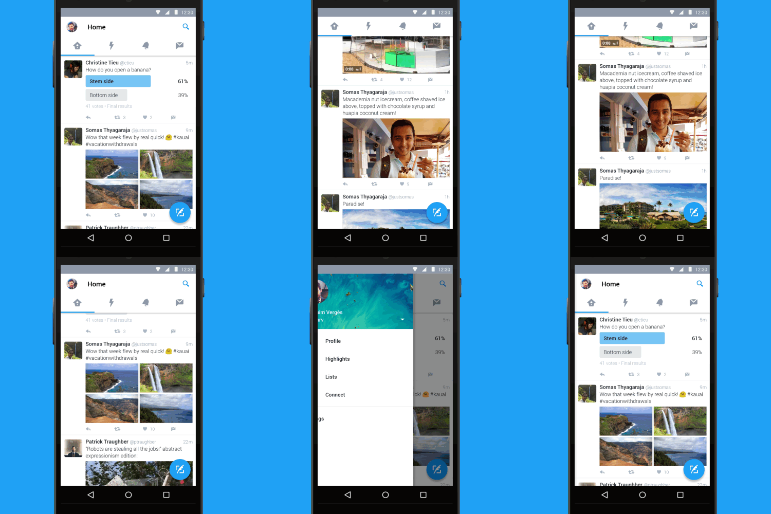
The alpha version has some other nifty new features in what can only be described as a redesign of Twitter with tab options for Timeline, Moments, Notifications and Messages. Users have reported seeing two different versions for the menu UI, indicative of A/B testing, where two different versions of an app are tested to gain feedback on user preference. The two versions that users have reported are user a hamburger icon with a slide out menu while others have reported three dots and an over flow menu.
- Hamburger Menu Testing
- Hamburger Menu
- Overflow Menu Testing
- Overflow Menu
For now there is no user control for the feature with its activation and deactivation depending on the timing, nonetheless, when the final build appears on Twitter, there should be more user control over this feature.

What do you think about night mode for Twitter? Is it a feature that you would use?
[Via Phone Arena]


