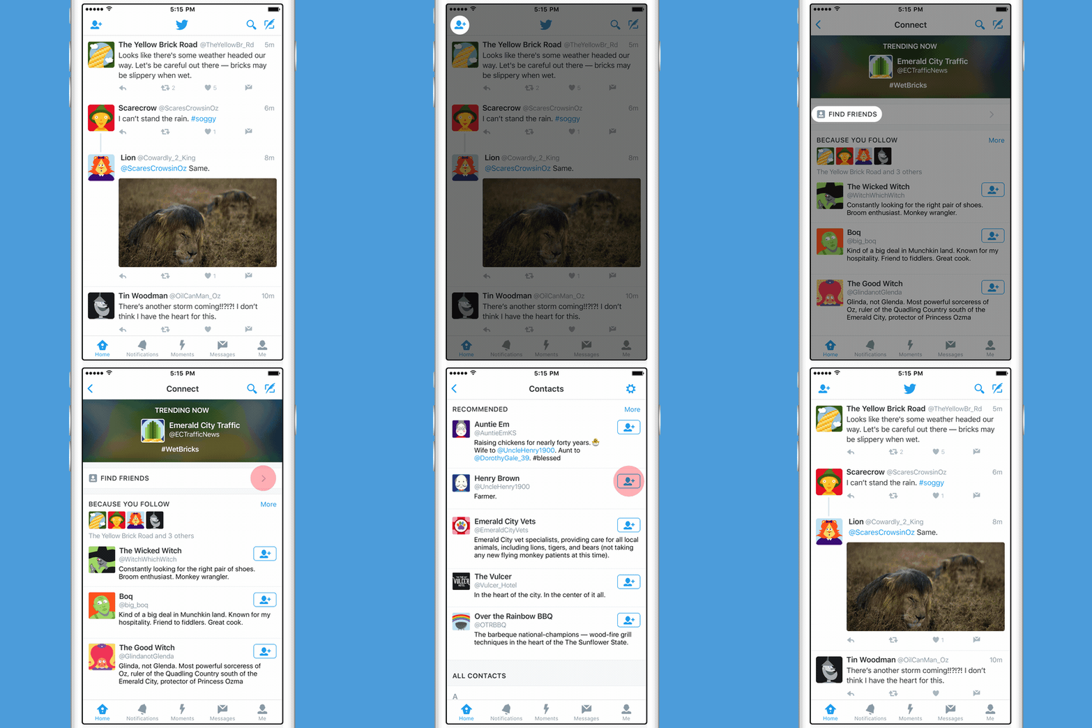
After months of alpha and beta testing, Twitter today announced that it is now rolling out a new Material Design inspired update for its Twitter for Android app. The update will completely revamp the UI of the app to make it more inline with Google’s Material Design guidelines.
The primary interface of the app is now divided into different tabs — Home, Notifications, Direct Messages, and more — that you can easily swipe between. Adhering to Google’s guidelines, the app now also features a navigation menu that can be accessed by sliding to the right. The menu provides quick access to your profile, highlights, lists, Connect tab, and settings. Finally, there is also a floating action button that allows one to quickly compose a tweet.

The Twitter for Android app has been in a dire need of an update, so it is great to see the Android team over at Twitter finally roll out a hefty update for it that adheres to proper Material Design guidelines of the platform.
The update is rolling out globally from today and you can get it by updating the Twitter app from the Google Play Store.
[Via Twitter]


