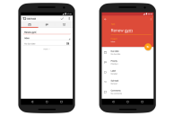
Todoist, one of the most popular task management apps for Android, has received a major Material Design makeover today.
The update brings about a complete overhaul of the app that greatly enhances its usability and experience. The team behind Todoist has re-written major parts of the app to make it faster and more fluid than before. While the older version of Todoist had dull and boring grey colors, the new app features a bright red and yellow theme, and in case that does not suit your taste, there are 10 new colorful themes to choose from as well.
The redesign also comes with some new features including the ability to quickly add new tasks with natural date parsing, which is available in 14 different languages. You will also be able to swipe left on tasks to schedule them, or mark them as complete by swiping to the right.
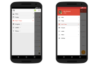
Make no mistake — this is a complete redesign of the Todoist Android app. Every single aspect of the app has been materialized, and there is also a new navigation menu that makes jumping between your different projects easier and intuitive. Check out the screenshots below and see for yourself.
If you have long been waiting for a beautiful to-do manager for Android, the redesigned Todoist app is going to easily fulfill all your needs.
Download: Todoist


