Samsung has been working on a foldable smartphone for years, and now it’s finally here.
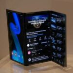
Samsung today, during its developers conference, officially unveiled its first foldable smartphone. A lot of the details are still on ice at this point, and Samsung isn’t sharing all that much, but we do get a look at the prototype hardware, and learn about some major user interface changes the company has in store for both its traditional devices and the new foldable devices. First, the new design.

It starts with an Infinity Flex Display, which will allow for the device to be folded down from a 7.3-inch display down to a candybar-like style, which will have a cover display that is accessible when the phone is folded closed. When the phone is opened into the larger display, it will be able to run three apps at once, what Samsung calls “multi active window”. And the company says the new display will go into mass production “in a matter of months”.

At this point, there’s no word yet on when we will be seeing more of the device, or its foldable display, but rumors are still circulating that Samsung plans on a public launch of the device at some point in the early stages of 2019.

As for the UI elements, Samsung is introducing what it calls “One UI”. This is meant to bring the majority of content to the bottom half of the display, which the company believes will reduce clutter and make it easier to access the features and elements of the UI any user would want to use. We can see that in the images here, where text messages are present on the bottom half of the display, along with the Google Search bar on the home screen, and other key tweaks.

“Samsung introduces a new and intuitive interface design called One UI. Its clean and minimal design keeps the most relevant content on the bottom half of the screen – making it more natural and comfortable for one-handed use. The experience was reengineered to reduce clutter and distractions, allowing the user to better focus and quickly navigate their phone.”
There is no word on when One UI, or the foldable phone, will debut.
[images via The Verge; Samsung]


