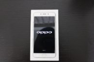
After a successful launch in China, the Oppo R9 has finally arrived in Singapore. Pre-orders are available through the Oppo online store, but the phone only ships out on the 30th. At Android Beat, we managed to get our hands on the device to bring you its unboxing and first impressions.
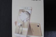
Looking at the phone box, Oppo has used premium materials to give the box an up-market look. The front image screams that it is an iPhone copy, a feeling that will be further reinforced when you look at the device itself. Whether the device matches it’s box will be determined later when we give an exhaustive review. For now, enjoy the unboxing of the Selfie oriented phone while we figure out how much of a clone it is.
The Box
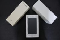
- As I said previously, the box feels sturdy and has a premium feel and design around it. Borrowing heavily from the design of the iPhone and Samsung boxes, the Oppo box looks like a blend between the two.

Design and Build
- If not for the thin bezel and the oblong home button, it would not be difficult to mistake this phone for an iPhone with just a glance. But as you hold that gaze, you will notice a few more things — that the phone is slightly thinner but larger than an iPhone 6s but smaller than the 6s Plus. Also, the position of the light sensor on the front panel follows the placement of Samsung devices as opposed to the iPhone.
- Though the phone is thinner and smaller than many phones with a 5.5 inch screen, it does not feel as slippery to hold. This is not because the materials increasing grip, but due to a slight tapering of the sides of the phone that makes gripping it comfortable.
- The materials and build of the phone do add to a level of confidence when holding it without any protection, nonetheless it gives you a sense that it lags behind in quality. Its not that we have a defective set to test, it’s just something you cannot put a finger on, but know it exists.
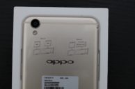
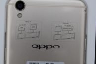
- The rear of the device has the unmistakable antenna bands running across it at the top and bottom, something that further strengthens the argument of it being an iPhone copy.
- The camera sensor does protrude from the rear, however given the slim design of the phone, the relative protrusion is minimal. Though Oppo should be congratulated on this feat, the protrusion does mean a case is better suited at protecting the phone.
- There is also the option of inserting dual SIM cards or expanding the memory of the device up to 128GB using a Micro SD card.
- The weight of the device at 145g makes it average, but given the device has a 5.5 inch display and weighs 2g more than the iPhone 6s with its 4.7 inch display, this is somewhat impressive.
Accessories
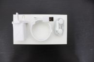
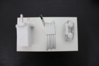
- The phone box comes with a VOOC Flash charger that impressively powers the device up to 70% after just 2 hours of charging. The charge cable provided is about 1.5m in length but has a clip type feature that neatly wraps up the wires if required for travel. But even this won’t help save much space for the immense charger head.
- Oppo is kind enough to include a transparent protective case in the box itself, while the phone comes fitted with a screen protector.
- The box also includes one-size-fits-all ear buds that bring nostalgic memories of the iPhone’s of yesteryears.

She’s Alive!
- Powering on the device, gives you an idea what stock iOS running on Android would feel and look like. In other words, it looks pricy but does it on the cheap.
- The stock Camera app does give you HDR settings on the rear camera but for a Selfie focused phone, that same setting is not found on the front camera. The buttons and UI having a penchant for giving users a ‘Déjà vu’.
- While the screen does look bright like an AMOLED display should, there seems to be a high degree of saturation present. Whether this translates into the images captured has yet to be seen.
- The Apps do not have a gloss over page like on Android, thus they download and form pages similar to that on an iPhone.
Overall, avoiding all the comments one can make about how it copies Apple and Samsung, it is a very decent phone that feels like it can provide for a wide audience. It has a large screen at a low weight, is simple and easy to use, and it convinces you it is solid enough to take a knock or two. ColorOS 3.0 manages to merge the Android and iPhone UI in simple ways that at first glance it feels like the missing link between the two.
Check out the gallery below with more images of the phone.
- The Box it comes in.
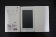
- Getting ready to power it up!
- Another angle.
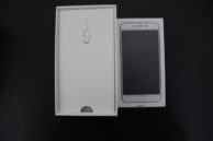
- Once you remove the Phone.
- Charger, Cables and Earpiece.
- The Band that neatly wraps up cables.
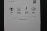
- Main selling points of the R9 on the box.
- The behind of the R9.
- Dual SIM / Expansion Slot
- Powering it on.
Till I can figure out the best angle for a selfie from the phone that evokes narcissism, do let us know in the comments what you think of the phones looks, design and UI.
