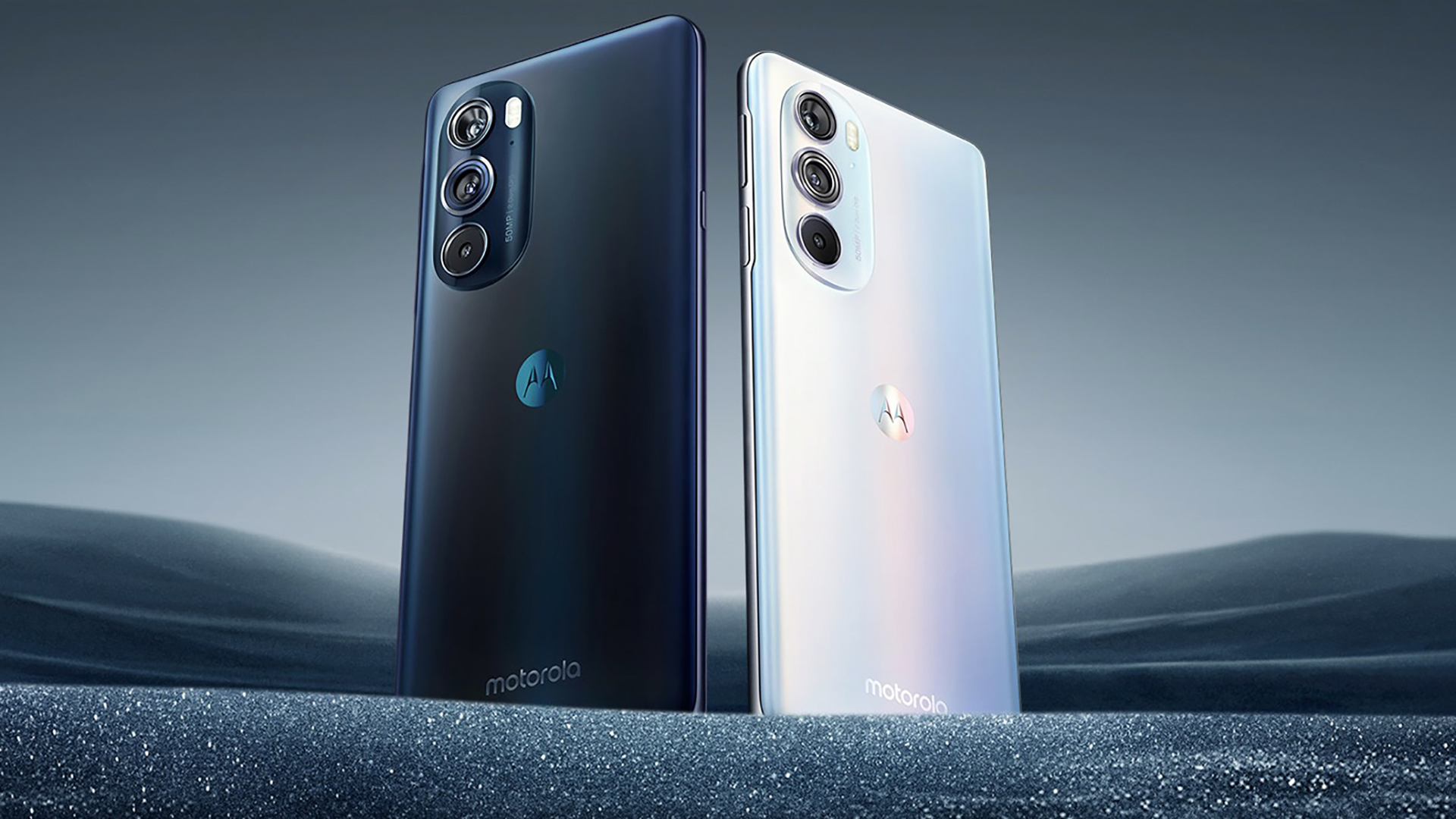
The effects of Google’s acquisition are finally showing on Motorola, and I mean that in a good way. Motorola has just announced its new logo, along with a new typeface for its logo. The company has retained its iconic ‘M’ symbol, which is now surrounded by a circle of various colors.
The company has also ditched its all caps ‘MOTOROLA’ name for ‘motorola’, with a new beautiful typeface. The logo is also accompanied by a new tag line “a Google company”, which will surely catch attention of the general consumer.
The change in logo comes at a key time for Motorola, when the whole world is eagerly awaiting the announcement of its X Phone. Rumours and leaks hint that the X Phone won’t be a top-of-the-line handset, but will instead pack mid-range specs for possibly better battery life and customisation options.
Only time will tell what effect the new logo and the X Phone will have on Motorola’s fortune.
Via – The Verge


