It’s something of a testament to the HTC One’s build quality and design that, of the last ten Android-focussed tech reviewers I’ve queried over the last two months, seven of them have ended up keeping the One as their daily phone and all have judged the device as the best Android smartphone they’ve ever held. Add me to the list, too. Not that the HTC One is perfect – despite its plus points, it’s ultimately restricted in a number of ways and there’s an annoying usability issue, but it’s fair to say that you have to be something of an Android power user or perfectionist to complain too loudly about any of this.

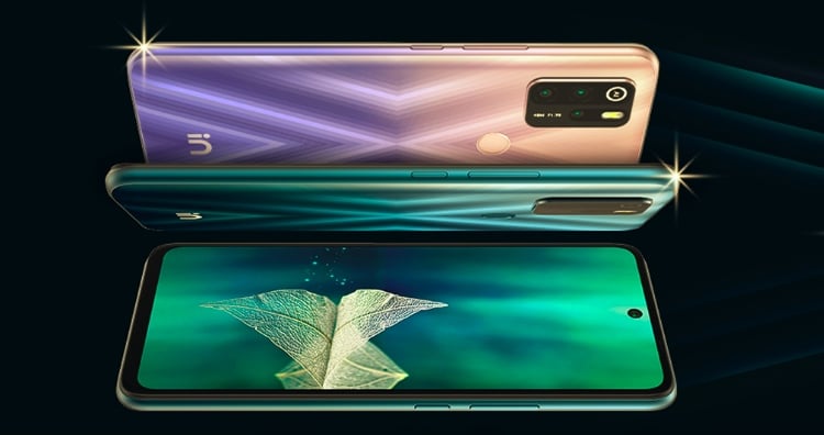
Machined from a single block of cool, hard aluminium, Apple-style, this feels like a sister product to a Macbook and, if possible, more Apple-like than the iPhone itself. In use, the subtle curves and contours fit the hand perfectly – yes, the HTC One is a large device, but it fits so well and looks so gorgeous that, again, noone’s going to mind.

The usual issue of metal not letting the essential wireless signals in and out is solved by putting all the antennae behind injection molded plastic inserts in special channels around the edge of the phone and on the back. It’s not clear exactly where each antenna is, but they do all seem to work very well and I had no signal issues.

The 1080p SuperLCD3 display is superb in terms of colour, resolution and contrast, in all light conditions. It’s not clear whether polarisers are used, as on Nokia’s Symbian and Windows Phones, but HTC’s best displays are clearly very competitive here and, at times, it’s tempting to think that you’re looking at an AMOLED screen, such is the quality of the blacks and the richness of the colours.
Even better are the viewing angles. You may remember the Sony Xperia Z, the phone whose display could almost not be seen unless you were looking at it head on? The viewing angles on the HTC One are insane – it’s as if the current display contents were a high quality ‘promo’ sticker stuck onto the glass – contrast is just as good when you’re looking at the phone almost side on.


Viewing angles are excellent, the display looks almost printed on top of the glass.
But even the screen quality is outshone by the very components that frame it – the front-mounted stereo speakers. HTC’s choice of components for its speakers in the past has been legendarily bad, with devices like the popular Desire producing little more than a tinny squeak whilst competing devices from Nokia, Apple, Sony Ericsson and Motorola had speakers which sounded good and could be heard across a room. It does seem as though HTC listened to the criticism at the time and speaker quality started to improve from the One X onwards, but it’s taken until this, the (simply named) One, that the company can claim to have blown away the competition (there’s a demo in the video at the bottom, here).
There are actually four aspects here to note. Firstly, there are two speakers rather than one (as on almost all current competitors) – which doubles volume, by definition. Secondly, the speakers are mounted to face towards the user, rather than relying on bouncing sound off a convenient desktop or wall. Although this doesn’t necessarily increase volume per se, it does mean better quality in terms of frequencies, especially treble and bass. Thirdly, the speaker components themselves are bigger and of much higher quality – well done, HTC.


The top speaker grille (matched at the bottom) pumps out terrific sound, especially when combined with the Beats EQ.
Finally, the Beats Audio software EQ enhancements, often trivialised in the press, do seem to work much better on the HTC One than on previous handsets. I suspect this is largely because the bass and treble heavy Beats EQ profile was completely wasted on the poor speakers in previous handsets, whereas on the quality hardware here the top end in music shimmers and you can even hear a degree of bass too, something I never thought I’d say about phone speakers. In short, the results are spectacular – watching a movie (or at least part of one) on the phone is quite an experience. The biggest problem will be complaints from others about the volume the One is kicking out!


The HTC One’s 4mp ‘ultrapixel’, OIS camera, with single LED flash
Another interesting bit of technology in the HTC One is its camera. Bucking the trend for squeezing ever smaller pixels onto a tiny ⅓” sensor (though Samsung made it work pretty well on the Galaxy S4, with its 13 megapixel resolution), HTC has limited it to 4 megapixels, ensuring each is larger, at 2 microns (HTC refer to these as ‘ultrapixels’, note that the pixels in the S4’s camera are around one micron across). There’s also a largish f/2.0 aperture, plus HTC has given the camera Optical Image Stabilisation (OIS), similar to that on (but more limited in implementation than) the innovative Nokia Lumia 920. Add the factors together and you end up with good photos of static subjects in low light, with much reduced digital noise and less blur due to the user’s hand shaking.


Sample photo in good light – excellent result, though ultimately restricted in detail and resolution.
In my tests, the HTC One’s photos in this low light scenario didn’t match up to those from the Lumia 920, but they’re still pretty good. Of course, whatever mainstream smartphone you’re using, moving subjects (e.g. people!) indoors or in low light will end up blurred. What’s perhaps needed is Xenon flash, as I’ve written before.
Except that…. this isn’t necessarily true, due to the HTC One’s next party trick. The phone can be set to shoot in ‘Zoe’ mode, short for ‘zoetrope’, in which the hardware is constantly (and silently) shooting photos and buffering them. In zoe mode, you’re effectively capturing eight photos before you press the shutter icon and 16 after, plus a short bit of illustrative video (sadly, only after the shutter ‘moment’, but hey) to give you an overview. What this means is that when shooting children and toddlers, for example, who are utterly unpredictable, you can wait for a moment of magic, perhaps a chuckle or specific action or expression, and then touch the shutter icon, safe in the knowledge that you haven’t missed the moment.


Ah, the baby clapped and I tapped too late and just missed the moment. If only I’d had a HTC One…


Ah, yes, the HTC One was in zoe mode. Rewind a few frames, from BEFORE the shutter icon was tapped and… voila!
Yes, most of the 24 photos will be blurred or non-optimal in some way, but there will almost certainly be a gem in there that’s crisp and, quite possibly, one that was taken before you took the action of tapping the shutter icon. And, yes, jaws will drop when you show off the photo later and people will marvel at your photo skills in terms of capturing the perfect ‘moment’.


Ah yes, a Zoe moment, plucked afterwards from a batch of 24 burst snaps. Perfect!
It’s true that there isn’t the time-freezing, mid-air aspect of photos shot with Xenon flash, but the latter tech has the disadvantage that it takes a good second to recharge, so you’re likely to miss a magic moment altogether. I’ve tested the Nokia 808 PureView and HTC One back to back in a social situation and the latter almost matched Nokia’s camera champion in terms of great shots. Which is a huge compliment.
Admittedly, in terms of raw resolution, the HTC One’s photos can seem disappointing in 2013. We’ve got very used to high resolutions and ‘splaying’ into a photo to look at details – with four megapixel originals here, there just isn’t the same flexibility. So if you’re someone who likes ‘cropping in’ to a photo later on, you may find there’s not enough here to work with, however high quality each ultrapixel’s output is.


Lovely macro work from the HTC One’s camera here…


The One’s camera includes a hardware-accelerated HDR mode, here’s an example snap. Pretty good, though with a tendency to over expose?
Of course, effectively creating 24 photos every time you tap the shutter icon is going to clutter things up a bit. The built-in Gallery has been coded to intelligently keep the 24 photos together, put up the video as a thumbnail (very cool) and then, when tapped, present the burst of photos as a timeline that you can pick from and share as needed. But if, as do most people, you have Google+ set to auto-upload all your photos to your private store in the cloud, you’ll often find that your ‘zoe’ batches of 24 images are all uploaded as-is. Yes, if you’re mobile then you can set Google+ to only do this over Wi-fi, so bandwidth won’t be an issue, but clutter most certainly is – your typical 20 zoes from your ‘week away’ will then be uploaded and presented in your Google+ as a dense mass of 480 JPGs. Gulp.


Clutter after auto-upload of one zoe ‘photo’ in Google+!
Perhaps HTC can work with Google to solve this issue – the zoe system is a great idea and deserves to be handled more elegantly by Google+ (and, indeed, by Dropbox, which also offers to auto-upload all photos as part of the HTC One set up screens – I declined, thinking ahead to this very issue)?
Video capture is merely acceptable (for a 2013 flagship), I found footage to be routinely over-exposed and that the two-axis OIS didn’t offer anywhere near as much stabilisation as on the 3-axis OIS Nokia Lumia 920. Here’s a brief side by side comparison of the One (left) and 920 (right):
Accompanying HTC’s ImageSense electronics (mainly to handle the zoeys) is the main processor, a cutting edge quad core Snapdragon 600. Along with 2GB of RAM, this thing flies. The Verge’s full home page is the ultimate example of javascript and image bloat, yet it loads up in about seven seconds, which isn’t much slower than my mains-powered desktop. In today’s web-obsessed world, bandwidth-permitting, you can pretty much hit any URL you want with this, without having to stop and wait for things to render.


Coping with even the heaviest web sites with ease; (right) take two browsers into the shower? – a recipe for confusion!
You get two web browsers, oddly, HTC would do well to ditch the old Android browser and just stick to Chrome. In the meantime, users will get a little confused, I think. HTC’s Sense skin is lighter than it used to be, but the way you scroll through apps, or add widgets or shortcuts, everything’s just a little different to stock Android. But I can live with it and new users, of course, won’t know any different.
This first homescreen is titled BlinkFeed and can’t be removed. It’s a visual amalgam of your social feeds and the news sources of your choice, and works pretty well. Think Flipboard and you’re 99% there, though you can’t add RSS feeds of your own choice – all sources have to be HTC-approved. Still, it’s pretty, fast, and defaults to only updating over Wifi, which is very sensible. Other homescreens have to sit to the right of this and swiped to, though you can at least set any screen as ‘home’, perhaps wishing for a more traditional central Android launcher and hub.


BlinkFeed in action, initially with Facebook and then starting to add in supported news sources.
Android 4.1.2 underpins all of this, along with a 32GB internal disk. It’s non-expandable, and you only get 24GB free after you’ve powered on for the first time and updated all the built-in apps via the Play Store to the latest versions – but I do think this should be enough for most people. Also sealed is the 2300mAh battery – I easily got through a day (with brightness set to ‘Auto’) but, as ever, I do worry for users about a year down the line when the battery’s down to around 70% capacity.


Power front and centre on your notifications pane and (right) the items it affects…
I was a bit worried about the front-and-centre ‘power saver’ options here. There’s one main toggle, and this affects display, data use, CPU efficiency and vibration, any of which you can leave alone if you prefer. However, power saving doesn’t seem to be needed very often, so it’s safe to just leave it turned off.


Every manufacturer wants to try and sneak in its own content stores, duplicating what Google offers as part of the OS package – and HTC is no exception. They’ll fail though – they always do.
In addition to the usual Android core apps, there’s the 7digital music store and the HTC Watch movie store, neither of which are likely to see much use given the standard Google Play apps, plus a rather splendid ‘kid mode’, aka, Zoodles, with loads of small-kid-friendly games and video content. I guess the idea is to keep a child happy in a queue or on a car journey, though do note that the video resources it needs might bump up your data bill a bit! To get out of Zoodles, i.e. as the parent, there are various options, including, most helpfully, tracing the secret gesture!


Two snapshots of the excellent kids suite, Zoodles
HTC’s trademark weather system is here in large widget and app form, too, along with a few useful extras, Tunein Radio and SoundHound, plus the full Polaris Office editing suite – nice. Plus you can of course add all the Android apps you care to try or buy.


There’s a flat look to HTC’s trademark weather clock now, but tapping through brings back animated photorealism
So plenty of positives above, but the usability of the whole phone takes a tumble when the penny drops about the positioning of the power/wake button. Just as on last year’s One X and sister devices, the only, repeat only* way to wake the screen up is using the button at the left edge of the top face of the One. With my hands, I can just about stretch to turn the One on with one hand – and then contort to do the upwards swipe to clear the lockscreen. But it’s not comfortable. With these larger screened devices, it’s essential to have buttons to activate the phone on the sides or front, where they can be reached one-handed. As it is, the HTC One almost becomes an enforced two-handed device much of the time.
* This is, in fact, such a pain, that already we have users leaping on third party utilities in the Play Store such as Awesome On Off, bypassing the HTC power button completely.


The top of the HTC One, with the only physical button capable of waking the screen – sadly.
Talking of buttons, I thought the switch to only two Android control buttons here at the bottom would annoy me, but I got used to it very quickly. Double-tap the home button to get the ‘recent apps’ thumbnail menu, and so on. Works pretty well, although I didn’t like having to long press home to get Google Now – happily the latter can simply be placed as a small or large widget on a homescreen and accessed in more traditional fashion.


The non-standard Android control keys – you get used to having only two, but there are some usability inefficiencies.
Not having a Samsung (or Android ‘Gingerbread’) menu key is still catching some apps out, I think, and rather showing up Facebook’s programmers, to take just one high profile example. You effectively lose a lot of screen real estate to an almost completely pointless menu shortcut – hopefully an update will appear here to put the menu back up in the top tabs/actions bar!
One final feature that some reviews will mention is the infrared blaster built-in into the top power/wake button. It worked OK for my TV, but failed miserably for my main DVR/Freeview box, the one that actually controls all the digital channels. So I’m not qualified to say whether it’s any good or not. Maybe it works better with equipment in the USA and Taiwan?
Despite the many plus points above, I still find myself worrying about the HTC One as something of a long term risk. The hardware and software seem solid enough and I’m sure the resale value would stay high as a result. But anyone with a passing knowledge of the smartphone industry in 2013 will know of HTC’s supply chain, management and financial woes. It’s often speculated that Blackberry (nee RIM) and Nokia are in danger of disappearing over the next 12 months, but I think HTC should possibly be put in the same category. I personally think that there’s room in the market for all three and, therefore, that HTC will still be around to service your One, to provide support and to work on updates through 2014 and beyond. Let’s hope so!
That aside, it’s easy to recommend the HTC One to almost anybody. It’s beautiful, fast, stable, feature packed and there’s very little to dislike. That its arch rival, the more flexible but more cheaply built Samsung Galaxy S4, will sell ten times the number of units in 2013, shouldn’t be taken as an indication of the One’s quality.


