Last year, Lenovo’s budget K3 Note turned out to be a surprise hit for the company in the Asian market where it shipped more than 1.5 million units of the handset in only around 6 months. Less than a year later, the company unveiled the successor of the K3 Note: the Vibe K4 Note.
The Vibe K4 Note is priced slightly higher than its predecessor, but it packs in so many features that the price increase can be almost forgiven. With front-facing stereo speakers, a 13MP rear camera, a metallic chassis and a touch-based fingerprint scanner, the Vibe K4 Note looks like a pretty damn good handset on paper. These features are usually found on smartphones that are priced much higher than the Vibe K4 Note. So, is the K4 Note really as good them? Or are all the features on the phone only good on paper? Read our review to find out.
Design and build quality
The front of the Vibe K4 Note houses a 5.5-inch Full HD display that is flanked by some sensors, and a 5MP camera; while the bottom houses the capacitive navigation keys. The phone also comes with front-facing stereo speakers, which have been done quite tastefully and really add to the look of the phone. And unlike HTC, the speakers are not accompanied by huge bezels, which usually spoils the design of a handset.

The bottom of the handset houses the microUSB port, while the rear houses the 13MP F/2.2 camera, dual-LED two-tone flash, and a touch-based fingerprint scanner. The right edge of the handset houses the volume and power keys, which are also done in metal, while the left edge is devoid of any ports and buttons. The rear panel of the handset is made of plastic and is removable, though the battery is still sealed in. Taking a cue from OnePlus, Lenovo is offering different textured back cover for the Vibe K4 Note as well.
All this is held together by a solid metallic chassis that really helps in improving the overall feel of the Vibe K4 Note. I found the K3 Note cheap and built like a toy, but the Vibe K4 Note is in a different league altogether.

If anything, my biggest gripe with the Vibe K4 Note are the capacitive navigation keys. Not only are they in the wrong order, they are not backlit as well, which makes them very difficult to see and use in dark rooms and lighting conditions.
I absolutely hated the build quality of the Lenovo K3 Note. The plastic-y feel of the handset was a huge turn-off for me and just made it feel cheap. In comparison, the Vibe K4 Note is in a completely different league. The metallic chassis really helps in improving its overall feel and build. The back is made of plastic and removable, and Lenovo is offering different textured back covers for the K4 Note that you can buy to change the look and feel of the phone down the line.
The Vibe K4 Note does not feel as premium as the iPhone 6 or the Nexus 6P, but for a phone that costs less than half of them, its build quality is truly remarkable.
A special note regarding the front-facing speakers and the audio quality of the Vibe K4 Note. It is only now that most flagship smartphones have started featuring front-facing speakers, so it is remarkable to see Lenovo include it on the Vibe K4 Note. Even better, they barely occupy any space and sound truly fantastic. Yes, they don’t have the bass and richness as the BoomSound speakers found on HTC devices, but they sound significantly better than any other phone in this price range. The audio quality over earphones is also top-notch, all thanks to the dedicated DAC. In fact, it even sounds better than my current daily driver, the Nexus 6P.
Display

True to its ‘note’ name, the Vibe K4 Note houses a 5.5-inch Full HD laminated display at its front. With 5.5-inch displays now becoming the norm and in great demand, the panel quality from display suppliers have improved greatly. This greatly benefits the Vibe K4 Note as you will be hard pressed to find any sore spot with its display.
The viewing angles are great; the contrast and saturation levels are also decent; and since the display is laminated, it only suffers minor reflectivity issues when under harsh lighting conditions. My only qualm with the display has to be its brightness, or more specifically Lenovo’s auto-brightness algorithm. Lenovo’s auto-brightness system tends to keep the display brightness on the lower side, which led to numerous situations where I had to manually increase the brightness.
Software
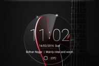
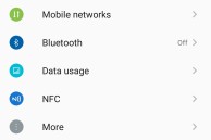
Out of the box, the Vibe K4 Note runs on Android 5.1.1 Lollipop with Vibe UI running on top of it. Unlike Huawei’s Emotion UI, Lenovo’s Vibe UI does not look as pretty, but it packs in a ton of functionality, features and customisation options. Some options are buried so deep though, that it is unlikely most people will even know that they exist.
The home screen is simple and lacks any flashy widgets, though the Quick Settings panel is brimming with toggles that can be overwhelming for first time smartphone users. Thankfully, almost every part of the UI can be customised to one’s liking — right down to the home screen style and the number of columns present in Quick Settings.
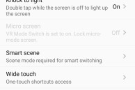
To keep things simple and easy to find, Lenovo has tucked most of the hardware related features under ‘Feature’ in the Settings menu. Inside it, you will find options to enable features like Quick Snap, double-tap to wake, Smart Scene, Fingerprint gestures, VR Mode Switch, and more. And even though the Vibe K4 Note runs on Android 5.1 Lollipop, Lenovo has included its own take on app permissions control that can be accessed ‘Permission Control’ in Settings.
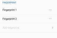
Lenovo has taken every feature of stock Android and made it more advanced in its Vibe UI. Not only do you get multiple user accounts, but there is also a ‘Secure Zone’ for all your private files, photos and videos. Similarly, you can use the fingerprint scanner on the device for more than just unlocking the device: taking pictures, acting as a back button, and more.
Lenovo’s Vibe UI is really not going to win any beauty pageant, but it is simple, fast, and customisable.
Performance
Under the hood, the Vibe K4 Note is powered by a modest 1.3GHz octa-core MediaTek MT6795T chipset. This chip is actually slower by a fair margin than the 1.7GHZ chip found inside the K3 Note. I had initially assumed that this difference will make the Vibe K4 Note a fair bit slower than its predecessor and might even make the phone downright unusable. As it turns out though, Lenovo seems to have optimised its software to makes sure that day-to-day tasks are not affected by the slower chipset.
Browsing heavy websites like The Verge, frequently switching between multiple Excel files, using Google Drive to edit spreadsheets — the Vibe K4 Note did it all without complaining or crashing. Yes, apps do take just a wee bit longer to open, but that is not something you are going to notice until and unless you switch from a high-end phone. Additionally, having 3GB of RAM ensured that the Vibe K4 Note was easily open to have a bunch of apps present in its memory for excellent multitasking performance.
Not that the slow chipset never disappoints; it does. Heavy games like Asphalt 8, NOVA 3 and FIFA 16 are completely unplayable on the Vibe K4 Note. At high settings, I was barely getting 10FPS in Asphalt 8, and even reducing the graphics settings to Medium hardly improved things. It was only after dropping the graphics quality to low that the game was playable, but barely. Other less graphically intensive games like Badland and Rayman Adventures worked just fine on the handset and were completely playable.
Camera
The rear of the Vibe K4 Note houses a 13MP shooter with an f/2.2 aperture, phase detection autofocus and a dual-tone flash. Just like its Vibe UI, the camera app on the K4 Note is simple but effective. You don’t get a plethora of modes and options, but the bare essential options — HDR, Flash, Video mode, Gallery, other camera modes — are all within easy reach.
Sadly, the camera app offers very limited control over different camera aspects. You can control the white balance and ISO level and that’s about it. There is no way to control the shutter speed or shoot pictures in RAW format, though it is unlikely that most people looking for a phone in this price range require such functionality.
The camera app is smooth and fast and there is barely any shutter lag, which makes clicking pictures on the Vibe K4 Note a joy. The presence of phase detection autofocus also ensures that the handset is quick to focus on objects.
- HDR helps in capturing more details, but it takes its own sweet time.
At first glance, my only complaint with the Vibe K4 Note’s rear camera is how easily it tends to overexpose and blow highlights. Under adequate amount of light, the camera captures plenty of details, though the noise reduction does eat away some of the finer details.
In extremely low-light conditions, the Vibe K4 Note’s camera struggles just like any other mid-range smartphone camera. And in certain cases, the camera app tries to make up for the lack of light by increasing the shutter speed, it leads to the final image turning into a blurry mess.
Now, don’t get me wrong: the Vibe K4 Note’s rear camera is decent, but its not a game changer. In my opinion, the camera app plays an equally important role in the camera experience, which ultimately makes the Vibe K4 Note a winner.
The slower chipset of the handset also shows its weakness here: While the Honor 5X and other mid-range smartphones now come with slow-mo video recording, the Vibe K4 Note is only capable of recording videos in Full HD resolution at 30fps.
The 5MP front camera captures plenty of details for your selfie needs, though the beautification mode — which is enabled by default — tends to soften up images quite a bit.
Battery life
With a 3,300mAh battery and a paltry 1.3GHz octa-core chipset, the Vibe K4 Note should easily last through a day of heavy usage, and it does. With moderate usage, I was consistently able to squeeze out nearly 2 days of battery life from the phone without switching to any power saving mode or sacrificing any other functionality. Plus, the inclusion of Power Saver and Ultimate Power Saver gave me peace of mind that I could make the last phone for at least a few more hours even when the phone’s battery level dropped down to less than 10% without any issues.
If anything, the lack of any kind of fast charging tech on the Vibe K4 Note is my biggest complaint with the handset. Almost every other smartphone now comes with at least Quick Charge 1.0 support, so its was a poor decision on Lenovo’s part in my opinion to not include this feature on the K4 Note. The phone does come with a 2A charger, so the handset charges quickly, but it is still not as fast as quick charging.
Conclusion
To be honest, I had written off the Vibe K4 Note when I first read it specs. The slower chipset was a clear downgrade when compared to its predecessor and I could not fathom why Lenovo even took such a decision in the first place. After using the Vibe K4 Note over the last couple of weeks proved though, I have realised I was horribly wrong.
The gaming performance of the phone might not be one of its strong suit, but in every other department, the phone is absolutely stellar. Right from the display to the front-facing stereo speakers to the fingerprint scanner, the Vibe K4 Note packs features that are actually useful and not just a gimmick.


