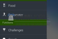
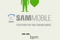
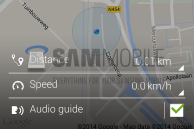
New leaked screenshots show Samsung’s updated S Health app with a flatter user interface. The new images surfaced on the web thanks to mobile site, Sammobile. Judging from the captured photos, the fitness application’s primary features hasn’t changed. The new and improved S Health app is now more in-line with the design of Google’s Android 4.4 KitKat. Aside from the UI overhaul, Samsung added a new wrinkle that allows users to view their location on a map while also controlling the music they’re playing from a single screen as they walk or run.
The screenshots do look convincing, however, Samsung has yet to confirm any official changes to the app publicly. I believe the new flatter design makes the app more polished. Check out screenshots from the new S Health app below, tell me what you think in the comments?


