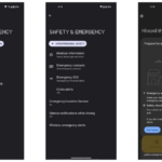
Google has started rolling out a new update for its Google Search app on Android that gives the Google Now Launcher a partial Material Design makeover.
On devices running Android 4.1 or higher, the Google Search bar background will change to white with a new animation when activated accompanying it. Other minor changes includes the background of the app drawer as well as its icon’s background being changed to white.
Additionally, the Google Now part of the launcher now features a slide-in panel from the left that provides access to options like switching accounts, settings reminders and changing Google Now settings itself.
Even though partial, it is nice to see Google bringing some of its Material Design goodness to older versions of Android at least until the OEMs manage to update their devices to Lollipop. As always, Google is rolling out the update in stages so it might not show up instantly on your device.
➤Google Search (Free)


