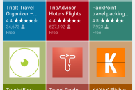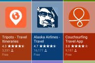
The next time you use Google search on your mobile to search for any particular category of apps, you will be greeted with a beautiful new layout from Google.
The new layout from Google seems to be targeted towards improving app discoverability of the ‘apps’ mobile search result page.
- New ‘apps’ search page in mobile Google search
To have a look at the new ‘apps’ layout screen from Google, all you need to do is do a quick google search from your Android device for a particular category of apps. For example, searching for “travel apps”, “camera apps”, or “fitness apps” will automatically bring up the new apps layout menu in Google search. You also have the option to expand the list of apps being display, and tapping on any one of them will take them to its Play Store listing so that you can download it on your device.
What do you think about this new UI for app discoverability from Google on mobile search?


