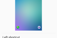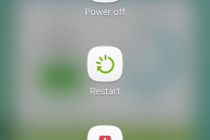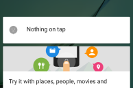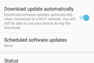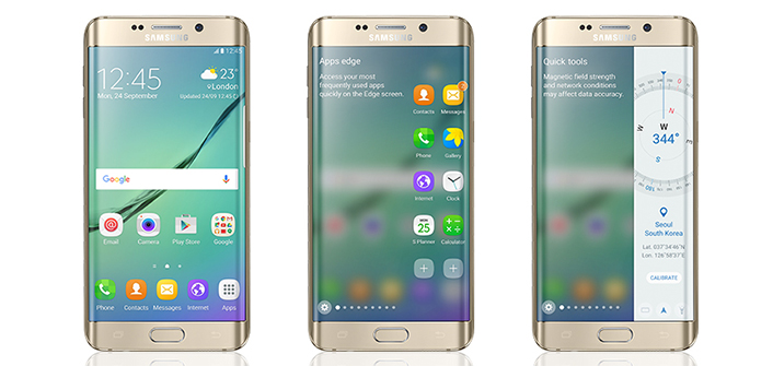
Yesterday, Samsung announced that it was seeking beta testers for the Marshmallow update for the Galaxy S6 and Galaxy S6 edge in the UK and Korea. Just a day later, the company has started rolling out the Marshmallow firmware to beta testers in the United Kingdom.
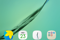
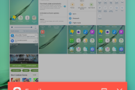
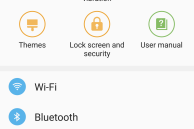
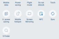
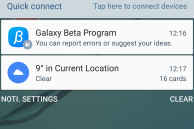
As per screenshots being posted by Galaxy S6 users who have received the update show, Samsung has changed its interface quite a bit. I don’t particularly like the new white theme for the quick settings. The revamped power menu seems to be overdone and is similar to the one found on the LG G4 and MIUI running devices.
Samsung has also tweaked the System UI theme to use a lighter shade of blue. All the notable Marshmallow features like Now on Tap and camera shortcut on the lock screen are also present in this firmware.
If anything I had expected Samsung to improve its UI with the Marshmallow update, but the company has managed to do just the opposite: make it even worse.
What do you think about the new UI that Samsung plans on bringing to the Galaxy S6 and Galaxy S6 edge with the Marshmallow update?
[Via SamMobile]