Yesterday, Google released the first developer preview of Android N, which comes with plenty of new features and changes. While Marshmallow was all about refining the core user experience, Google has focused on adding more useful new features with Android N.
With Android N still at least six months away from its final release, it is entirely possible that Google will tweak a few things and even remove some features. However, the major new features are going to be around, and in this article, we take a close look at them.
Read: How to enroll for Android beta program to get the Android N developer preview OTA update
Split-Screen
The highlight of Android N has to be the new split-screen multitasking feature. After years of longing for an official split-screen feature in Android, Google has finally gotten around to implementing it in Android N.
With split-screen, you can have two apps running side-by-side on your Android device. By default, both apps occupy 50 percent of the screen, but you can change this according to your liking. During my testing, split-screen worked as it should on my Nexus 6P, and while there were some random UI glitches every once in a while, they can be forgiven since Google still has more than six months to refine this feature further.
Developers will have to update their app to support split view in Android N, though most of the heavy lifting will be done by the OS itself.
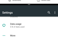
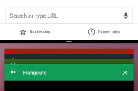
There are two ways to activate split screen mode in Android N: by long pressing the Recent Apps button or by holding dragging and dropping the card of an app while in the Recent Apps UI to the top of the screen. Once you have selected the primary app for split view mode, the bottom half of the screen will automatically switch to the Recent Apps view to allow you to select a second app. To resize the size of an app, simply drag the handle present between the two apps to the top or bottom. You can exit split view by dragging this handle to the very bottom or top of the screen to make the app re-enter full screen mode.
Google also highlights over at the Android N developer preview page that the OS features picture-in-picture as seen on iOS 9 for Android TV, but it is unclear if it will be bringing this feature to Android devices or not.
It will be interesting to see if Samsung and Huawei ditch their own split-screen implementation in favor of Google’s implementation or not, once Android N is released.
Read: How to install Android N developer preview on Nexus 6P, Nexus 5X, Nexus 6, and Nexus 9
Revamped notifications
With Android N, Google is giving one of the strongest parts of Android — the notification shade — a major revamp. Beside a new look, the notification panel in Android N comes with many new features like Direct Reply, bundled notifications and more.
First, let’s talk about the new look of the notification panel, which is now sleeker and more information packed than before. At first glance, this might seem a bit overwhelming, but I think this new design makes better use of the high resolution screen found in most Android devices today. However, I do think there should be a better differentiation between notifications from two different apps, which right now is just a thin line that does not really help much.

Direct Reply builds on the quick reply feature introduced by Google in Marshmallow. On an actionable notification and a supported app, you can tap on the reply button and respond to the message right from within the notification panel itself.

Bundled notifications will allow developers to group multiple notifications from their app into one. Each notification can also be individually expanded to reveal more information.
The top of the notification panel in Android N now also features quick toggles to Wi-Fi, Data Saver and other important system settings. Previously, accessing quick tiles required a second swipe on the notification panel, but that could be slightly cumbersome in certain cases. This change will make it easier for users to access the frequently used quick toggles, especially on Android device with a large screen.

The Quick Settings panel is still present in Android N, and it can be accessed just like before: using a two finger swipe down gesture from the home screen or by swiping down once with the notification panel open. The Quick Settings panel now opens with a slick new animation, and quick tiles are now spread across multiple pages. The Wi-Fi and Bluetooth tiles are no longer given special attention, with each column now having 3 tiles each.
The option to customise the tiles being displayed in Quick Settings has now graduated to a full fledged feature in Android N. You can not only add new tiles, but also rearrange the existing tiles in the order you like.
Data Saver
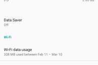
Google offers a built-in data saver mode in Chrome for Android, but with Android N, the company is integrating this feature to the OS itself. The new Data Saver mode in Android N helps in reducing mobile data usage by restricting background app data usage. This feature was already present in previous versions of Android. The new addition here is that Android can now also restrict data usage for apps while they are in foreground.
Google has not exactly mentioned how the data saver mode works while an app is in the foreground though, but the onus is on app developers to make sure that their apps use less data while in foreground when this mode is enabled.
You can also whitelist apps to have unrestricted access to the Internet when the Data Saver mode is enabled.
What do you think are the top features of Android N? Drop in a comment below and let us know about them.
Make sure to check out our other Android N related articles as well:


