On the other hand, Inbox is a modern, innovative concept that redefines how we interact with our messages. So which one is best? Much as it is with Google’s slate of messaging apps, it’s a tricky question to answer. As there’s a high degree of preference subjectiveness involved. Each client has clear benefits over the other, but it all depends on how you use your email. So We’ve broken them down for you.
Design
Email clients are all basically the same. The Gmail app follows a pretty standard blueprint. The main inbox window contains messages as they arrive, with unread messages in bold circular avatars separating emails by sender. It’s clean and functional, with a helpful swipe shortcut that lets you instantly archive or delete a message.
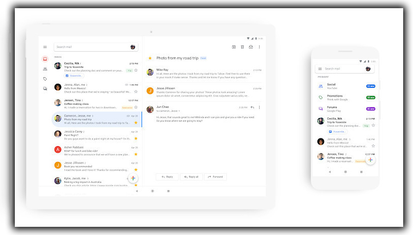
Swiping from the left side of the screen or tapping the hamburger menu opens the usual sidebar. That shows where you’ll find your inbox categories labels and settings for things like the signature, categories, and sounds. Long pressing on a message brings up a set of basic options, including trash, archive, and mute. Still, there aren’t too many surprises with the Gmail interface. It’s built for speed and practicality and is a perfectly functional free email app.
The Differences
Inbox, on the other hand, is anything but ordinary. It treats your inbox as more of a to-do list than a mailbox. The result is a hyper-focused interface that forces you to rethink your email strategy. Your messages are still given chronological treatment. Still, they’re separated by innovative bundles, with pinned messages getting top-billing spammy promos separated from the pack. Inbox also grabs your reminders from Calendar and sorts them accordingly between your messages.
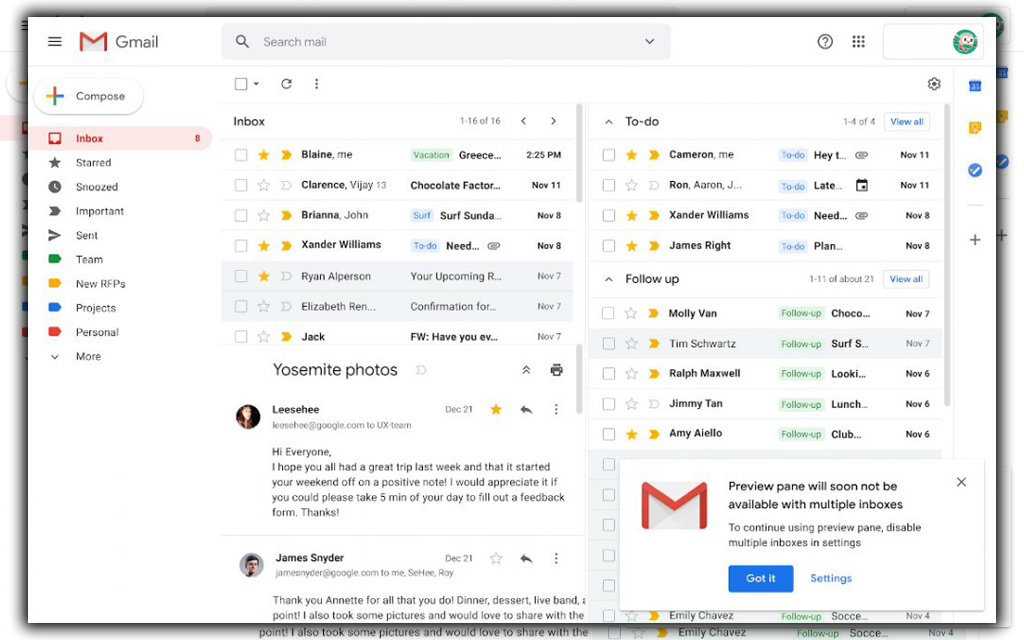
The same sidebar, swipes, and gestures you know from Gmail are all on display here. Along with handy settings for snooze options. A vacation responder, and a switch to turn off Gmail notifications. But as the name suggests, Inbox takes a decidedly different approach with its Inbox. You can argue that it’s more casual than Gmail, but its colorful, icon-heavy interface somewhat belies its power. It’s undoubtedly more whimsical than Gmail, but that needn’t suggest that it’s any less versatile than the regular Gmail app. Despite its reliance on an account.
Organization
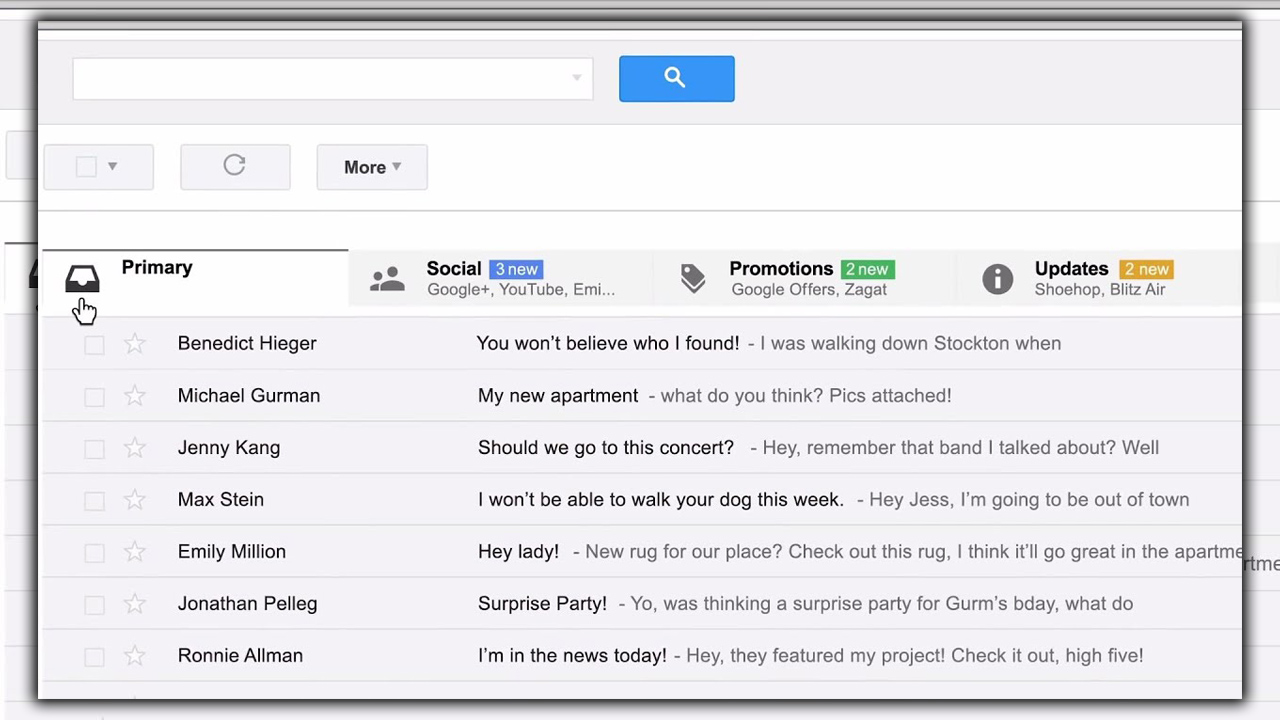
While their designs may differ, the main distinction between Gmail Inbox is their approach to organization. The Gmail app functions much like a mobile version of the web app, with Primary, Social, Promotions, and Updates tabs. The main catch-all container that will show messages from all of your accounts.
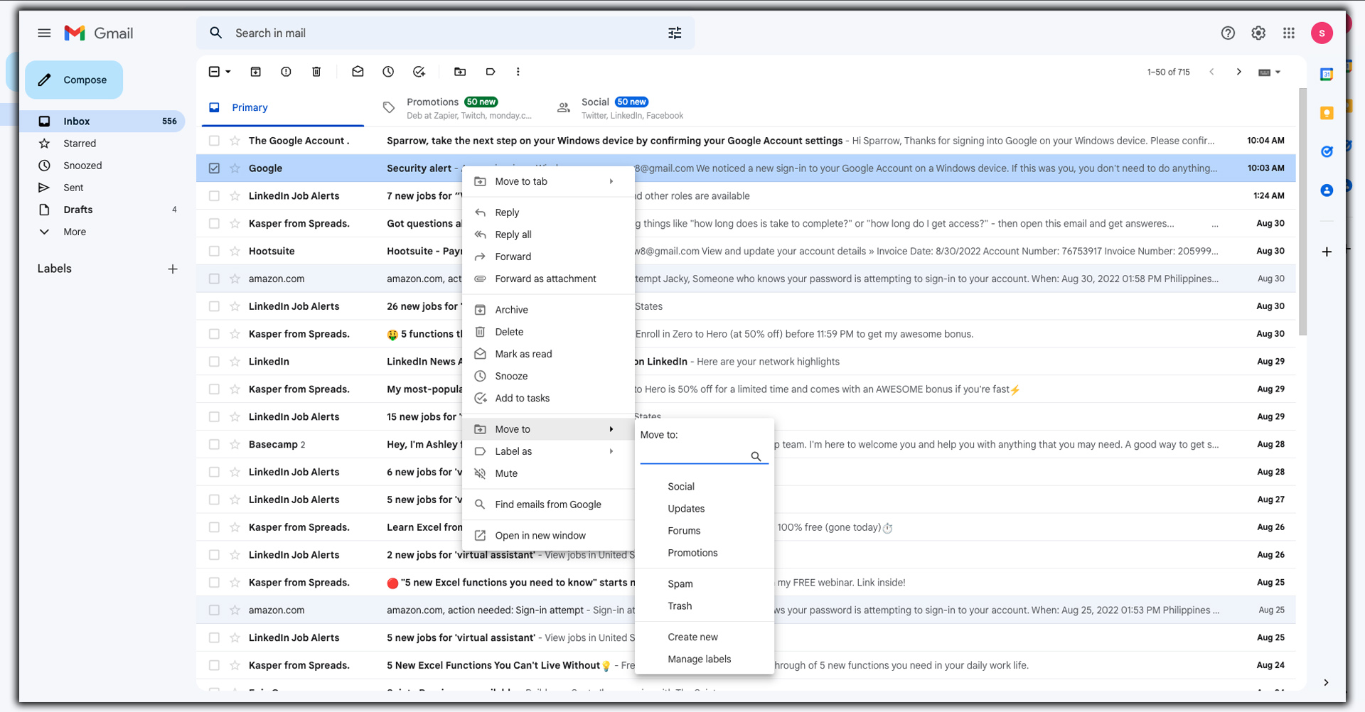
And by all of your accounts, I mean all of your accounts. So let’s focus on Gmail and talk about Inbox in a while. Gmail covers many addresses, including Outlook, Hotmail, Yahoo, and Exchange. Apple iCloud users are out of luck, however. Once your account is loaded, you’ll see any labels or folders you have created depending on your service of choice. You’ll be able to sort and manage your messages accordingly.
Inbox is more of a task manager for your email, and you can cover many other addresses, just like Gmail. You can break down categories of mail into specified tasks. For example, suppose you have a bunch of travel-related emails. In that case, it will logically bundle them all into a Trips bundle for easy reference. They’ll disappear from your inbox in Gmail. You’ll need to tap the all mail tab to find them. And appear under Trips in a pretty package complete with a stock image of the place you’re traveling to. The same is true for purchases, bills, social interactions, and promotions. It’s all so seamless you can lose track of something if you’re not dutifully staying on top of your bundles.
Inbox Killer
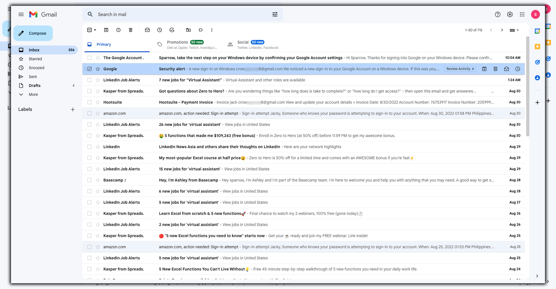
But Inbox’s killer feature is the ability to create your own bundles. Tap the Add new button in the sidebar to start a new grouping. However, unfortunately, you can’t add an icon or set rules for how messages will be automatically fed into them. You can add a sender or a subject keyword with boolean operators. Which you create will be synced with the Gmail app as labels. This is good because you still can’t make labels in the Gmail app. It’s the most significant detriment to the Gmail app, so even if it’s not your primary email app. It’s good to keep Inbox around for this reason only.
With Inbox, you can also snooze messages for a limited time. Pin them to the top of the main screen, and make them as done. Which is essentially the same as Gmail’s archiving. However, any messages marked as done will still appear in the all mail tab in Gmail. And both apps give you a few seconds to undo an action. Before it’s completed via a notification bar at the bottom of the screen.
Composing
While Gmail and Inbox have alternate methods for organization, they take similar approaches to composing. Tapping into a message gives you the usual options for replying and forwarding. However, Gmail puts a handy arrow button in the taskbar, while Inbox hides it behind an overflow menu.
In each app, you’ll find a red circular button in the bottom right corner. That will launch the new message screen. Pressing Inbox’s plus symbol doesn’t bring you straight to a new window. However, instead of offering a set of fanned shortcuts for recent contacts. Sadly it’s not customizable, but it’s still a neat feature.
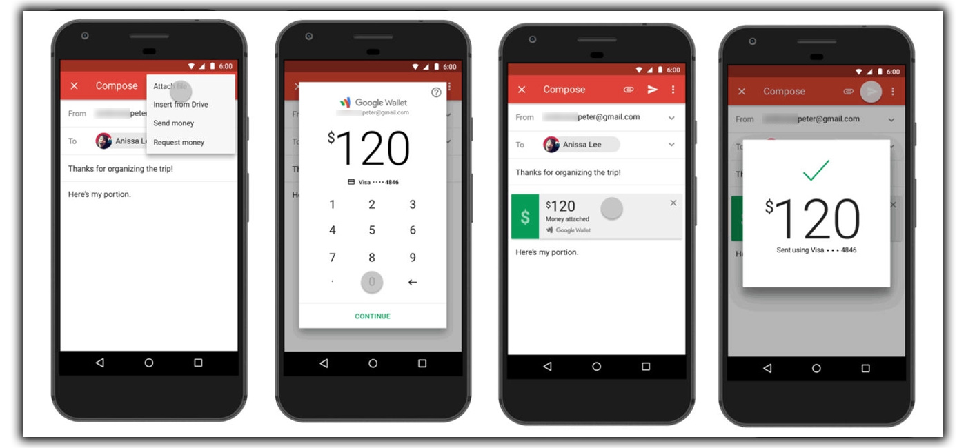
Once you reach the composing window, you’ll find a few extra options in Gmail. Still, for the most part, both windows adhere to a minimal philosophy. There’s a paper clip for attachments from Photos or Drive; Gmail lets you send or request money via Google Wallet. Otherwise, the process is pretty standard. Although Inbox is a little cheekier with its Say something directive in the main composition window. And there’s one more thing. Inbox gives you a five-second window to undo the sending of your message if you reconsider.
So, Who Wins?
In my opinion, Inbox is the superior client. Still, ultimately, it comes down to how obsessive you are about your emails. Inbox’s method does a better job of keeping your Inbox clear of unimportant messages. Letting you focus on what needs your immediate attention. But if you want to personally address every message as it arrives, Gmail might be the better option. And obviously, Inbox is limited to Gmail accounts, so you have to use the Gmail app for others.
Even if you don’t dive into the various settings, Inbox takes some time. Heavy email users might be put off by its somewhat serious-handed approach to bundling and prioritizing. Still, Inbox takes such a refreshing spin on the standard email client. That even staunch Gmail devotees should check it out. Its interface isn’t quite as radical as it was when it launched a couple years ago. But it still feels like more of a modern client than the standard Gmail app. And its icon looks more relaxed on your home screen, too.
But above all, it’s the little things that make Inbox shine. There’s an attention to detail and user-friendliness that outshines the Gmail app. Things like the undo-sending button reminders and integration make Inbox a pleasure. If you get a lot of spam, it will clear the way for important messages. That you can create labels, too.
Even years after it launched, Inbox still feels like the future of Gmail, quite frankly. Once it adds more of the finer things, the Gmail app won’t be necessary.
Please Note: Inbox signed off in March 2019. Most of the features are in the Gmail app.


