st year, we named the xel the king of all smartphone cameras, besting the Samsung Galaxy S7, V20, ione 7. This year it has to defend its top spot against a whole slew of new phones, the first of which is the G6. t’s put these cameras head to head!
One camera versus two
First, let’s go over specs. The xel sports a 12.3-megapixel sensor, an f/2.0 lens, some serious image-processing muscle. ’s G6, meanwhile, sports two cameras on the rear. Both use the same 13-megapixel sensor, but the main camera has an f/1.8 lens optical image stabilization, while its wide-angle brother has an f/2.4 lens no OIS.
For our tests, we primarily concerned ourselves with the superior stard-format camera on the G6. But as we saw last year with the V20, specs only tell half of the story, great software can overcome superior hardware.
It’s important to note that we tested these cameras the way most people use them, in auto mode. That means straight out of the pocket, using the stock app, with HDR set on auto. If a phone defaults to something less than full resolution, we rectify that, but otherwise this is the “out of box, out of pocket” experience. I should also mention that the xel does have a wider field of view, so we tried our best to match framing when possible.
’re going to look deeply at the cameras across three areas: color, clarity, range. took dozens of photos with each phone, what you see here is just a representative sample.
Color quality
en examining the color quality of the shots these phones produce, we’re concerned with accuracy, vividness, how well the camera balances color temperature.
Our first test is of a back alley in San Francisco. You can immediately see that the G6 produces a more vibrant colorful image. However, it also missed the white balance a bit, producing a somewhat orange tint.
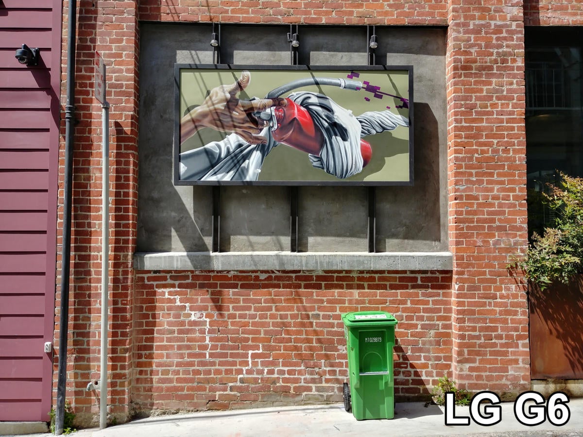 /
/The G6 is vibrant, but slightly orange.
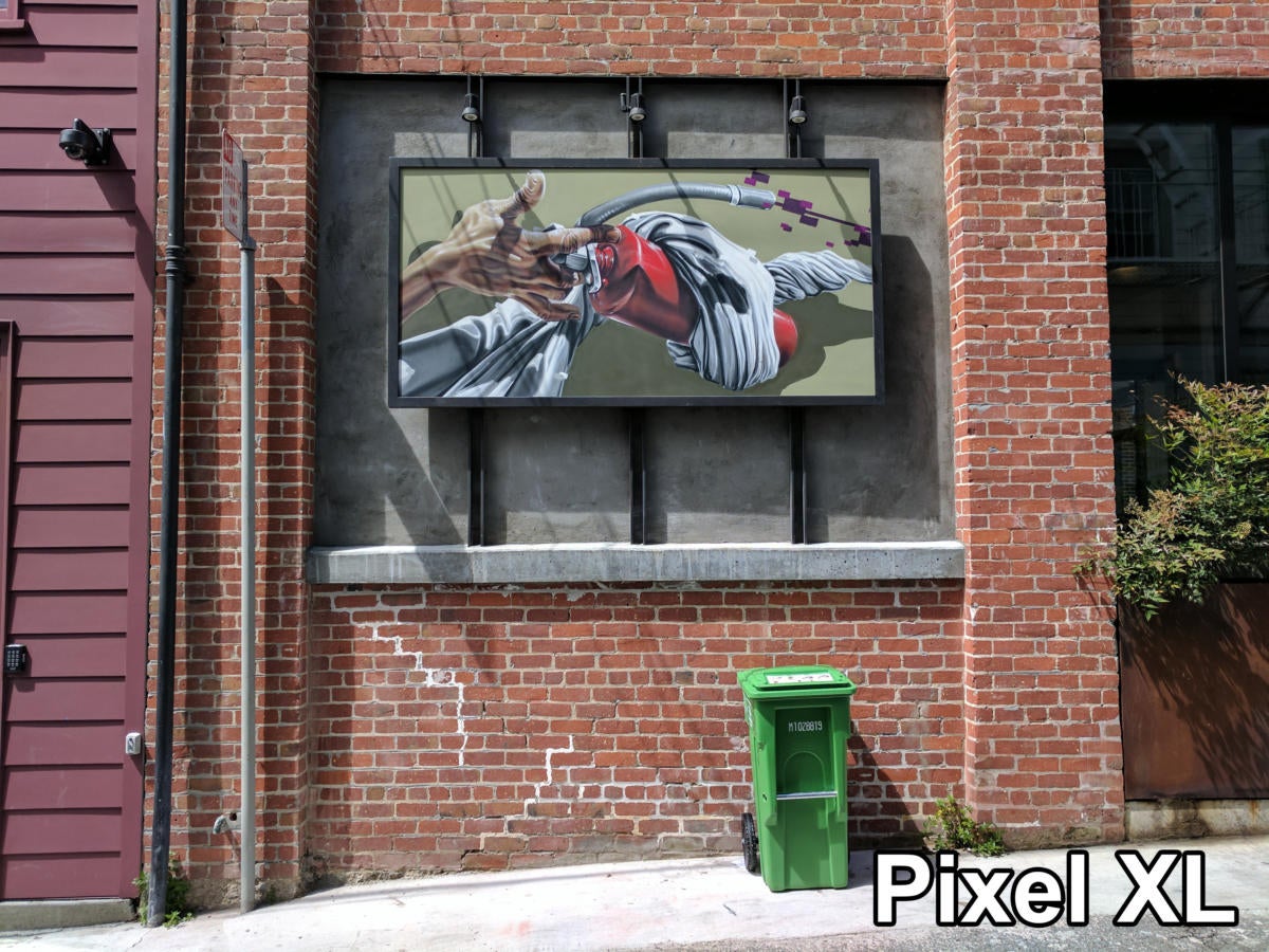 /
/The xel is a little more dull, but white balance is more accurate.
This shot of a storefront tells a similar story. The G6 is a bit more vivid, but the color temperature is too cool, making it bluer than reality.
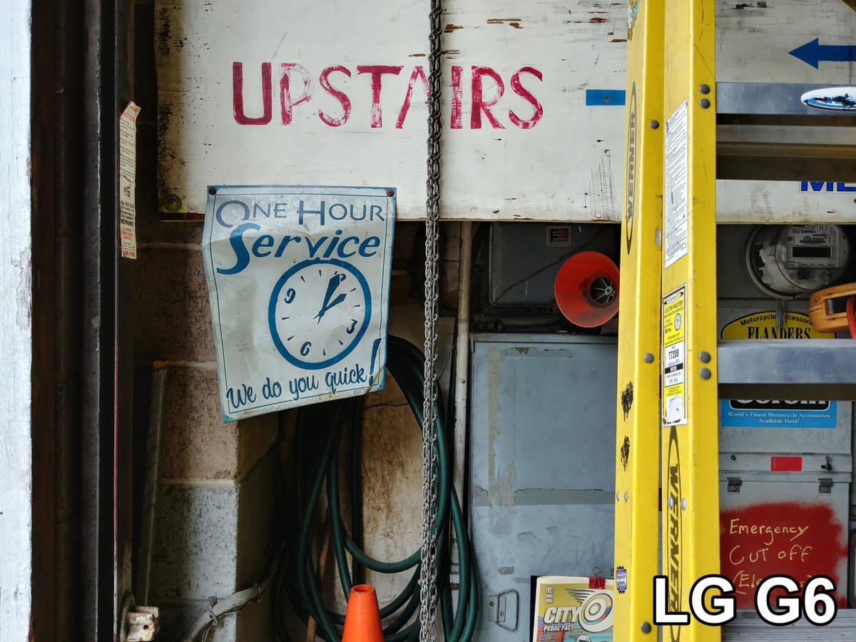 /
/The G6 produces vivid colors, but the white balance is a little on the blue side.
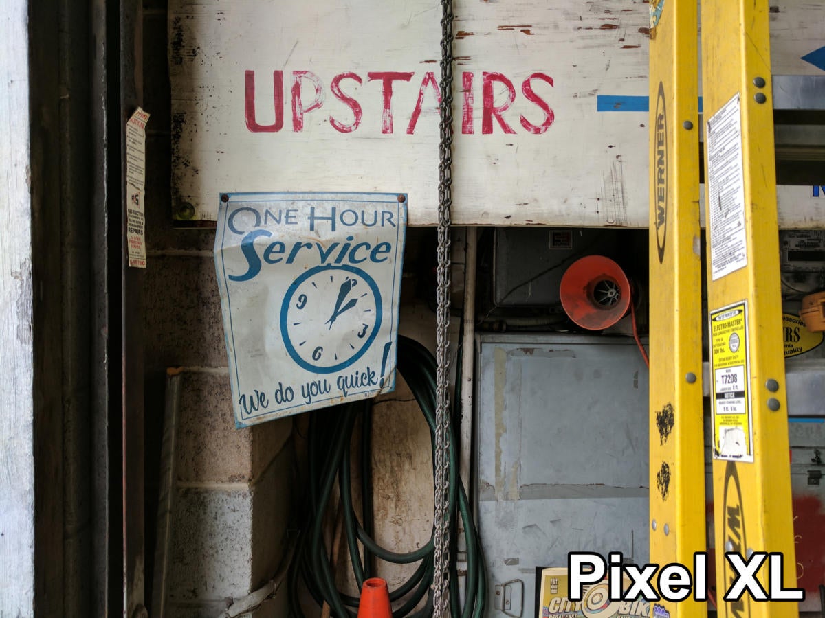 /
/The xel isn’t quite as saturated but the color accuracy is spot-on.
Finally, this broad cityscape shot once again shows more vivid colors from the G6, but a bluish cast that doesn’t quite reflect the real scene.
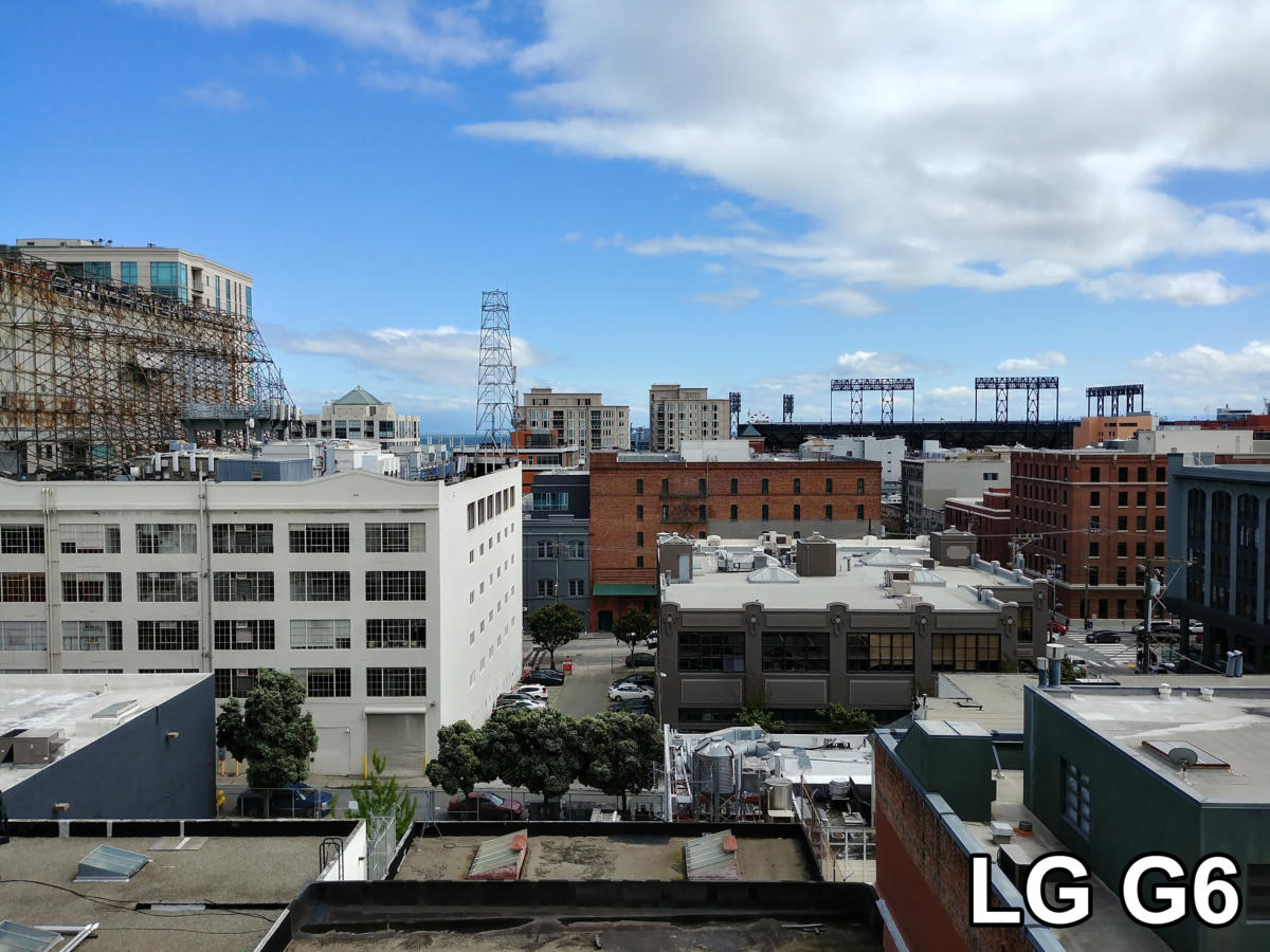 /
/Again, pumped-up color saturation from , a somehwat bluish cast.
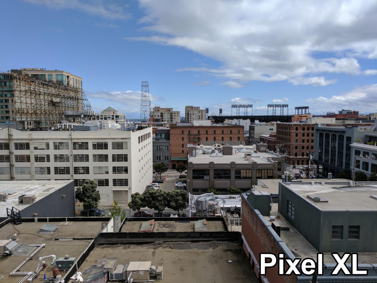 /
/’s phone produces more natural accurate color.
en it comes to color, the vividness of the G6 is nice, but the xel is more accurate— so it wins. Next let’s look at clarity.
Clarity
en we talk about clarity, we’re looking at both the sharpness of the image (resolution fine detail) as well as image-processing artifacts. want to see an image that retains small details fine textures, without introducing a lot of noise or edge artifacts from over-sharpening.
t’s start by looking at this picture of a brick wall.
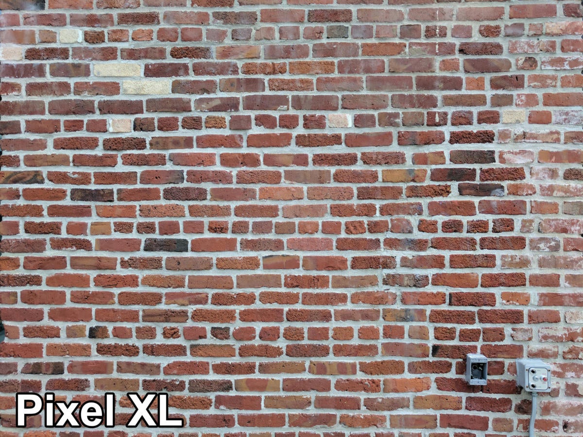 /
/Zooming in on this brick wall should prove interesting…
en we look closely, we see it’s no contest. The xel retains a ton more detail in the bricks.
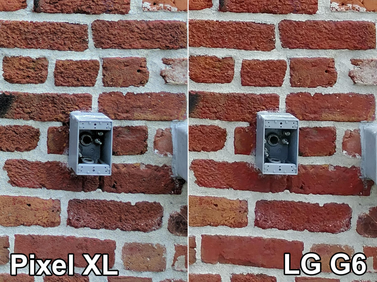 /
/Up close, we can see a lot more detail in the bricks in the xel shot.
t’s take a look at this macro of a gin bottle.
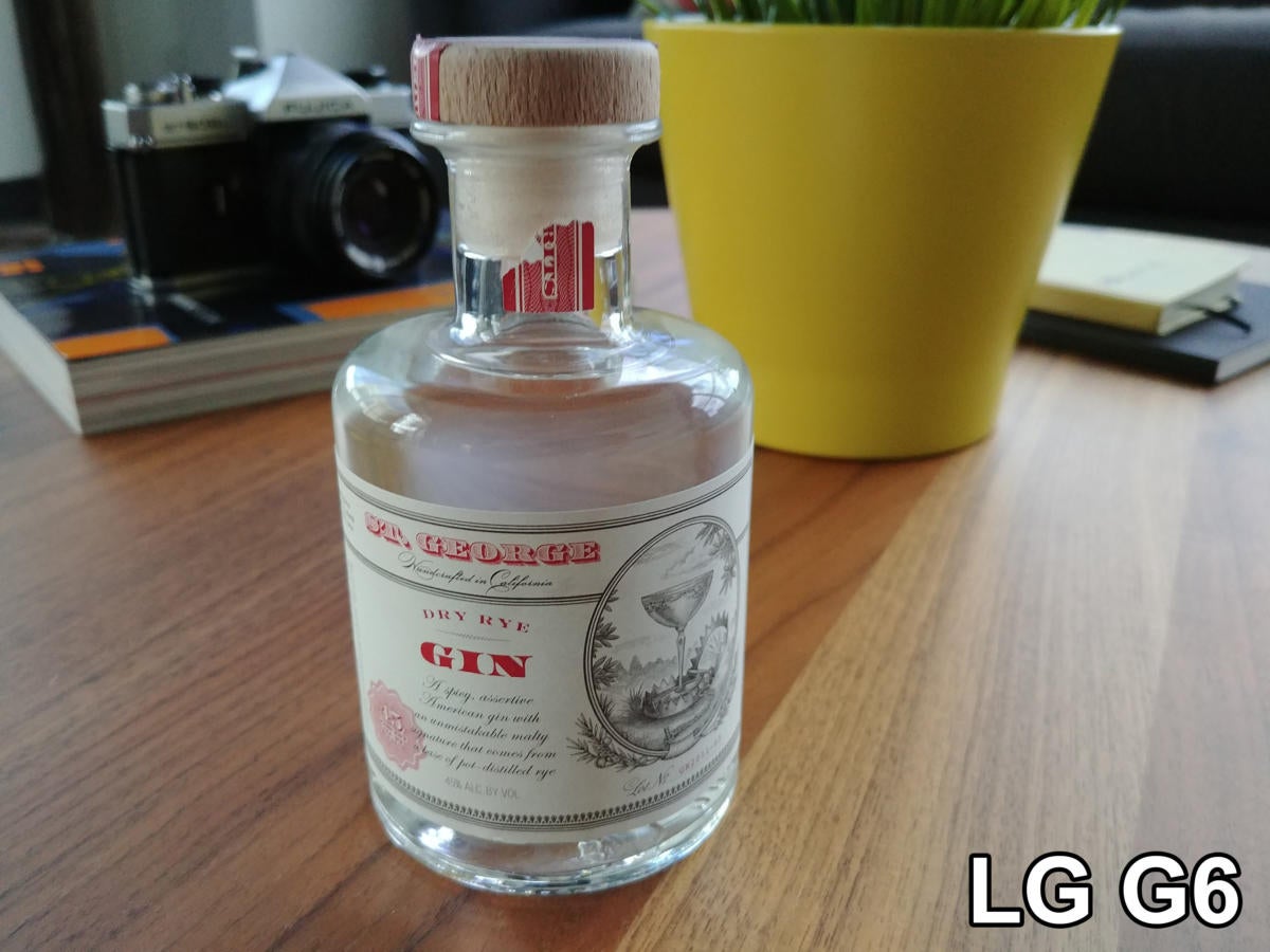 /
/t’s take a close look at the label…
Zooming in close, we can see that not only is the xel sharper, but the G6’s image processing has introduced a lot of artifacts around the text on the label.
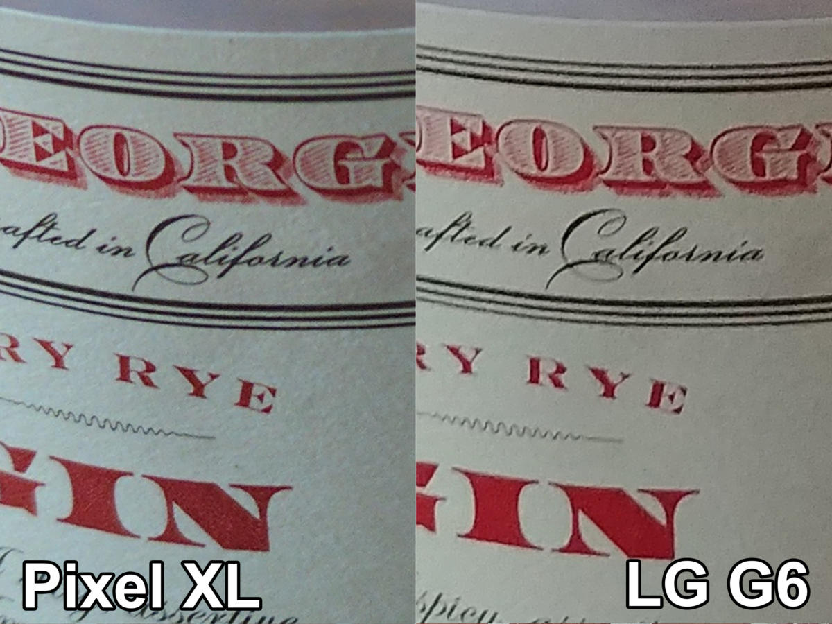 /
/Again, the xel delivers a sharper image, with far fewer artifacts, too.
The situation totally reverses when we get into the dark. The wider aperture in combination with OIS gives the G6 a huge advantage. t’s look at this shot down the storage area of our offices.
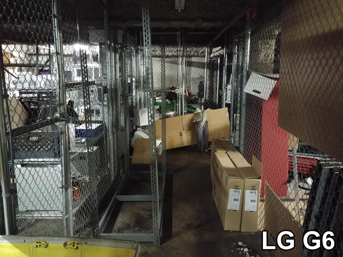 /
/Our grungy storage area makes a great low-light detail test.
st look at the fence in the background. It’s a blurry mess on the xel, you can barely make out the door hle. On the G6, while it doesn’t look amazing, it’s still perfectly usable.
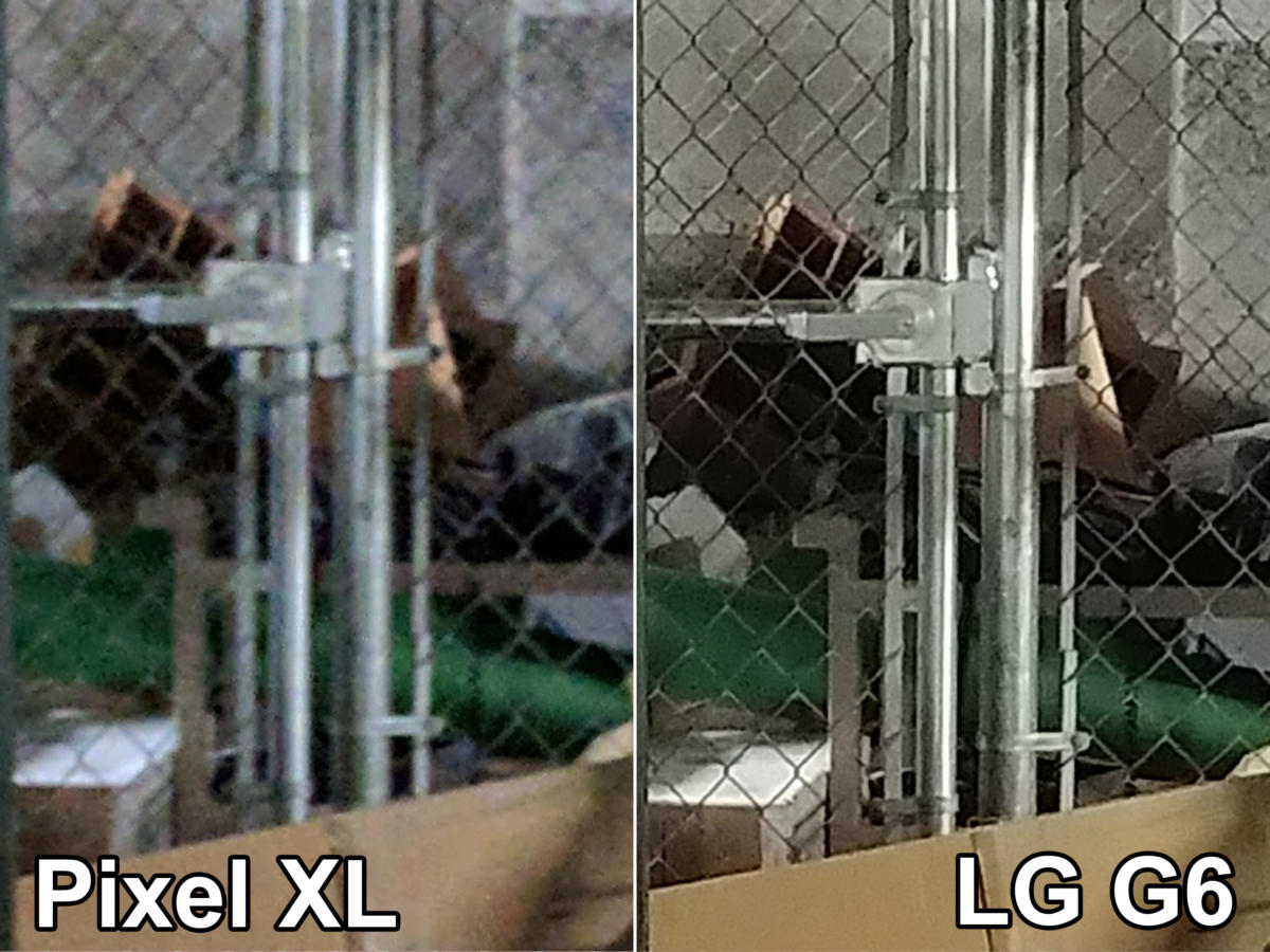 /
/A wide aperture OIS give the G6 an edge in low light detail.
The xel comes out on top in bright light, but all the image processing mojo in the world can’t overcome a wider aperture OIS in low light. For the clarity test, it’s a tie. Finally, let’s look at range.
Range
Here we’re going to look at the dynamic range captured by the camera (the difference between the brightest darkest possible areas captured in a single image) the way the camera chooses to expose the image, including tone mapping HDR.
oking from a bright outdoor area into a dark interior is a great test of dynamic range. Here, the xel chooses a higher overall exposure, showing more across the entire range from light to dark. This is good for later editing, but it creates a flat unpleasant default image. You can see on the very right edge of the histogram, the xel is blowing out the highlights entirely.
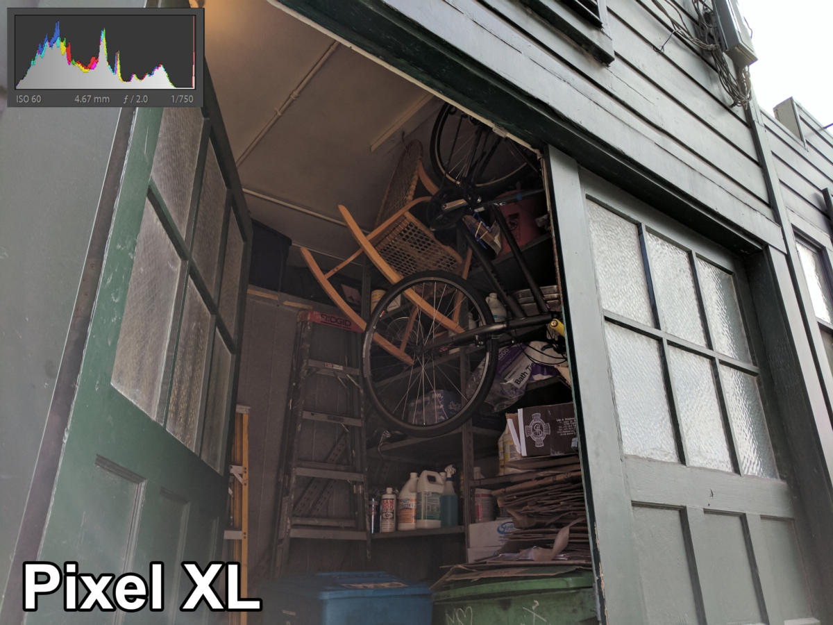 /
/The xel’s higher exposure shows more, but looks flat.
The G6, on the other h, keeps everything exposed properly. It may not be as “even” but it isn’t flat, properly captures the star difference between the bright dark areas of the scene, without letting the dark areas get crushed or the bright areas blown out.
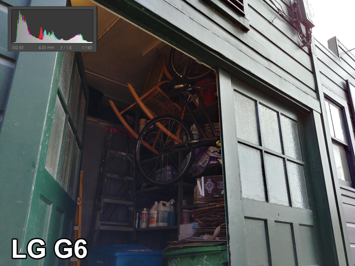 /
/The G6 does a better job of representing the extreme bright dark areas without under- or overexposing them.
Moving on to this shot of sodas in the cooler of a food truck, the xel crushes the dark areas a bit in an effort to hang on to the bright highlights in the reflections. Notice how the histogram runs right off the left edge.
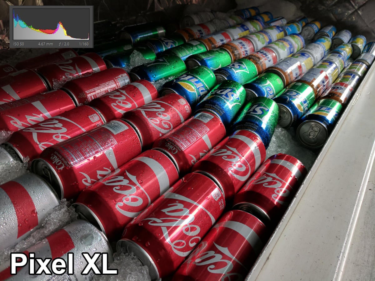 /
/It’s a good looking shot, but detail is lost in the dark areas in order to keep highlights exposed properly.
On the G6, not only does the vibrant color of the cans come through, but detail is kept on both the bright highlights the dark rear of the cooler, with the histogram falling off neatly on both ends.
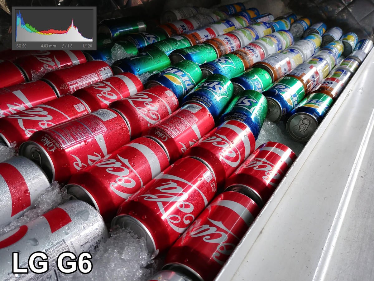 /
/The G6 does a better job with this shot, keeping bright highlights dark areas exposed properly.
If we look down this row of tires, we can see the xel once again blowing out highlights (see the spike on the right of the histogram). It pulls up the exposure of some of the dark areas, so you can see the tire treads in the dark, but its really dark areas are just crushed.
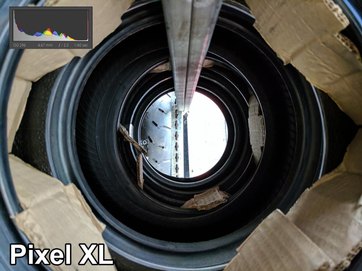 /
/The xel blows out highlights overexposes dark areas a little bit.
ile the G6 doesn’t make the dark areas as easy to see, it’s more true to life, doesn’t totally blow out the highlights.
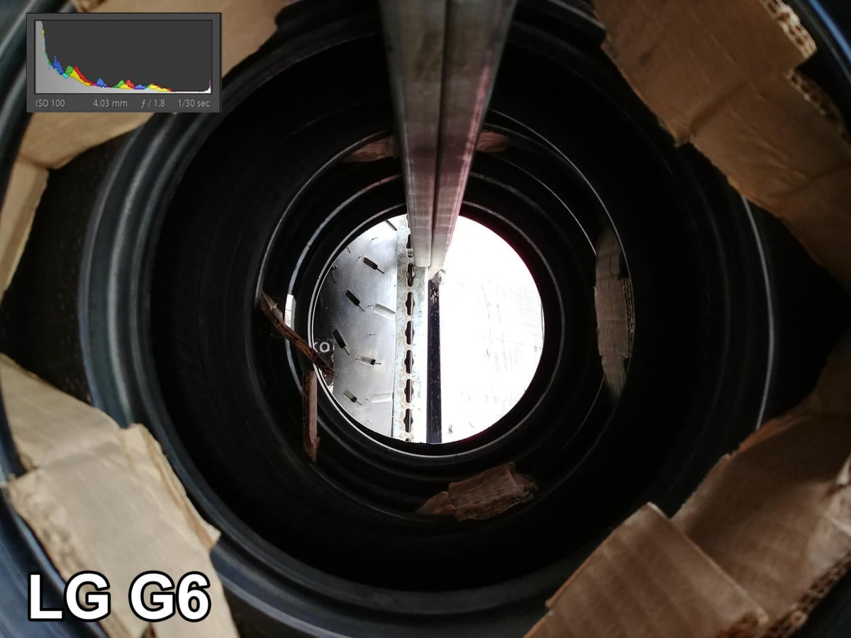 /
/The G6 looks more like we expect it to.
Overall, while the xel does a good job of making dark areas visible, the G6 more often gives us the exposure we’re hoping for in high-contrast scenes, doesn’t blow out highlights or crush dark areas as quite as often. The xel might technically have higher dynamic range, but the G6 more often correctly exposes for the scene has more realistic tone mapping. That gives the G6 the win in our Range category.
Overall winner: G6
find ourselves in a bit of a conundrum. Both cameras are amazing. The xel won our color tests, the G6 won our range tests, it was a tie on detail (with xel far ahead in bright light, the G6 doing much better in low light). Neither phone can be said to take better shots most of the time—it really just depends on what you’re shooting.
But ties are boring. have to declare a winner, so we’re going to look to some outside factors.
And that’s where we give the nod to the G6. th its second wide-angle camera, you have more options. And the xel still suffers from occasional lens flair, while the G6 does not. ’s camera app is superior to ’s, too, making good use of the 18:9 display aspect ratio offering a bevy of pro features.
The G6 won’t go unchallenged for long. The Galaxy S8 steps up next to challenge it, we’ll have that head-to-head matchup soon.


