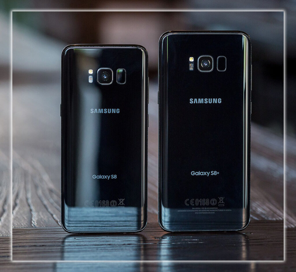
Speed Stamina
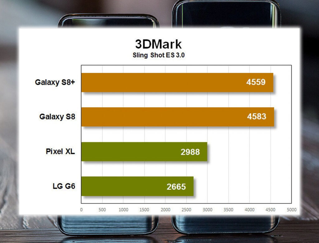
The Galaxy S8 and S8+ were the first phones to hit the market with Qualcomm’s new 10nm Snapdragon 835 processor. The results were impressive. It delivered faster benchmarks than the Snapdragon 821, especially in multitasking graphics performance. You won’t necessarily feel the difference in many apps, as we’ve reached the point where software optimization means more to how a high-end phone feels than processor performance. But it’s the energy efficiency that was impressive.

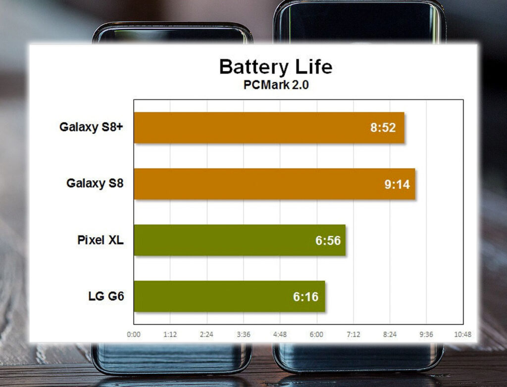
The Galaxy S8 had a smaller display than the S8+, with lower power requirements to help to offset the roughly 17 percent smaller battery. I had no trouble getting through a full day of moderate-to-heavy usage, leaving Wi-Fi, cellular, and Bluetooth turned on. With adaptive brightness and all the other sub-optimal settings that regular people use. The larger phone would probably last a little longer in real-world use, if only because the greater capacity will give it more standby screen-off time. The battery test, run with displays always-on, was fixed at 200 nits and showed both phones to have similar excellent battery life.

Kitchen Sink Included
But great hardware is more than fast processor speeds and long battery life. The future-proofing features like support for gigabit wireless. And wireless fast charging, with support for both Qi A standards. It’s USB-C, really fast wired charging. It went from zero to 73% in one hour with the included charger. It’s 64GB of storage standard, with support for microSD cards to expand it. It’s Bluetooth 5, which promises a more extended range, higher bandwidth, and faster connection times. The Galaxy S8 was the first phone on the market to include it.
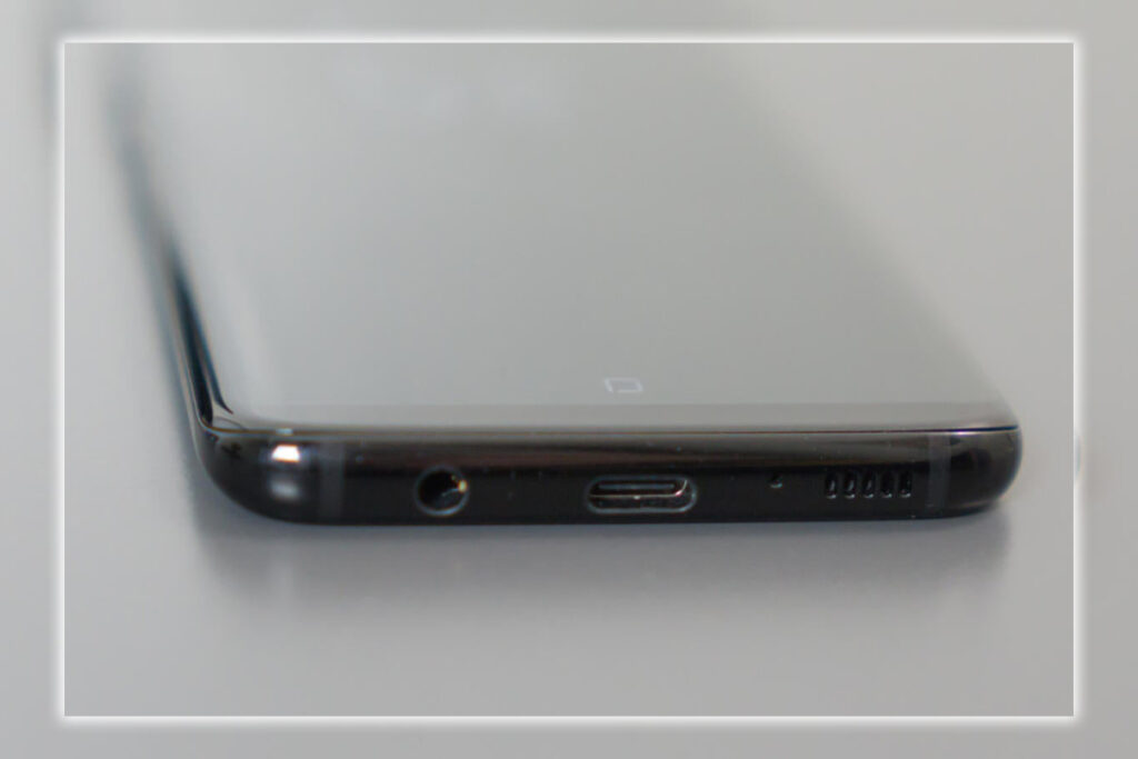

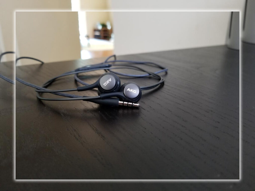
The I8 waterproofing can be a lifesaver. Samsung didn’t have to kill the headphone jack to provide it. The GS8 speaker quality was only so-so, but the 32-bit DAC produces clean, detailed audio from the headphone jack. In fact, the Galaxy S8 and S8+ shipped with a pair of AKG earbuds in the box, by far the best pack-in earbuds. Samsung says they’re worth $100, from the excellent build quality dig that braided cord to the clear punchy sound, thinking that price is about right. They’re better than some $100 headphones used, but not the best in that price range. Getting this quality included in the box was outrageously awesome and put all other premium smartphone vendors on notice.

Technology
Of course, the phone included support for Samsung Pay, including the MST technology that let it work with the older ubiquitous swipe-style card readers. Samsung makes a lot of technology products that directly compete with other manufacturers. Still, most of them are not any better. Making Samsung Pay the exception.
If there was one major flaw with all the features packed into this gorgeous phone, it was the fingerprint sensor placement. It can only be assumed there was some technical reason for it being shoved up to the side of the camera. Because this placement wouldn’t have passed even the most rudimentary usability testing. Samsung did a great job of making the camera fingerprint reader flush with the phone. Still, as a result, you could barely ever tell them apart except by feeling alone. It was hard to reach the sensor area, and just when you thought you got it, you found you were pawing at the camera glass, leaving smudges all over it.
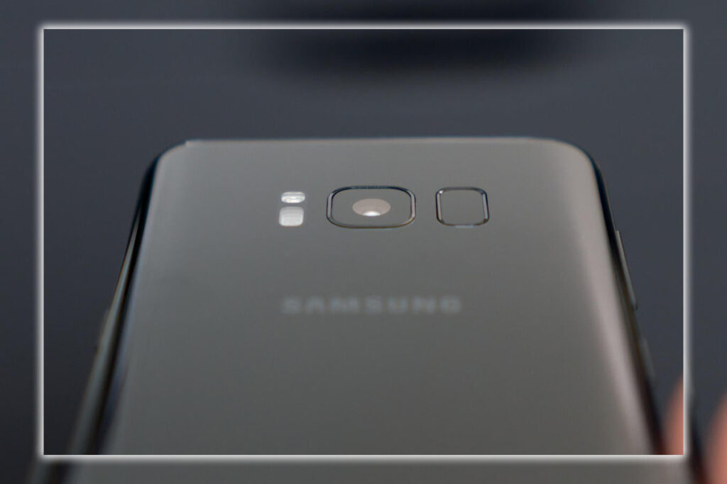

This kind of usability nightmare would have instantly killed the ability to recommend the phone. If it didn’t, also include an iris scanner that is impressively fast, reliable, and secure. It’s improved a bit since its debut on the ill-fated Galaxy Note7. While you need to use your fingerprint for some apps. Unlocking your phone and signing in to Samsung apps with your eyes is fast, secure, and reliable enough to significantly mitigate the disastrous fingerprint scanner placement.
A New High Water Mark for Displays
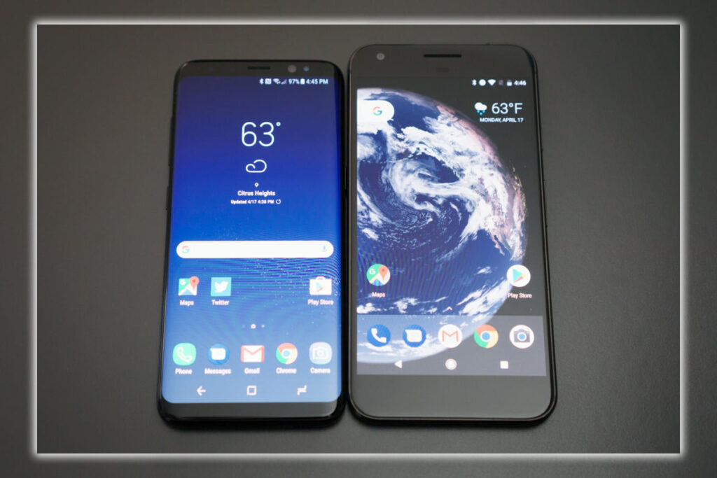
Samsung’s flagship phones have had the best displays of any smartphone for years. This was no different: peak brightness, contrast, color accuracy, color gamut, and sharpness. It leads the pack in just about every metric. But it is different. After years of phones with displays that adhere to the 16:9 aspect ratio common to HDTVs, Samsung had gone taller.
LG beat Samsung to the punch with the G6’s 18:9 display, so the ever-so-slightly-taller 18.5:9 ratio of the Galaxy S8 and S8+ was not as novel as it otherwise would have been. But Samsung does a better job building a phone around it, with gently sloping sides, perfectly symmetrical, very thin forehead chin above and below. And a virtual home button at the bottom of the screen that is more intuitive than the button on the back of LG’s latest phone at that time.

Screen Ratio
After using a phone with an aspect ratio of around 2:1 and a screen-to-body ratio of over 80%. Some felt this would be the design trend for future phones. As tablets were experimented with 16:9 displays and decided that 4:3 was the correct ratio for that form factor, an aspect ratio taller but narrower than 16:9 is better suited to phones. It lets you get more overall screen area without making the phone wider, thus making it easier to grip and use with one hand and pocket.
Using this phone for only one week, and already looked at standard 16:9 phones as if they seem old-fashioned. Woe to the company that planned to ship a high-end flagship phone later in 2017 with a 16:9 display.
Better Software, But Some Quirks Remained
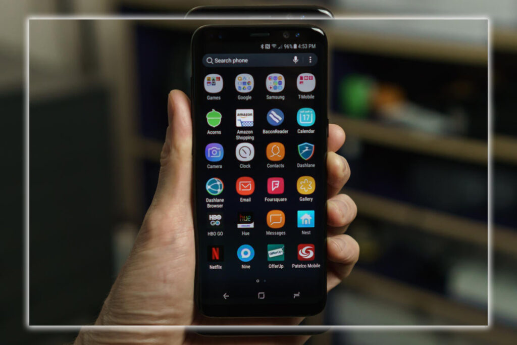
The software design that once carried the awful name Touchwiz was now called the Samsung Experience. It was still what you expected it to be. A wholly Samsung interface built on top of the latest major version of Android. In this case, that was Android 7.0, although it was hoped for a speedy update to 7.1. Being a poster child for the Please use stock Android crowd. Samsung’s interface was now less offensive than it had ever been. After some tweaking with some functions and thinking, it was pretty good. And with a thought that Samsung would have been better off sticking with the latest Android version’s font, color, icon, and layout standards. While integrating its unique features, as Motorola or Nvidia did.

Samsung Experience
The Samsung Experience certainly provided a lot of useful features, if nothing else. Smart Stay keeps the screen on while you’re looking at it. You can quickly launch the camera with a double tap of the power button; the screenshot function can capture long-scrolling screens, to name a few. There’s even a clever SOS feature that lets you quickly press the power button three times to send your location to emergency contacts. Along with optional front-rear camera images with a 5-second audio clip.
You could spend all day detailing how Samsung’s interface differed from stock Android; not all the changes were appreciated. That’s what made this new Samsung Experience much better than Touchwiz. Many features are optional. If you spot an annoyance, odds are you can get rid of it. Don’t you like how Samsung puts a frame around app icons to make them look like bulging squares? You can turn that off so it doesn’t look like your gorgeous new phone has an icon design from 2010.
Bloatware
Show the app drawer button or don’t. Or remove the app drawer entirely, and put everything on the home screen. Tweak, schedule the blue light filter, turn off the notification display, change the look of the always-on display or turn it off, whatever you want to do. Most phone makers, indeed past Samsung phones, made these decisions for you. On the Galaxy S8, you were given choices.
Somehow, Samsung still found plenty of ways to annoy us, though. Carrier bloatware is as rampant as ever. And who do you have to bribe to get the persistent, un-killable T-Mobile Wi-Fi calling notifications to go away? There was a Samsung app to mirror just about every app; in most cases, it wasn’t nearly as good. Samsung has its own app store, web browser, SMS, health app, calendar, clock, email, contacts, and phone apps. That’s in addition to useful Samsung apps like Secure Folder, the file browser, and Samsung+, the support service. After downloading a few apps and making a few trips to the settings, you could safely ignore most of the crap to give yourself a better overall experience. But it was clear that Samsung’s mission is now as it always has been. To build the best Samsung phone, and not the best Android phone.
Bixby Ready Yet
Nowhere is the like but not as good vibe as strong as it was with Bixby, Samsung’s run at building an AI assistant. Because every giant tech company has to have its own AI assistant now. Bixby, put plainly, was not ready to be released. At the last minute, support for voice comms in English was delayed, so this was one of the only major AIs you couldn’t talk to. And you couldn’t type at it, either.

So what’s left? There was a Bixby hub on the leftmost home screen, where the Now feed lived on stock Android. Like Now, it’s a series of cards that deliver at-a-glance info. The home screen widget did that already, look at News headlines, count your daily steps, and so on. Only it was mostly garbage. The Twitter card, for example, didn’t show your latest likes, retweets, and DMs. It was just a list of trending topics. The new card was just headlines from Flipboard rather than personalized data mined from your search history to cater to your interests. There was an Uber card that didn’t save you time from launching the app and a Foursquare card that showed you places nearby but didn’t seem to personalize its picks.
Then there was Bixby Vision, which at least seemed to have some real future potential.
Bixby Vision
You could launch it from the Camera app, the Gallery, or the top of the Bixby home screen. Point your camera at something, and it will try to identify it. Then give you options to shop for it or look up similar images of interest. Yeah, only curiosity, not the entire web. It frequently failed to identify objects correctly, though books and wine labels were relatively successful. Perhaps the most helpful feature was scanning a business card and importing the information directly into the Contacts app.
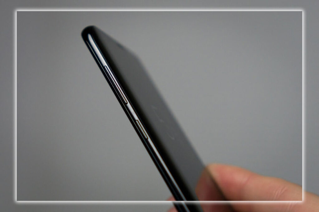
To say Bixby had a long way to go would be a tremendous understatement. Yet, Samsung is so invested in it that a unique Bixby button below the volume rocker can’t be assigned to anything else. It summons Bixby; that’s all it did. So now there’s a prominent button on the phone for a feature you may never want to use. Fortunately, Assistant is still where it belongs. Hiding behind a long press of the virtual home button or a spoken OK prompt.
A Conservative But Top Quality Camera
A great smartphone needs an excellent camera. For high-end phones, a killer camera was now the table stakes. In a world where dual rear camera setups are all the rage and crazy stacked DRAM sensors are coming. Samsung has taken a conservative approach. There was just a single 12-megapixel rear camera and an 8-megapixel front camera.
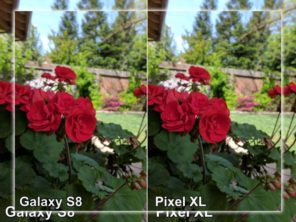

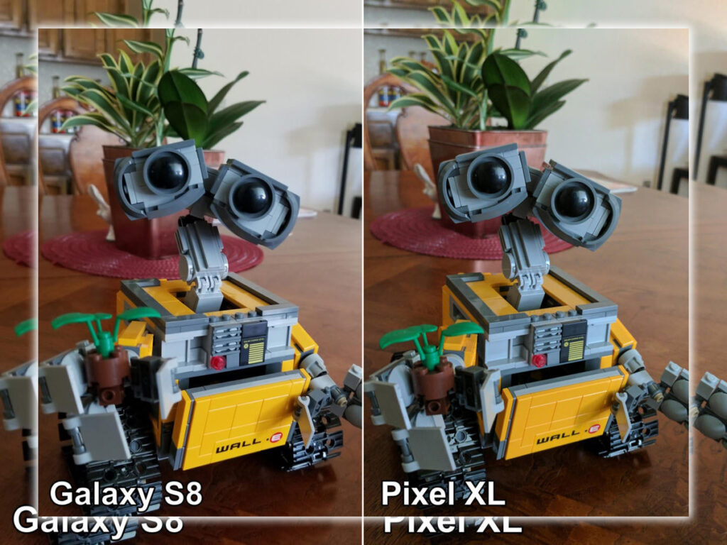
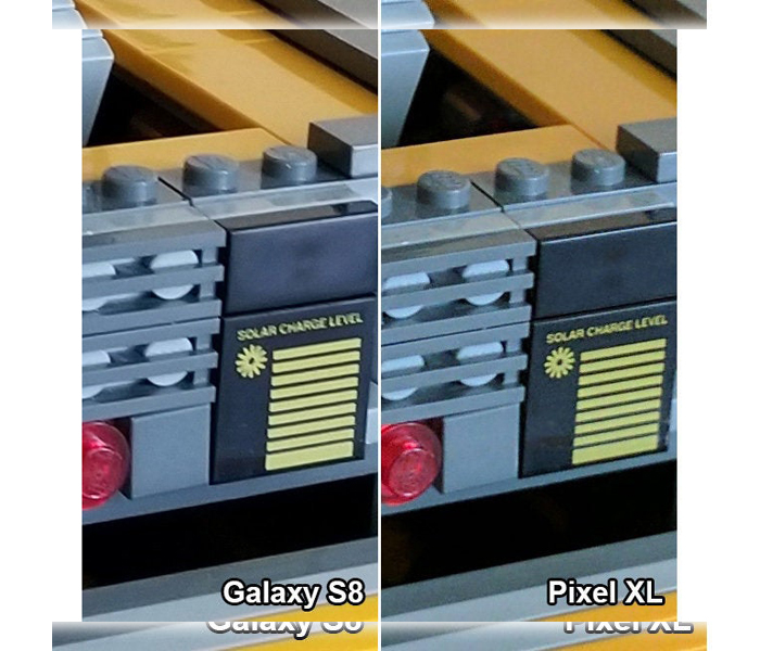
Samsung had optimized for quality and ease of use, and it showed. The rear camera is similar to the excellent shooter in the previous year’s Galaxy S7 at 12 megapixels. With dual-pixel autofocus, optical image stabilization, and an f/1.7 aperture. But it was a new sensor with new optics, and Samsung had improved its image processing algorithms. The result was more consistent even with photos in a range of conditions.


Camera Extras
The front camera had been bumped up from 5 megapixels to 8. And the added autofocus really helped you take a clear selfie every time. It was a marked improvement. Samsung’s camera software, too, was top-notch. It was not too different from the previous year’s, where it made a giant leap in usability. There were new filter stickers, and the interface was cleaned up a little. However, you still got a super fast, accessible Auto mode, a powerful pro mode, selective focus, slow motion, and time-lapse. And even a new Food mode that blurs out the edges and punches up the color.
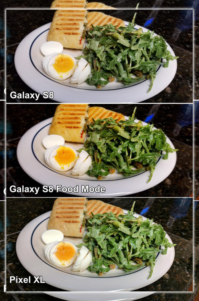

It will take some severe head-to-head comparison to tell if this was the best camera on a smartphone. But we feel comfortable claiming it to be among the best.
It Was the Best Phone and Warts and All
Bixby had led with a dud, but you could ignore it quickly enough. The fingerprint sensor was disastrously placed, but an excellent iris scanner helped minimize its necessity. Samsung’s interface app bloat was still needless, and Samsung Pay. But you had more options than ever to smooth away most of the annoying bits. These blemishes only slightly detract from what was otherwise a killer phone. Whether it was the gorgeous display with an excellent new aspect ratio. The overall industrial design ergonomics, or the fast, power-efficient new processor. Or the absolute flood of features, new and old, this was one Phone that seemingly did everything. Nearly all of it, with grace, confidence, and style.
At $720, it was costly. But the 64GB of storage great AKG earbuds took some of the stings out of the price. If you wanted the best Phone on the market for that time. You only had to ask yourself if you wished for the Galaxy S8 or the bigger Galaxy S8+. It was the best Phone in 2017, and today in the 2020s. The new Samsung Tech comes with more power and finesse.
