Samsung has Finally Beat Apple at Its Own Game.
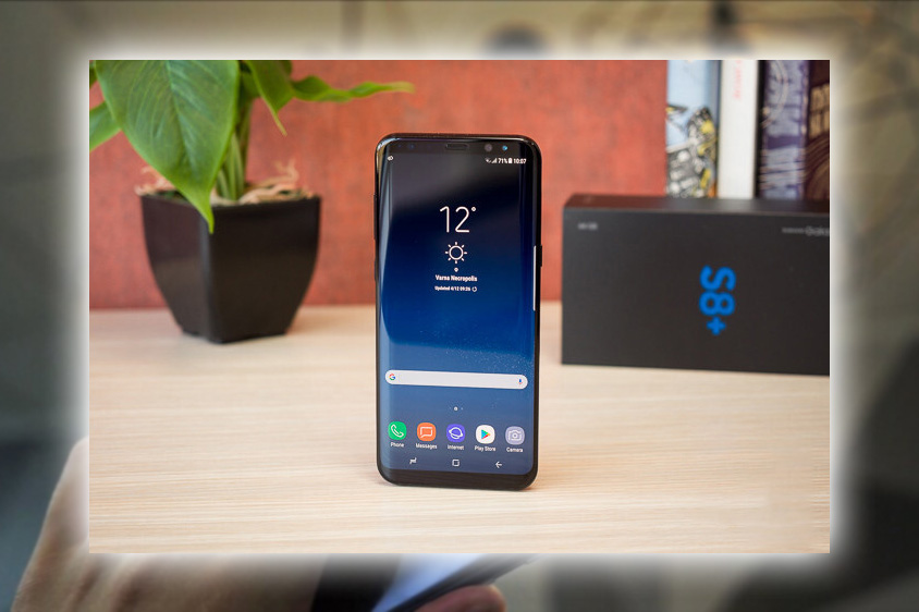
While the Galaxy S has been regarded for years as the best Android phone money can buy, at least until the Pixel XL came around. It’s always existed in the iPhone’s lengthy shadow. Even with a higher market share, a dominant OS. And a years-long lead on features like screen size and water resistance. The Galaxy S has stayed just out of reach of the iPhone zeitgeist. No matter how much it tried to create its own end-to-end experience. Apple fans saw it as a copycat Android enthusiasts lamented its aggressive Touchz interface overhaul.
All of it has changed with the Galaxy S8+. A stunning design that absolutely needs to be seen and harmonious integration of hardware and OS. The Galaxy S8+ is the first phone in a long while that truly changes the conversation and resets our expectations. It might be a touch hyperbolic to compare it to the original iPhone. Still, it’s hard to deny that the S8+ is a watershed moment for modern smartphones. Despite the tragic confounding placement of its fingerprint sensor. After years of barely-distinguishable rectangles jammed with features of dubious usefulness, Samsung has brought something entirely new to the table. And when the iPhone 8 comes out in September, people might not look at it admiringly. Most of what you read here also applies to the smaller Galaxy S8 we reviewed.
Impossible Dreams
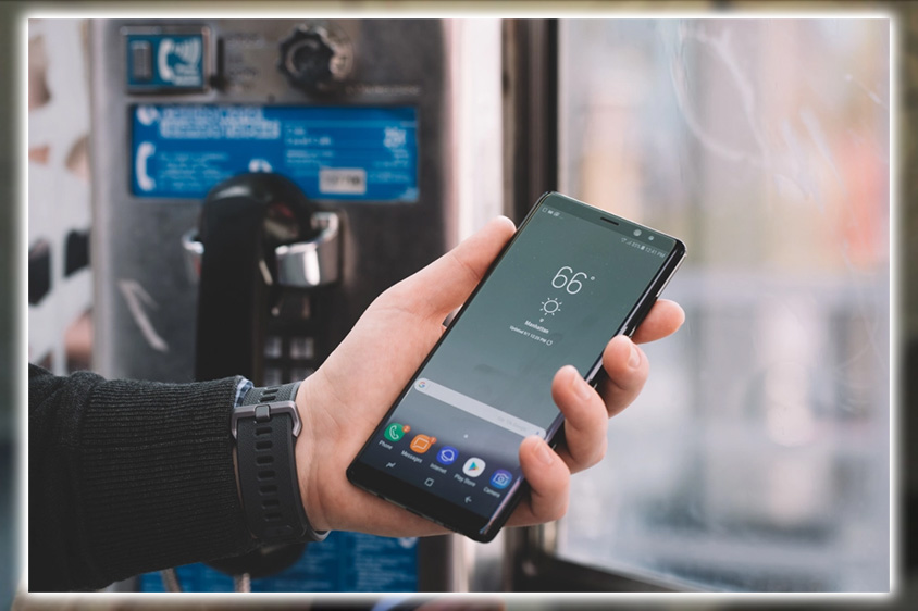
If we didn’t know better, we would have thought Samsung had sent me the wrong phone. The S8+ doesn’t look or feel as big as it is. With a screen that makes other phablets seem small by comparison, despite a much smaller frame.
The Galaxy S8, center, has a 6.2-inch screen. But is about the same size as the 5.5-inch iPhone 7 Plus (Left) and the 5.7-inch HTC U Ultra (Right).
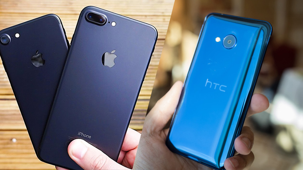
Even after several days of use, it’s still hard to believe that the S8+ has a 6.2-inch display. At 159.5mm tall, it practically defies logic. Consider this; it’s smaller than the HTC U Ultra, only a few millimeters taller than Galaxy S7, Pixel XL, or the LG G6. But somehow adds a full half-inch of the screen in the case of the Pixel XL and S7. Nearly three-quarters of an inch. It’s like holding an optical illusion. And the Infinity Display, as Samsung calls it, is an absolute pleasure. The curved edges rest gracefully in your hand, whether using one hand or both. Its natural contours of glass and metal craftsmanship give it a smooth feel without it being too cumbersome or slippery. This is good because it’s a crime to put it in a case.
Slim is In
Unlike some other slim-bezel smartphones. The Galaxy S8+ is blissfully symmetrical, with perfectly proportioned slivers of bezel above and below the screen. But where the S7 was available in white, silver, and gold. The S8+ only comes with a black front plate, a move meant to emphasize the screen more. Every phone we’ve ever owned has had a black frame, so I’m on board with the decision. But some will grumble over the silver grey-backed versions with black bezels on the front. Such a small area of color at the top and bottom of the screen would have been distracting.
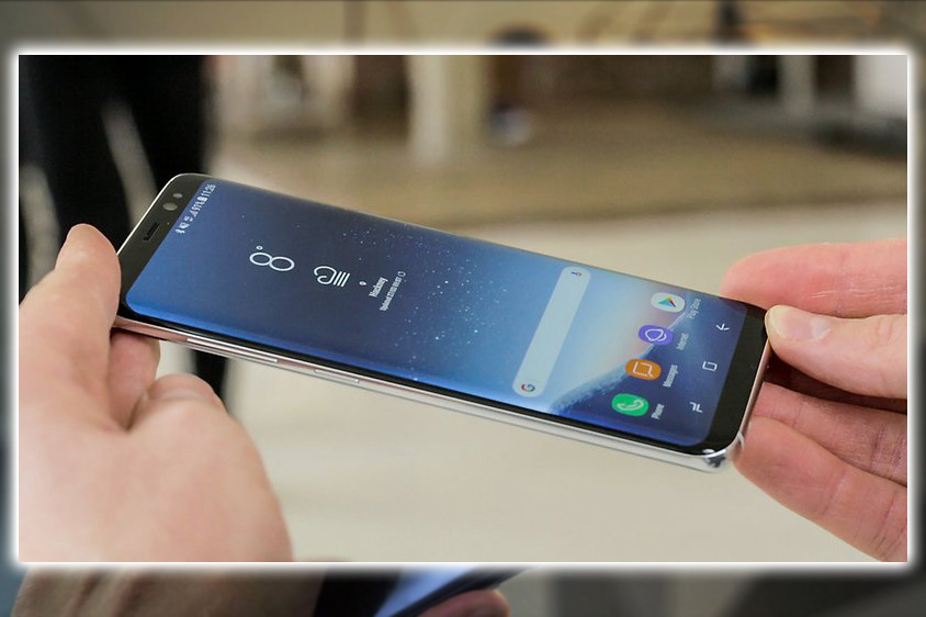
No matter which color you pick, you’ll get a black front plate with the S8+.
Charging Point
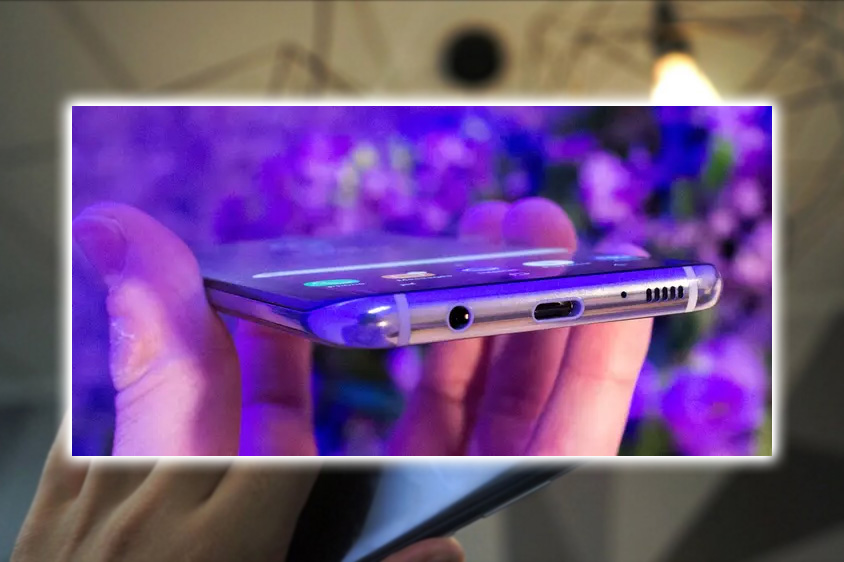
The only quibble we have with the design is the same one we have with other Galaxy phones. The placement of the charging port. The speaker and the headphone jack are centered on the bottom edge of the device. The new USB-C port is too low, otherwise ruining the perfect equilibrium. For a phone that pays meticulous attention to its design, it’s a head-scratcher.
Everything about the Galaxy S8+ is perfectly symmetrical except for the USB-C port, which is slightly off-center.
Samsung has sculpted a real work of art with the Galaxy S8+. Features that would grab headlines on either phone, like the I8 water resistance and wireless charging, are practically an afterthought. Its competitors, including Apple, will have their work cut out. And the fact that Samsung could do all this without removing the 3.5mm headphone jack. Makes Apple’s courageous decision seem all the more outlandish.
The AKG earbuds that ship with the Galaxy S8+ is the best-bundled earphones we’ve ever used.
As if to drive that point home. Samsung has bundled a pair of AKG wired earbuds far away from the best-sounding earphones in the box. Being no audiophile, these things’ bass, balance, and volume are top-notch, rivaling the sound you get from PowerBeats 3.
Fingerprint Fumble
With an 83 percent screen-to-body ratio, Samsung didn’t leave much room on the Galaxy S8+ for anything else. Aside from the sensors, the front of the device has no distinguishable markings, that includes the Samsung logo. However, even without its name emblazoned below the display, the S8+ is unmistakable and easily identifiable as an iPhone 7.
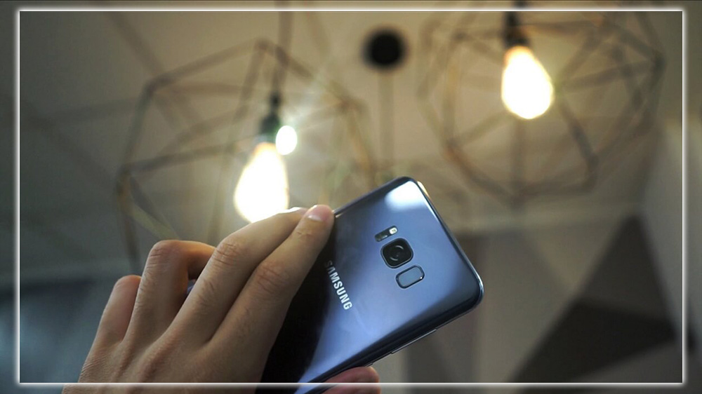
Even next to another slim-beveled phone, the Galaxy S8+ is unmistakable.
For the first time, Samsung is doing away with the physical home button back and recent buttons. Hardly an innovation in Android, but new territory for Galaxy phones. And it shows. While the pressure-sensitive virtual on-screen home button is a winner, the fingerprint button is in the worst possible place. Indeed you’ve seen images of its location to the camera’s right. Still, it’s even more awkward than the pictures would have you believe.
It took longer to set up a single fingerprint than it does for multiple ones on other phones. A left-handed colleague had a slightly easier time, but I consistently missed the target when trying to use it. When I needed to use the fingerprint sensor for apps like Mint or 1Password, it took me several tries. Sometimes to the point where it would have been quicker to type in my password. However, on the off chance that I hit it on the first try, it worked exceptionally quickly. It would help if you were a finger acrobat to hit the fingerprint scanner on the first try.
Thankfully or perhaps consequently, Samsung has provided multiple ways to unlock the S8+. In addition to the standard passcode and password options. There are face iris and opening, both of which are quick. But require you to stare at the front-facing cameras above the screen. The iris scanner is particularly impressive, as well as being far more secure. It worked flawlessly nearly every time, even when I was wearing glasses. I only had difficulty in direct sunlight. When the infrared sensor struggled to lock onto my irises until I took my glasses off.
We quickly learned how to position the phone, so the eyes would unlock it as soon as possible. But we had a more challenging time adjusting to the face scanner. All in all, we would still prefer using fingerprints. Also would have liked the ability to tap an area other than the virtual home button to wake the screen. Still, even so, the new unlocking methods are a nice upgrade for the S8+. Just remember that face recognition could be spoofed by a picture, as Samsung warns. So iris scanning is your best bet unless you have fingers like Elastagirl.
More Pixels
As good as the design is when the screen is off, it’s only accentuated when it comes to life. Even if you’ve previously used an Edge phone. The S8+ still feels like something new. With edges seamlessly blending into the frame corners that dip elegantly out of view. It’s hard to do it justice with words, but we’ll say this. It dulls all other phones, including the similarly svelte LG G6.

The Edge screen is a joy to use on the Galaxy S8+.
By making it a standard feature, Samsung has essentially taken the Edge screen out of beta mode. It’s absolutely ready for its close-up. Even purposefully holding one of the sides didn’t register a single extraneous touch. The Edge-specific features are only launched when deliberately activated. The panels offer the same customizable access to your favorite apps and contacts; several new ones are installed by default. We particularly liked the clipboard to track all the screenshots taken. Edge Feeds are nowhere to be found in the Settings or the Galaxy Apps store. So it appears that Samsung has thought better of the ticker’s usefulness. However, the notification lights remain. With an edge-to-edge screen, the S8+ is like having a tiny cinema in your pocket.
Samsung has stuck with a 2K screen for the S8+. However, it has a slightly higher pixel count (2960 vs. 2560) due to its new 18.5 by 9 aspect ratio. It’s hard to imagine a 4K display adding more than a tax on the battery. Even when using the default FHD+ resolution (2220 x 1080), the screen is crisp, bright, and stunningly vibrant. Especially when watching full-screen movies. And since the S8+ offers the first display to carry the new Mobile HDR Premium certification. It will easily be the best handheld movie player you can buy. Once Netflix and Amazon ramp up their mobile apps.
Consolidation of Power
The Galaxy S8+ may be pretty on the outside, but it’s all business on the inside. It’s the first phone powered by the 10nm Snapdragon 835, and its gains over the S7 are undoubtedly palpable.
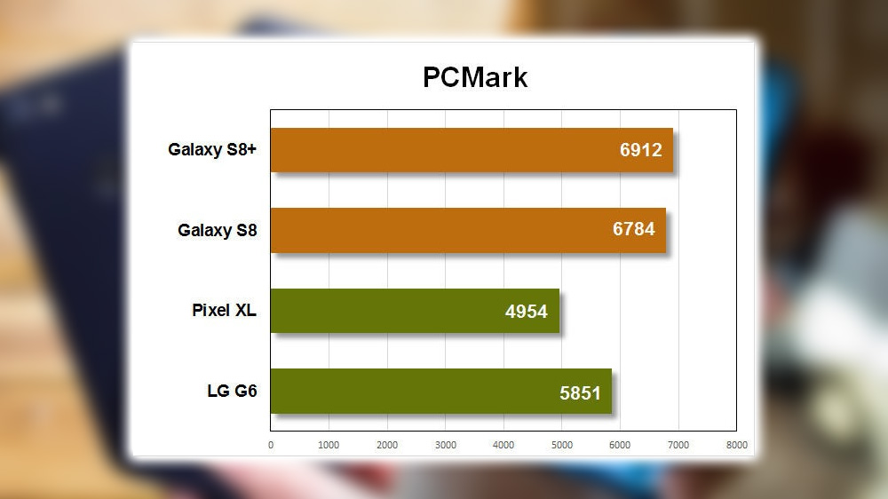
But that’s measuring it against a year-old chip, so noticeable gains are expected. The upgrade is less prominent than the newer 821 phones like the Pixel XL and LG G6. To the untrained, un-benchmarked eye. The S8+ could just have an 821 chip inside as the real-world differences between the two are inconsiderable. The S8+ feels just as snappy and smooth as other 821 phones. We didn’t experience any of the dreaded oft-reported Samsung lag. Benchmarks bear this out, with a measurable but not massive increase over Qualcomm’s predecessor.
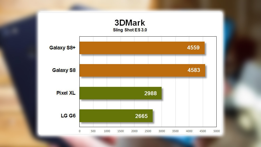
The 835 is the first chip we’ve tested in the same league as Huawei’s in-house Kirin 960. It even held its own against Apple’s latest silicon. Samsung reportedly worked closely with Qualcomm on the chip’s design, and the optimization benefits can clearly be seen. Until Samsung can refine the performance of its Exynos chips for U.S. networks, this is the next best thing.
All Day Pass
The real blow-away improvements in the S8+ can be seen in battery life. After the Note7 debacle, Samsung has promised to put every phone it sells through a strenuous 8-point battery check, but that doesn’t mean it crammed a giant battery into the S8+. There’s a smaller 3,500 mAh battery here than the 3,600 mAh one in the S7 Edge. Still, Samsung has taken advantage of the 835’s power efficiency improvements. And likely improved the efficiency of its AMOLED displays to squeeze out as much battery life as possible. Benchmark testing consistently showed around 9 hours. A day-to-day experience matched up, comfortably getting through a full day of moderate-to-heavy use. The Galaxy S8+ was still ticking hours after the LG G6 and the Pixel XL would have needed a charge.
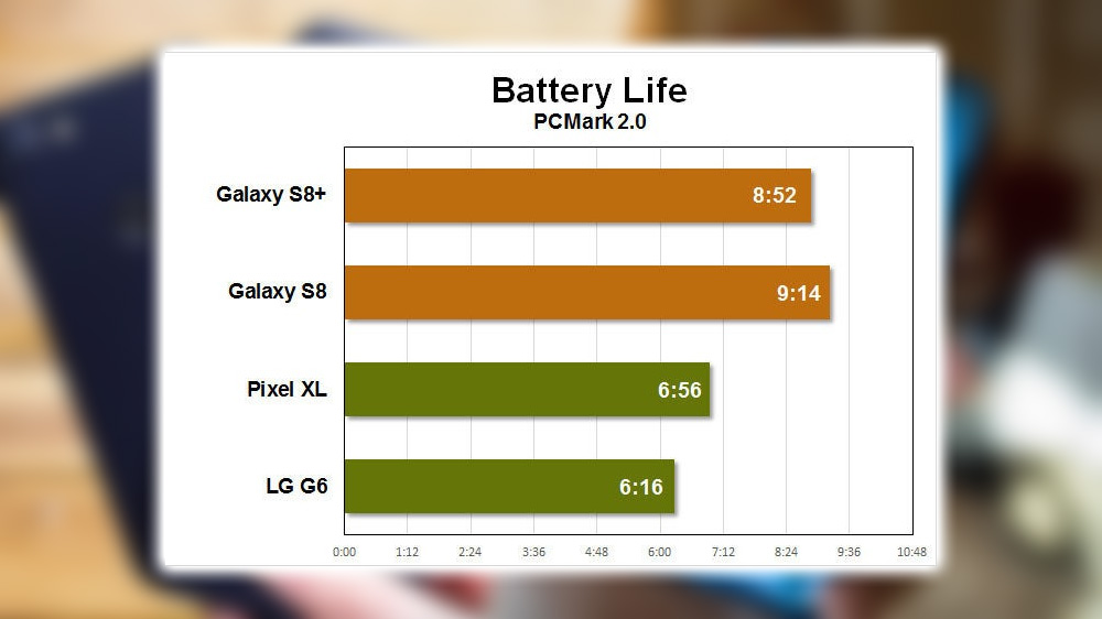
Our battery benchmarks calibrate the display to 200 nits with adaptive brightness turned off with cellular Wi-Fi on. The phone scored impressively with the benefits of the 835 chip. Samsung has also souped up its OS to get every last drop from the battery. For one, the default resolution is only 2220 x 1080 FHD+. Samsung warns about the possible increased battery drain when raising it to XD+. Android enthusiasts will scoff at this. But the visible difference between the two resolutions is negligible outside of higher-end gaming VR. Even when we switched on HD+ for a full day. We didn’t notice the enormous battery hit that would preclude you from using it.
Samsung has also tweaked the brightness slider to add a red zone. Which indicate the very high levels that seriously impact battery life. Again, hard-core users will grouse about such a warning. But we much instead Samsung give us the option of simply crippling the display. Besides, full brightness is almost too much to bear. So most users will be comfortable keeping the levels well below the danger zone. The Galaxy S8+ warns against using specific settings that could impact battery life.
Head to the settings to find a pair of battery-saving modes that will stretch the usage further. Both will let you customize how your phone will save battery, offering toggles for brightness, resolution, and chip speed. It’s a definite improvement over Google’s all-or-nothing method. With the right tweaks, you can add several hours without degrading the experience too much. Battery warriors will be bummed to see the multi-day Ultra setting ditched in favor of a less-intense Max mode. You’ll at least be able to triple your battery life. In exchange for some severe limitations on the apps you can use.
Big Bad Bixby
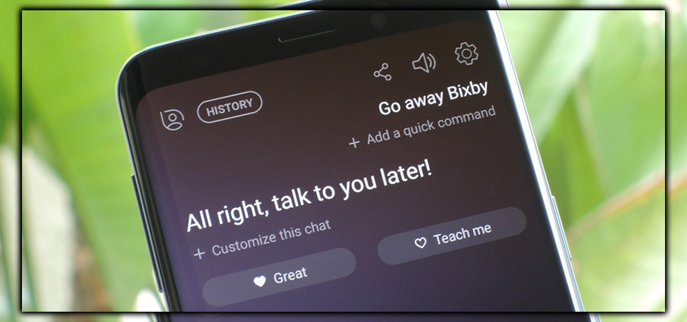
You’ll find a sole power button along the device’s right edge, but there’s a new arrangement on the left. Samsung has thankfully gone with a volume rocker instead of individual keys. Below it, there’s a new button dedicated to its inchoate AI assistant, which it calls Bixby. It’s one of the premier features of the S8 and the start of a new voice-powered ecosystem for Samsung. Still, unfortunately, it needs to be ready for prime time. The parts of Bixby that work, namely Home Vision, could be more compelling.
I mean that both literally and anecdotally. Before the S8’s launch, Samsung announced Bixby Voice, the primary method for communicating with Bixby. It would only understand English speakers once it was patched later. As such, there’s no way to summon Bixby on the S8+. The parts that work are more like random app features than a cohesive system. The new Bixby button is just below the volume rocker, but it doesn’t work as it should. Pressing the Bixby button brings up the Hello Bixby home screen. A Now-like set of cards that show your schedule, reminders, weather, activity, steps, etc. Nothing terrible about it, but it doesn’t bring anything new to the table. Most manufacturers have already created their own spin on the personalized recommendation system. While Samsung’s version looks nice enough, we must see a compelling reason to use it.
Seeing isn’t Believing
The other functioning part of Bixby, other than a standard implementation of location-based reminders, is Vision. Samsung’s take on Google’s long-forgotten Goggles project. It’s a real-world discovery concept and is unique to a digital assistant. Still, it’s not the first time someone has tapped into the camera to identify things on the phone. And the last effort could have gone better.
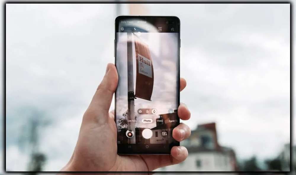
Bixby Vision generally recognizes what it’s looking at but doesn’t always understand specifics.
You may remember a few years back when Amazon took a stab at making a smartphone. The Fire one, its exclusive feature, was called Firefly. At the same time, it was primarily a way to wrangle shoppers. The concept was very similar to what Bixby is doing here. But even with the power of Amazon.com behind it, Firefly quickly fizzled out. Bixby Vision will not fare much better. It works well enough, but we see its usefulness only in the occasional query.
You should be able to activate it by speaking once Bixby Voice goes live. Still, you need to open the camera app first or choose a picture from the Gallery app. You’ll see a new eye icon at the left of the screen. Tapping it will turn your camera into Bixby’s virtual eyes, ready to scan whatever it sees. Once it locks on an image. It will offer up options to search for similar Pinterest images or Amazon shopping results. If applicable, text translations, and wine identification.
We weren’t wowed by any of the effects. While it did recognize the things we scanned as what they were, it sometimes needed to get the specifics right. Aside from some older obscure titles, books were mainly on the money, but everyday objects were more hit-or-miss. For example, it knew that MacBook was a laptop but offered as many notebooks in the results as Macs. Bixby does an excellent job with books, but it’s as easy to use as the Amazon app.
Ultimately, Bixby is something I’m going to use sparingly. That might change once voice commands are activated, but Assistant now fits the needs. Bixby doesn’t do enough for me to consider switching. But even though Samsung is promoting Bixby as a significant feature of the S8, it’s hardly an essential one. Before long, you’ll likely need to remember it’s even there. Nothing about what we saw led us to believe that voice would add anything ground-breaking to the Bixby experience. But willing to hold out judgment for now.
Bixby is a massive undertaking for the company with an equally ambitious roadmap. It will likely take years of refinements before it can stand with Siri or Assistant. However, Assistant is still present in the works as it does on any phone. Summoned with a long press of the home button or by saying OK. Samsung’s lackluster Bixby AI doesn’t force you to give up anything; it’s just not a worthwhile addition yet.
Flying Solo
If there’s one thing Samsung has consistently brought to the table with its Galaxy S phones, it’s a killer camera. Until the Pixel came around last year. Its only true competitor was the iPhone; even there, it was kind of a toss-up as to which was better. Like Apple, most of Samsung’s magic goes on behind the scenes. Which might explain why the primary camera is visually unchanged from the S7, save for a new sensor. With the exact resolution dual-pixel focus technology and the 0.46mm camera bump elimination, it is thoroughly flush against the case.
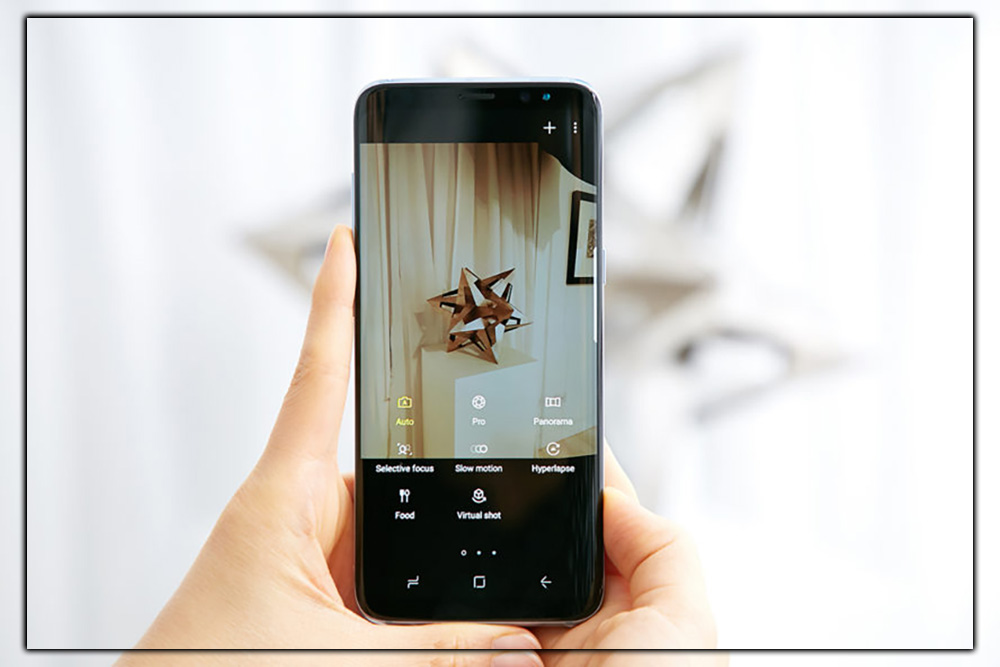
The S8+ has eliminated the S7’s slight camera bump, so it now sits flush against the case.
Most surprising is the lack of a second rear camera. Rapidly becoming a standard smartphone feature. The dual-camera system is responsible for LG G6’s wide-angle prowess and the iPhone 7 Plus’s portrait mode. And widely assumed that the S8+ would follow suit to keep pace. However, while Samsung experimented with a second camera, it ultimately decided it didn’t need it. It’s a bold decision for a premium phone in 2017. But the S8+ isn’t about following trends; it’s about setting them. And Samsung has done more with a single camera than most other manufacturers have done with two.
Samsung is so confident in its processing prowess. It hasn’t even done much to upgrade its camera hardware in the S8+. You’ll find the same 12 Megapixel Dual, f/1.7 lens, and optical image stabilization, but the sensor’s been upgraded. Depending on the region, you’ll get a Sony IMX 333 or a Samsung-made Isocell S5K 3H1. Compared to the IMX 260 or S5K2 in the Galaxy S7. With updated image processing algorithms, Samsung has made most of its improvements behind the scenes.
It might not seem like much, but it makes a noticeable difference in your final shot. In tests between the Galaxy S7 and S8+, photos were consistently more accurate to life with the newer sensor. With the S7’s pics seeming washed out in bright sunlight and oversaturated in lower light.
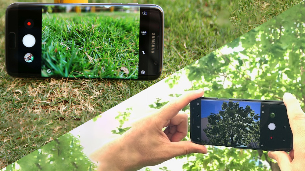
With HDR turned on, the Galaxy S7 (left) blew out the shadows in bright sunlight. The Galaxy S8+ (right) fares much better.
The differences were only accentuated with HDR turned on, with the S8+ picking up greater detail and better contrast. When dealing with solid shadows and mid-tones almost to a fault, the S7’s over-compensation distorts colors blowing out the distinction.
Super Selfies
The camera app is mostly the same, with a nice set of pro controls and a series of shooting modes. Including the sublime selective focus. The new additions come in the form of Snapchat sticker filters that add a bit of whimsy to your shots. They work with both the front and rear cameras. Still, they seem more designed for selfies, an area to which Samsung has paid close attention.
The promotion shows that the front camera has a severe upgrade over the 5 Megapixel one in the S7. With an 8M f/1.7 aperture lens with autofocus. The S7’s front camera was somewhat pedestrian. Still, on the S8, it’s a social media addict’s dream, producing clean, crisp shots in all kinds of light. The autofocus helps lock on your friend’s faces quickly. A series of beauty sliders will keep your complexion looking its best.
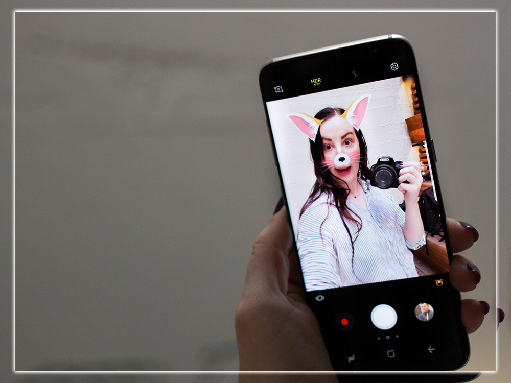
The new stickers filters in the Galaxy S8+ camera app are too fun to ignore.
But most people will want to play with the new animated filters. There are 30 to choose from; each is more fun than the last. Instant detection applies and animates each time a new face enters the scene. It’s just the kind of thing that could bring the fun of Snapchat to parents and grandparents. It’s fun, I’m kind of surprised that Snapchat didn’t think of it first releasing it as a standalone camera app. The S8+ rear camera might be the go-to shooter for capturing scenic shots. Still, people who have never taken a selfie before will use the front camera more.
Clearer Skin
We have TouchWiz and now called the Samsung Experience. It runs on Android Nougat, but it’s only 7.0, with several updates behind schedule. Samsung has intimidated us that it will be quickly updating the S8 to 7.1. Still, the lack of support at launch only underscores our frustrations with Android phone makers.
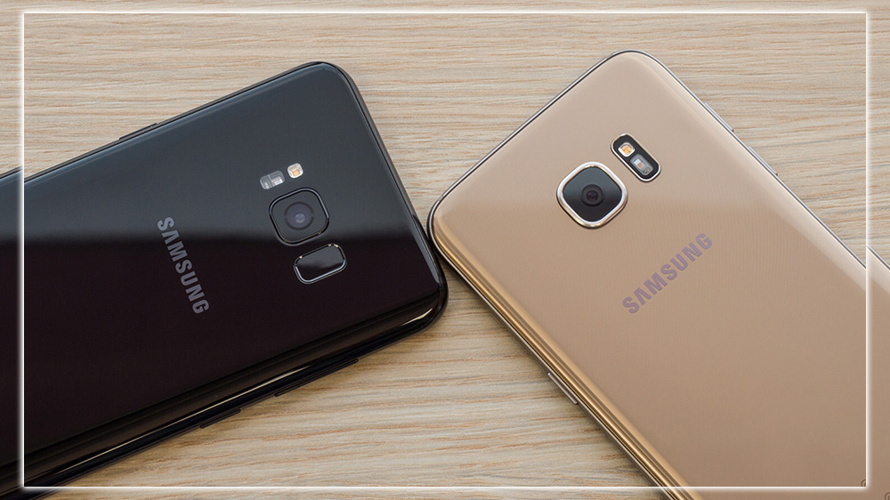
The Galaxy S8+’s interface is much cleaner than the Galaxy S7’s.
But despite the outdated version, Samsung has done a fine job with its new interface. Due to its deviation from stock Android, it will still have its share of detractors. Still, it’s a massive improvement over the Marshmallow version. It might take a lot of cues from the Galaxy S7’s Nougat to build. But it all feels like it was hand-made for the S8+. All the unremovable Samsung app services are well represented, with more than 15. Including a couple new ones. Have all been redesigned for Nougat. And some of them, such as the Calendar Clock, aren’t half-bad. And we love how the broken-line icon motif matches the virtual home navigation button. It’s still an acquired taste, but the new Samsung Experience is a nice upgrade over Touchwiz.
New Widgets
The new weather widget is the home screen’s most striking feature; while we liked it, it’s definitely an acquired taste. Its minimal, vertical design certainly fits the S8’s tall screen well. Still, like the rest of the Samsung Experience, it’s not quite as classy as the one on the Pixel launcher. But what the new interface lacks is elegance. It makes up for its highly personal intuitive interface. The usual TouchWiz customizations to tweak the font style, LED indicator, and always-on display. And that excellent shrunken-screen gesture for one-handed operation. There are handy little touches that make the interface much less aggravating than previous Galaxy releases.
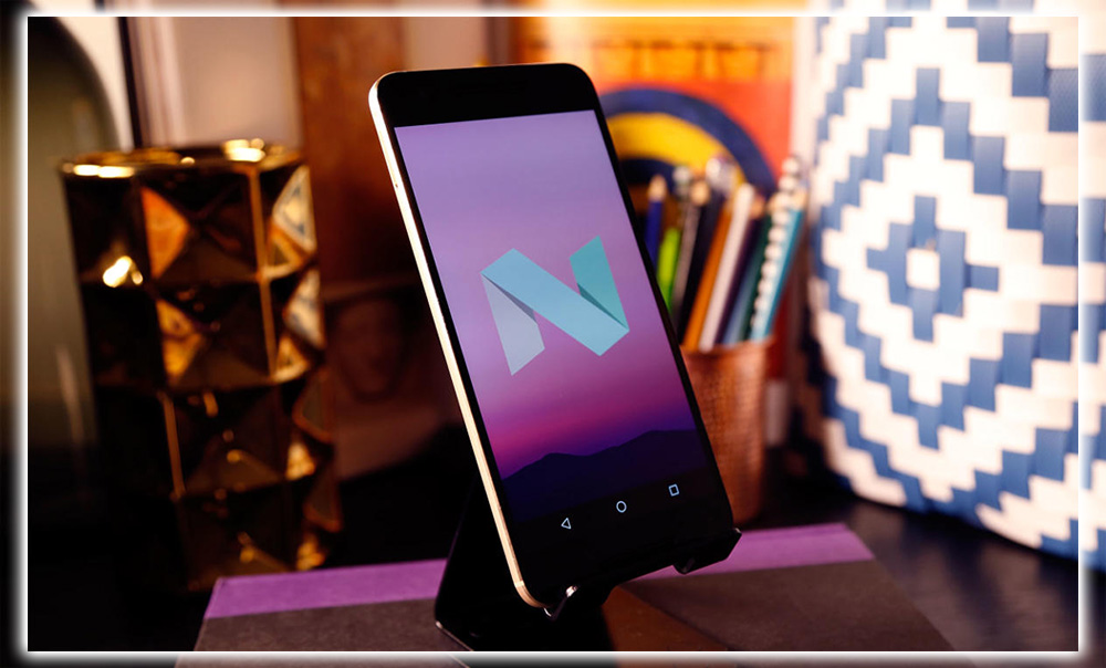
Even the always-on display has got an update for Nougat.
We particularly appreciated the small, mindful additions. Such as the 3D touch-like icon menus and switches to turn off all notifications. And condensing the status bar to just the last three icons. But what most stood out about the interface is its thoughtful, careful attention to detail. While we would still choose stock Android if a Play edition model ever made a comeback. There’s a sense here that Samsung is finally building its interface to take advantage of the hardware. It’s not unlike how Google optimized its custom launcher for the Pixel. It’ll be interesting to see if Samsung starts taking updates more seriously.
Down To Earth
The S8+ is every bit as stunning as the iPhone 7 Plus. When put side by side, it shows how stale Apple’s design has become. And while it may be a millimeter thicker than the iPhone 7. Its tapered edges make it feel svelte, and it has a headphone jack to boot. The iPhone 8 may pressure Samsung to upgrade its game with the Galaxy S9. The best-designed phone isn’t made in Cupertino.
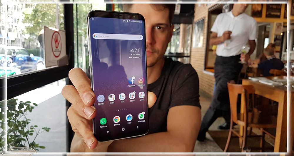
The design of the Galaxy S8+ is summed up in one word: stunning.
And while it certainly exists in the same stratosphere as other premium phones. Its price, $850 for 64GB of storage, is actually more of a value than previous Galaxy S phones. It has twice the storage and better earbuds than the $800 S7 Edge. Let’s not forget that Samsung bundles a $129 Gear VR with all preorders. Even if virtual reality isn’t your thing, that’s a pretty intriguing package. The S8+’s marvelous screen makes VR look better than ever. At the same time, the new controller brings the easy navigation that was missing from the first model. And the Oculus library is already way more extensive than the Daydream’s. With a slew of controller-ready titles on the way.
Should You Buy It?
If you got this far, you already know the answer to this question. But I’ll say it anyway. If you want the very best Android has to offer, go get a Galaxy S8+. It’s not perfect, but it’s as close as possible. And it’s hard to imagine another phone coming close anytime soon, except maybe the iPhone 8.
The Galaxy S8+ is just as gorgeous on the back as on the front.
Bixby may be dead or at least seriously injured on arrival. Still, Samsung will continue to refine and perfect its AI system with regular updates. So it will likely improve over time. But Bixby is, at best, an added benefit that is in no way essential to the S8+ experience. If it never evolves into something you want to use. The phone’s value will not be lessened. The Galaxy S8+ is all about that display; it doesn’t disappoint.
There are a lot of firsts for the S8+. But unlike prior Galaxy S models, it’s not just about getting there before Apple or Google. Bixby aside, the S8+ has a good relationship with hardware and software; as such. It represents a massive leap over prior Galaxy efforts and finally feels like a complete end-to-end package.
If it wasn’t for the downright hostile placement of the fingerprint sensor that frustrated us every time we used it. The S8+ would be the first phone worth 5 stars, including the iPhone 7 Plus. Your move, Apple.


