Samsung is just killing it with hardware design lately, with the Galaxy S8, the most impressive hardware in mobile steps it up a notch. The phone comes in two sizes: the regular S8 at 5.8 inches the S8+ at 6.2 inches. And I never thought I would say this, but I prefer the big one. I actually want a phone with a display over 6 inches!
I’ll have to use the S8 a lot more to form an opinion about Samsung’s latest software. But from the time I spent kicking the tires of some pre-production demo units, I think it’s clear that Samsung has made the most feature-rich phone in memory. And it all starts with a really, really big display.
To infinity…
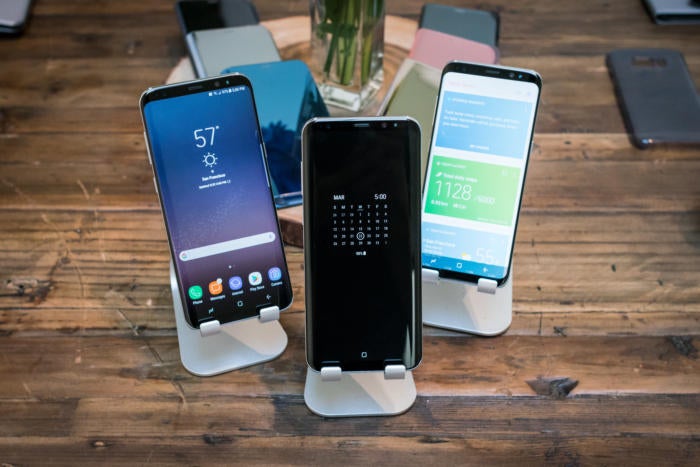
The first thing you’ll notice about the Galaxy S8 is that, while it still looks very Samsung-y thanks to curved sides, it’s basically all display. Samsung calls this new design “infinity display,” it’s built with the same top-quality Super AMOD technology used on other recent devices, with support for HDR wide color gamuts. But just as has done with the G6, Samsung dropped the 16:9 aspect ratio most phones use opted for a taller 18.5:9 ratio display, with only the tiniest bezel above below (just enough room for the front camera iris scanner). And, yes, that’s 18.5—I confirmed with Samsung that the resolution is 2960×1440, not 2880×1440 as is the resolution of the G6.
It’s a beautiful display, which should come as no surprise. Samsung’s flagship phones have had the highest-quality displays in the business, bar none. But I was surprised how much the new form factor changes usability. Even after hling the G6, which is easy to use despite having a 5.7-inch display, I was surprised by how easy it is to hle the bigger Galaxy S8+.
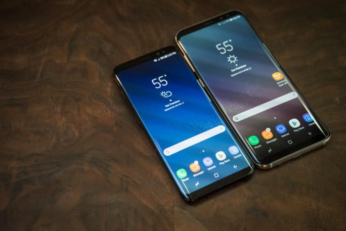
The new aspect ratio puts a huge display in your h. The larger 6.2-inch model is shockingly usable.
The sides are reminiscent of the Note7, with the left right edges sloping gently down, the rear edges curving up to meet them. The result is a very thin, easy-to-grip edge. Combine that with the taller, narrower aspect ratio, you’ve got a phone that’s surprisingly comfortable to hold. More than once while using one of the demo phones, I said to myself, “Now let me try the big one” only to discover that I was already using the big one. If you have an image in your mind of how unwieldy 6-inch phablets have been in the past, you really should try out the big Galaxy S8+ before passing judgement.
The new aspect ratio practically non-existent bezels make the Galaxy S8+ a phone that is easier to hold, hle, pocket than my xel X That’s incredible. Going in, I figured there was no chance I would prefer the surely too-big plus model. After hling them, though, I’m surprised to say I do.
No room for a home button
The super slim top bottom bezels leave no room for Samsung’s traditional physical home button flanked by multitasking back buttons. So Samsung has now gone to on-screen buttons, I’m excited by the possibility of reversing the positions of the back multitasking buttons—putting the back button on the left, as it is on every non-Samsung phone. Mind you, I didn’t find a setting to do this, but I didn’t have time to dig around in the options too deeply.
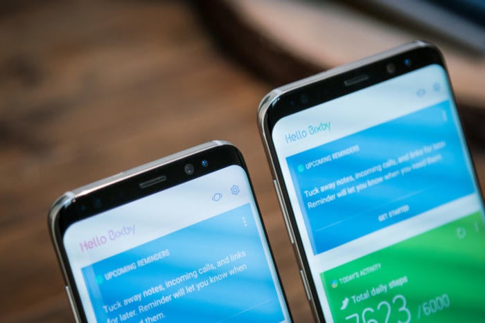
Super-thin bezels on the top bottom barely leave room for the front cameras, but there’s no room for a physical home button.
Samsung has added a little haptic “buzz” when you hit the home button area of the display. It’s not at all like the one on the ione 7, where the “Taptic Engine” makes it feel a lot like really clicking a button. It’s just the usual phone rumble, but it at least give you a bit of touch feedback. In full-screen apps when the home button is invisible, you can simply tap where the home button would be, it will act like you’ve hit it. I’m not sure how well this will work in third-party apps, but in the Samsung apps I tried, it never once failed. It’s natural intuitive.
Of course, with no physical home button, Samsung had to join the “fingerprint sensor on the back” club. And it blew it. The designers put the fingerprint scanner to the right of the camera module, instead of centered beneath it. It’s my guess that this was necessary to make room for more battery in such a slim design.
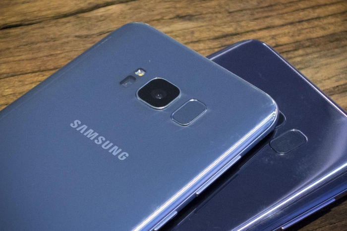
This is not a good place for a fingerprint sensor, Samsung. Especially for those who hold the phone in their left h.
I found it hard to find the fingerprint reader without flipping over the phone to look at the back or fumbling around with my fingertip for a few seconds, I can’t imagine how bad it will be for anyone holding the phone in their left h. Fortunately, the iris scanner from the Note7 is back. It’s surprisingly fast accurate, should prove to be a reasonable alternative to using your fingerprint to unlock your phone quickly.
rformance feels great, so far
This is the first phone with the Qualcomm’s 10nm Snapdragon 835 in it. Some international versions of the Galaxy S8 will have Samsung’s own Exynos processor (also made with a 10nm process). Is it amazingly fast? ’re at the point where I just can’t tell under normal operation. It feels just as snappy as other modern top-tier phones. Demo units loaded up with a limited selection of apps aren’t really going to show those edge cases where we might see some slowdown, but it felt to me like Samsung did a good job of ironing out some of the hitching stutters from the latest iteration of Touchz… or Grace UX… or whatever they call it now.

Samsung’s latest interface looks nice enough, but it’s still Touchz still has annoying bits like the rounded-square icons.
Of course, one selling point of these new processors is better battery life, there’s really no way to really know how that is going to shake out until we get a phone with the final software build put it through the wringer. The Galaxy S8 has a respectable 3,000 mAh battery, while the S8+ has a 3,500 mAh battery—good sizes, but not quite as big as one would expect Samsung to be able to fit into such large phones. rhaps this is in part due to a more conservative stance to avoid another exploding battery debacle, or maybe Samsung’s quest to make everything ever-thinner prevents it from giving us more.
The front camera has been upgraded to an 8-megapixel shooter with autofocus, but the rear camera is the same 12-megapixel sensor with “dual pixel” focus that we saw in the Galaxy S7. Samsung says it’s got new image-processing algorithms to improve quality, but there’s no crazy new camera technology here: no 960fps super slo-mo, no dual-camera bokeh modes. I have yet to use any phone with these sorts of features that makes them feel like a must-have, so Samsung might be off the hook if it really did a great job with its image processing. The Galaxy S7 still has one of the best cameras of all time, after all.
Bixby Dex: the jury’s still out
Two marquee features I didn’t really get a good chance to try out are Bixby DeX. Bixby is the name for Samsung’s new AI companion, which promises to let you do anything with your voice that you could do with touch (at least in some apps). In other words, its less of a search companion more of a voice interface enhancement.
Bixby was basically disabled on the demo units I tried out, Samsung went out of its way to temper expectations for launch. Only “a hful” of apps will be Bixby-enabled, we don’t know which ones, but they’re almost certainly all Samsung apps. More will come after launch, but it’s hard to see Bixby as a selling point based on the limited demos I’ve seen.
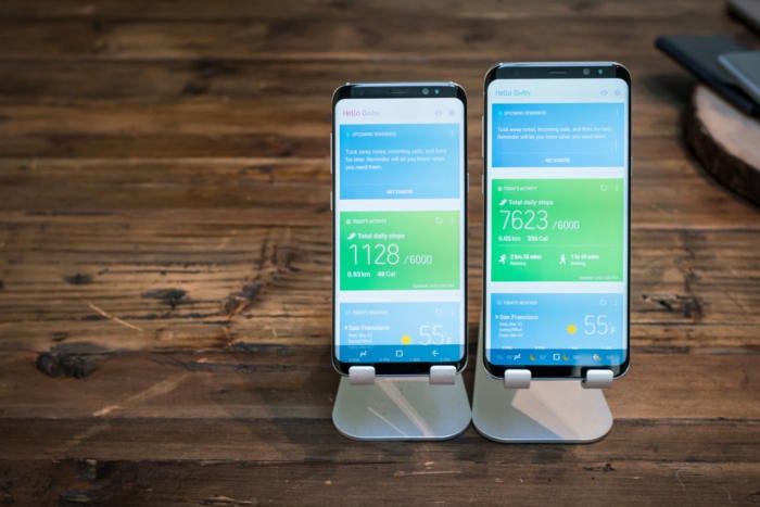
Bixby isn’t just a voice assistant. There’s also a Bixby home screen that gives a sort of personal device overview.
oking a picture in the gallery app saying “rotate this picture to the left” really isn’t a whole lot easier than just using the on screen interface to do that, I can’t see myself ever using voice to navigate apps in a crowded place. It’s a great accessibility feature for those with manual dexterity issues, but I’m not exactly dying to get Bixby on my phone. At least Bixby doesn’t replace Assistant, which is right where it should be on the Galaxy S8.
Interestingly, there’s a Bixby home screen that is summoned when you simply tap the dedicated Bixby button (a press–hold is how to give Bixby a voice comm), or swipe to the leftmost home screen. This is essentially Samsung’s own version of the Now tiles; a list of cards showing you stuff you might be interested in. There’s a weather card, an activity card showing your steps, reminders, notes, suggested YouTube videos… it’s basically an “at a glance” page for your phone. The design is clean orderly it might be a great way to get an overview of your phone-based life, but it’s hard to judge on a demo unit. This is the kind of thing you really want your own data to populate before you decide if it’s useful. It already seems like a better feature than the “Briefing” screen (powered by Flipboard) that it replaces.
ll you just plop a phone into a dock to do your desktop computing? Samsung hopes so.
There’s also a new desktop computer mode called Dex. You plop your Galaxy S8 into a dock can then keyboard mouse around with a special desktop computer interface. ’ll take a deeper look at that soon, but it’s hard to know how useful it will really be in the long run. It’s certainly cool technology, but I need to try it out with a wide variety of apps before passing judgement.
The phone that does it all
I struggle to think of a phone that does more than the Galaxy S8. There are plenty of phones that have features not found here, like dual rear cameras. But Samsung’s latest has damn near every feature from previous flagships (excepting, obviously, S-n stuff). ge display, Samsung y, wireless fast charging (Qi A), fingerprint, iris scanner, fitness stuff, waterproofing, a headphone jack (I can’t believe that’s a feature now), even a premium park of AKG headphones in the box… all with the very latest ultra high-end processor a crazy-cool giant display.
Even if Bixby DeX don’t pan out, this could be a real winner of a phone. I’d like to spend a lot more time with it, running a wide variety of third-party apps really digging into Samsung’s latest user interface. But my first impressions are twofold: this phone is going to cost a fortune, Samsung is going to sell a lot of them.


