The Camera App is Loaded
You’re going to hear a lot about the G6’s camera, rightfully so. It’s a beast. With a pair of 13MP sensors, optical image stabilization, a 125-degree wide-angle lens. It’s going to challenge the Pixel, and the Galaxy S7 for picture taking superiority. But what really makes the G6’s camera shine is its app.
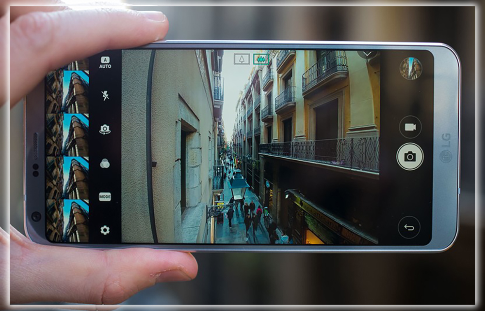
Stock camera apps aren’t generally much to write home about. LG has loaded the G6’s up with tons of features. So much so a third-party app might actually be a downgrade. Along with an excellent set of manual controls, you’ll find new automatic shooting modes. Like 360-degree panoramas, a scrollable gallery of your pics across the top of the screen.
But the real fun starts when you enter square mode. Switch to it, you’ll get two equal viewing windows, one that shows what your camera sees. Another geared to one of three creative shooting tools. With that second window you can compare what you’re shooting against a former shot. Snap pics with the front rear camera simultaneously. Collect a series of images to make a quick collage.
You can Adjust the Size of Apps
Lots of Android phones have different screen sizes, but the G6’s display is one of a kind. While nearly every other phone employs a standard 16:9 ratio, LG has gone with an 18:9 ratio in the G6. This could create some issue with your favorite apps, but it has a workaround.
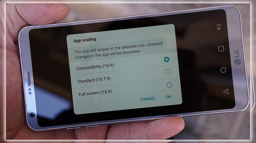
To help with the weird ratio. LG has built a new app scaling setting that will adjust the screen size of third party apps. The default setting is a funky 16:7:9, but you can also choose between 16:9 18:9. Think of it like letter boxing for your apps. Changes are made on the fly. If you don’t like how an app is cropped or skewed, you can easily change it back. Additionally, you can change the size of the app icons. There are three settings for display size, which zooms the app status bar icons, as well as the font size.
Multi Window is Actually Useful
Multi window view has been a feature enjoyed by Nougat users since it launched in 2016. But has taken it to a new level in the G6. As it turns out, the 18:9 screen is perfect for viewing content side by side in landscape mode. Thanks to its ability to be divided into two perfect squares.
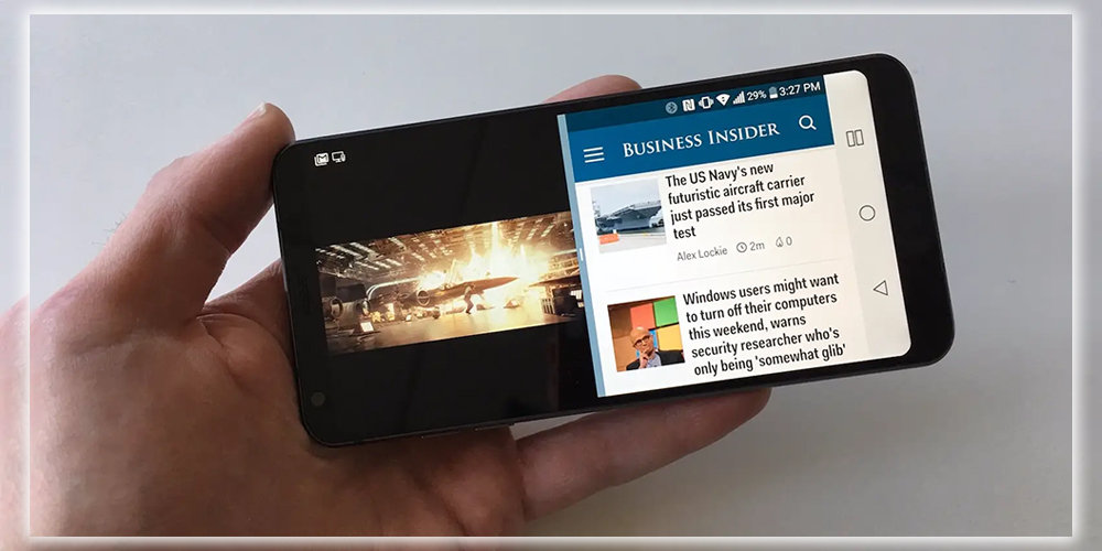
It works the same way as it does in stock Nougat. You just hold and drag app screens when you are in the multitasking carousel. But the 2:1 aspect ratio actually does make the two screens a little easier to use. I’ve always thought the split screen as more of a tablet feature rather than a phone feature. But the G6 has made me reconsider my stance.
The 2:1 goodness also extends to Androids own apps, it’s here where reality starts to set in. When using Googles calendar app in landscape mode. For example, it’s cool how the interface automatically switches. To show a calendar on one side and your schedule on the other. But I can’t imagine any other developer supporting it within their apps. It’s difficult enough to get Android developers to build a decent tablet app. Let alone support a niche feature on a niche phone. But it’s fun to dream.
You can Loop the Home Screen
If you have a lot of home screens, you’ll love this one. LG has added the ability to create an endless loop of home screens into settings. That means when you hit the last one it’ll cycle back to the first. You won’t have to scroll back manually.
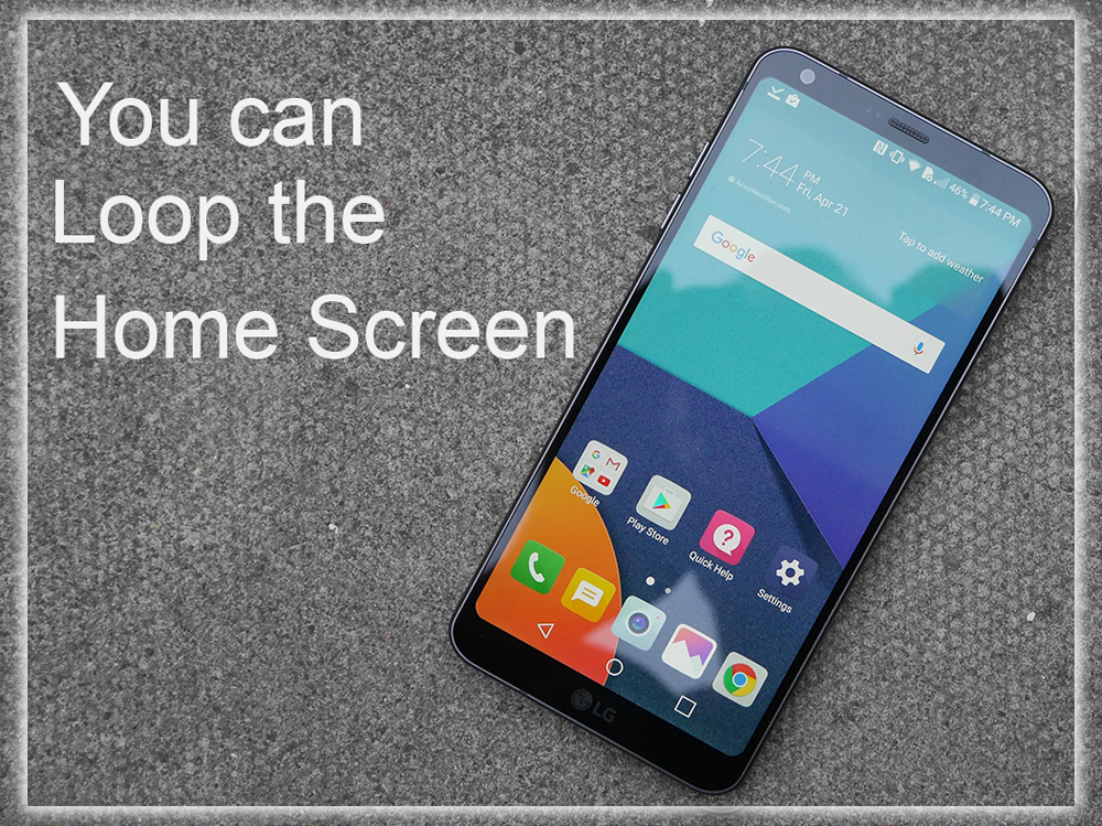
To find it, head over to the Display settings tab, tap Home screen, check the allow Home screen looping box. It’s a great feature that I’d like to see Google steal for the next version of Android. It’s particularly useful if you choose to forgo the app drawer. And keep all of your icons in the grid, although I can’t imagine why anyone would want to do that.
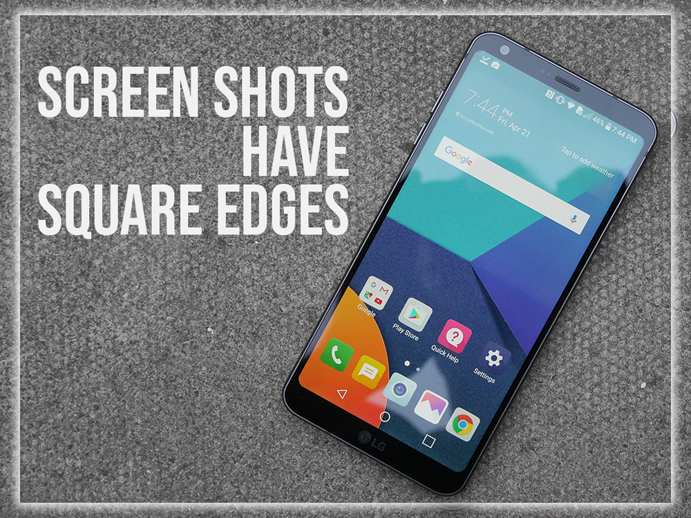
Screen Shots have Square Edges
Despite the G6’s rounded display edges. When you take a screen shot, as you can see in this post, it will appear with square edges. When you view it on any other device. So, if you plan on using the G6 to take take a ton of screenshots. Know that they won’t look weird next to ones from other phones.
You Can’t Hide the Navigation Buttons
Finally, a bit of bad news. In previous version of its UX OS. It allowed us to hide the home touch buttons in apps of our choosing. So they wouldn’t distract from what we were doing. For some reason, that option has been taken away in UX 6.0.
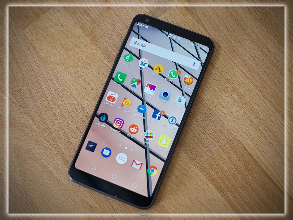
LG is still finalizing the software. So it’s possible it will be added into the shipping version, but if not, it’s a bummer. The G6 has a fantastic screen. Having to keep a black or white navigation bar on the screen at all times. Takes a little away from the beauty of this phone.


