ok at the Eco o3’s spec sheet you will find a phone that rivals ’s very own flagship xel lineup.
The latest greatest Qualcomm processor? Check. Massive battery? Check. 64GB of storage? Check. 4GB of RAM? Unlocked compatible with GSM carriers? An impressive design? Check, check, check.
Then you look at its $399 price tag, begin to question if it’s too good to be true. Heck, at one point the o3 was priced at $299 during a flash sale promotion to kick off its availability in the U.S. market.
How can a phone on paper look so good, while at the same time requiring you to h over so little of your hard earned money?
The answer: Eco.
Eco made a splash in October with an extravagant launch event here in the . The Chinese company purchased popular TV manufacturer Vizio last year, is now ready to take on the U.S. market. Or so it thought, with the company’s CEO stating just last week that it was growing too fast running out of money.
Nonetheless, Eco will continue to sell products in the U.S., starting with the o3 smartphone.
It looks the part
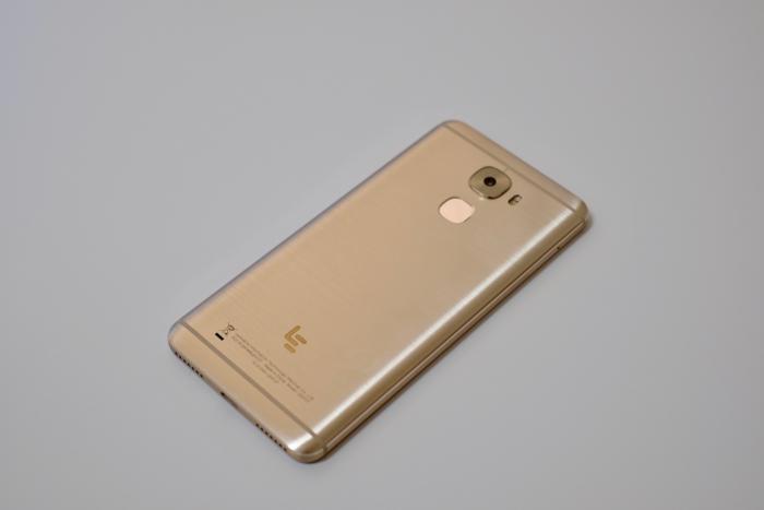
ly, there’s no other way to say it: The o 3 is a good looking device.
There’s no denying the Eco o3 is one well-designed phone. Continuing the 2016 trend of a brushed metal housing with antenna lines at the top bottom of the device, it looks familiar as well. The housing is a bit on the smooth side, almost to the point of being slippery, but ultimately feels good in the h.
On the back of the phone you find a fingerprint reader just below the camera lens two-tone flash. On the right side are volume power buttons, which have loud click to them.
On the bottom is a B-C port, used for charging, data transfer, audio. That’s right, the o3 lacks a 3.5mm headphone jack. Fear not, included in the box is a set of B-C headphones.
The display isn’t QHD, but I won’t complain. It’s bright vivid, offers good color reproduction even if it is only 1080p.
It plays the part
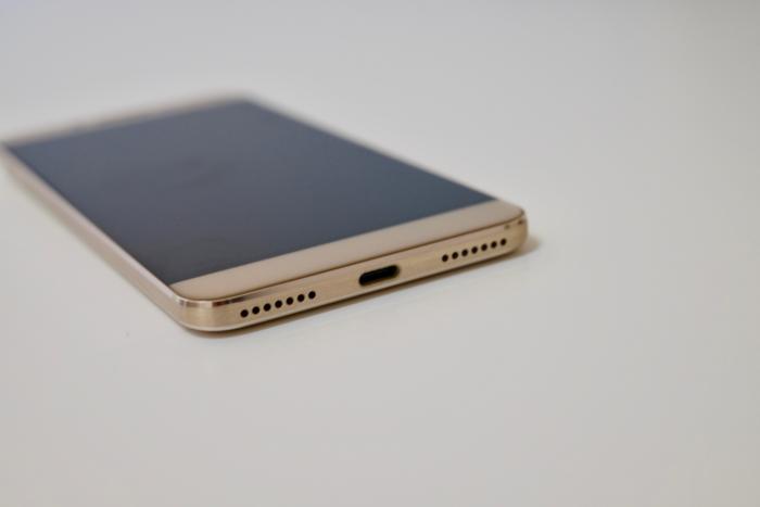
A B-C port that doubles as a headphone jack, kind of like the ione.
Running benchmarks on the o 3, I couldn’t believe my eyes. e after time, it beat even the most expensive devices, in some cases it wasn’t even close.
But as we all know, benchmarks don’t tell the full story. That’s what real-world testing is about, I can confirm the performance of the o3 is smooth, responsive, without hiccups.
A centerpiece of the sales pitch from Eco is its vast ecosystem of media shows available across the company’s TVs phones. As such, the o3 comes with a ve streaming app built in.
You can’t miss it, as its icon is placed where you would normally find the app drawer button on most Android devices. Oh, you cannot move it. You can’t disable it. It’s there, always will be.
In the streaming app you have the option to use a picture-in-picture mode as you watch one of the available shows, allowing you to continue to use your phone for Facebook or emails.
I watched Food Network for about 30 minutes, resizing the window moving it around the screen in an effort to push the o3 to its limit. Not once did I experience any lag or delay.
Battery life is exceptional, thanks to the huge 4,070 milliamp-hour battery. I was able to use the o3 as a dedicated navigation unit, letting it run Maps for 11 hours straight with the screen on, still had battery left over during a recent road trip.

This wasn’t a well lit room, but it wasn’t horrible. And yet, the amount of grain in the photo is far too high.
Camera performance was a bit mixed, with the 16-megapixel rear camera capturing quality photos in well-lit environments but struggling in harsh or low-light scenarios.
Yet, fails to get the part
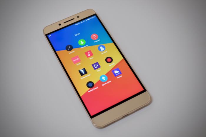
There are far too many tools for one phone.
It has the looks, it has the performance… what gives?
It comes down to software. Eco has taken a strong h in customizing Android, the end result is a confusing mess. The o3 ships with Android 6.0.1, with Eco’s proprietary EUI interface running atop it.
From the moment you set up the phone, you’re reminded of the changes. Between the constant permission dialogs that pop up the first time you launch even the most basic system apps, such as Music. (y does the Music app need to request access to the one?)

Browsing through my favorite Android news site while watching some people play soccer golf.
Consider that, instead of a tiered window multitasking view, you’re shown a row of thumbnails along the bottom of the display with a series of rows that are part of the “Control Center” above it.
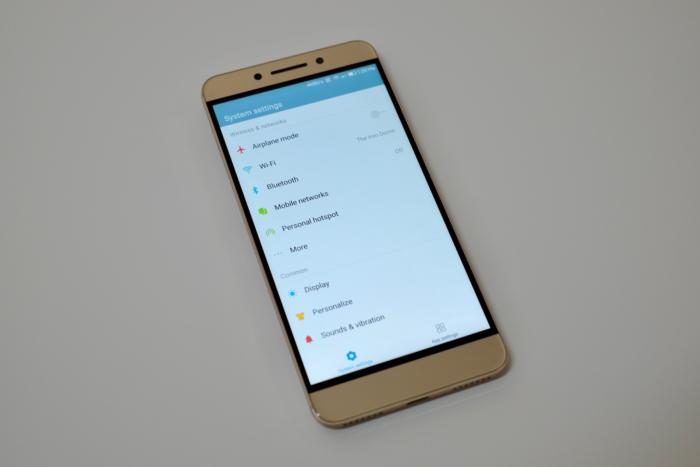
The days of too many redundant options were behind us, right?
The pull-down quick settings shade, where you typically find shortcuts to settings a list of notifications, only shows notifications. It’s jarring downright confusing, even after a week of use. Maybe with a few more weeks of exposure, muscle memory expectations would subside.
The settings menu is just as messy, with different options to white-list apps for increased performance, to a lock-screen cleanup mode that aggressively kills apps when your phone is locked, to an “align wakeup” setting that is supposed to reduce the number of times the phone wakes up during the course of a day to save battery life. I don’t underst that last setting, as the phone doesn’t offer any sort of active display or raise-to-wake feature. You have to press a button or touch the fingerprint sensor to wake the phone.
has put a tremendous amount of work toward improving Android battery life performance in Marshmallow Nougat, yet Eco has spent a lot of time adding duplicative, unnecessary features that clutter the interface confuse the end user.
It’s worth the cost, but is it worth the headache?
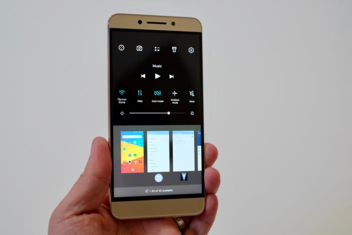
You can swipe up on an app’s thumbnail to close it.
I can say I wouldn’t want to use the o3 as my daily phone. It’s so close to being one of the best Android phones available at the $399 price point, but then you open another app for the first time are reminded just how bad the software experience is.
My initial reaction after using the o3 for a few days was: ll, eventually custom ROMs will come out, right?
And that sums up the o3. It’s a good phone — superb, even — when it comes to performance design. That’s why it’s getting a score of 3.5, not lower.
Unfortunately, the software gets in its way stops it from being one of the best phones on the market.


