Fifteen minutes with ’s new xel phone can’t tell me much. It’s can’t tell me anything about real-world battery life. It can’t tell me about still-photo image quality. Indeed, 15 minutes is only enough time to develop the inchoate wisps of first impressions. But I still left the Tuesday xel phone demo feeling like I found the replacement for my Nexus 6daily driver.
It comes down to this, people: If you want pure in a smartphone—the all-powerful y experience as intends it—then you need a pure Android phone. For most of 2016, that’s meant a Nexus 5X or Nexus 6 But come October 20, the story shifts to two xel phones, one with a 5-inch display, the other clocking in at 5.5 inches.
Are these two phones earth-shattering upgrades? Maybe not. But with better build quality, a better camera experience, Assistant baked directly into their home buttons, the xels might be too alluring for Android enthusiasts to pass up. Shoot, maybe even mainstream buyers will give the xels serious consideration—especially when they see what ’s new machine-learning assistant can do.

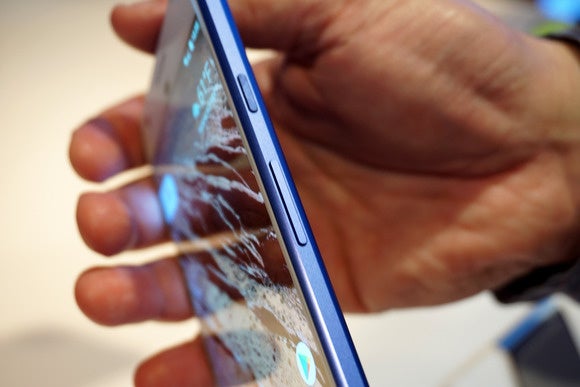
The xel in profile.
Industrial design
I spent almost all my demo time with the 5.5-inch xel X ke its smaller sibling, it comes with a Snapdragon 821 processor, 4GB of RAM, 12.3-megapixel rear-facing camera. The only main differences are battery size (3,460mAh for the X 2,770mAh for the xel) AMOD display resolution (2560×1440 for the X 1920×1080 for the xel). The xel Xhas a slightly smaller display than the 5.7-inch Nexus 6 but the newer phone feels noticeably lighter— perhaps a wee insubstantial—in the h.
killed the oblong “bump” that surrounds the camera on the Nexus 6 now in the xels you get a broad, rectangular expanse of glass on the upper-third of the rear chassis. I never minded the 6s bump, so I can’t say the new design is a vast improvement. But if you like your phones as streamlined as possible, you’ll probably prefer the xel’s design.

Unlike the Nexus 6 the rear of the xel doesn’t have a hump surrounding the camera. Instead, there’s just an expanse of clean glass.
The aluminum case has a rich, satiny finish reminiscent of past xel-bred products, the specimen I played with—cast in a limited edition “really blue” color scheme—looked spectacular. It’s too bad I cocoon all my phones in cases, because it really is a nice paint job. If you’re extremely persnickety, you may notice a tactile shift when your fingers glide from metal to glass on the back of chassis. But let’s call it a design feature instead of a flaw. In all, the xel Xfeels sturdy premium—more so than ’s upcoming V20, on par with Samsung’s GS7 Note7.
Assistant sans lo
l the phones at ’s xel launch event were running Android 7.1. It’s not a major upgrade past 7.0, but I immediately noticed that all the home screen icons were rendered as circles, not the hodgepodge of squares other shapes per current Android convention.
But that’s just a cosmetic decision. Much more significant is the loss of the app drawer button. In Android 7.1, if you want to see your app drawer, you swipe up from the bottom of the screen. It’s easy, it works, I like where is going with design decisions like this.

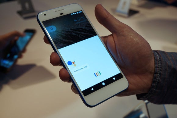
Assistant is baked into the home button.
Beyond that, the xel’s headline feature—no, make that the headline feature of ’s entire new world order—is Assistant, which you summon with a long-press of the home button. It’s the same AI-driven, machine-learning whiz kid that’s baked into ’s lo messaging app, but having it front center on the home screen is utterly more convenient. Indeed, I’ll probably never use lo, but I can see myself using Assistant all the time as my main search app. And my main texting app. And my main navigation app. And maybe my new main everything app.
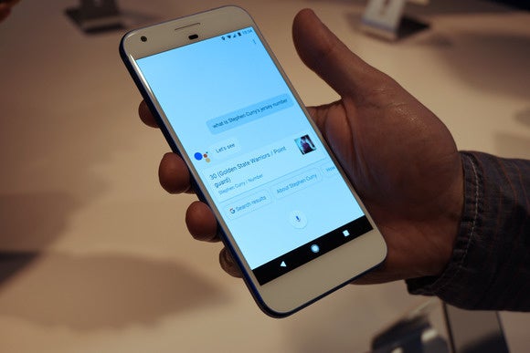
You can use Assistant to start text conversations (“OK , text Debbie”). You can use it to find specific images in your otos library (“OK , show me pictures from last April”). You can use it to start playing songs (“OK , play Talking Heads”). You can use it to find directions, theater times, store hours, what’s on your calendar, more. And all the information is delivered in graphically rich snippets. It’s also contextually aware. So if you first ask for Steph Curry’s jersey number, you can follow that up with, “OK how tall is he,” without ever needing to repeat his name.

Assistant is contextually aware, so once you’ve asked about a particular topic, you can pile on related questions.
To be sure, Assistant feels a lot like a better, smarter, more graphically snazzy version of Now. But the interface feels easier to use, somehow more… inviting. If my Tuesday hs-on showed me anything, it’s that I need to spend more time with Assistant to learn what it can ( cannot) do.
A faster camera experience
mping into the xel’s camera app, I was bummed to see that hasn’t added any manual control settings—you can’t manually adjust focus, shutter speed, ISO or any of the other settings that are exposed in phones from Samsung . In fact, at first glance, the camera app looks identical to the stock Android app available in the last Nexus phones.
But did make serious strides in its camera app performance. The app itself loads extremely quickly—quicker than the Nexus 6 It also appears to focus more quickly, as well as fire off shots more quickly, both in regular mode burst mode. I find it mystifying that won’t provide manual camera controls, but at least it’s improved basic usability for the 99 percent of all smartphone owners who just want to snap a great image as quickly as possible.

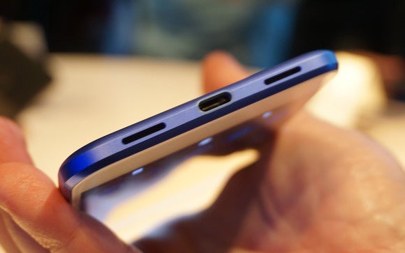
The xel charges via B-C. promises 7 hours of use on just a 15-minute top-off charge.
I couldn’t test actual image quality, but is promising the two xels have the best smartphone camera in the world, trotting out a chart-topping score of 89 from DxO Mobile. The rear camera may “only” be 12.3 megapixels, its aperture may “only” be F2.0, but says its particularly large 1.55-micron sensor pixels, combined with advanced software algorithms, deliver competition-beating low-light performance superb image quality in general.
So add another feature that needs to be fully vetted when we get our review units.
Both xel models are available for pre-order now, should begin shipping by Oct. 20 per Verizon. You can also get unlocked versions from the Store. I still have plenty of unanswered questions, hopefully those will be resolved once we begin testing review units. But as a happy Nexus 6owner, I like what I see so far.


