Decluttering is usually an exercise you go through at home to banish unnecessary decorations excessive pieces of furniture. A clean place leads to a clean mind, or so the thinking goes.
This mindset can also improve the smartphone experience. thout intending to, it’s easy to turn your phone’s home screen into a mess of app icons, folders, widgets that can make it really tough to find that new weather app you just downloaded.
can help you embrace a more minimalist setup that might help alleviate some of the frustration of smartphone life. Swipe less to access your apps. Spend less time building a mosaic of folders. rhaps you’ve always thought decluttering was a good idea, but just didn’t know what that would look like. Here are some strategies to get you going.
Go minimal with your home screen
Android offers a lot of customization options for how you arrange your home screen. One way you can use that to your advantage is to break away from filling up your screen with an entire grid of apps just go with what you really need. Consider the following example:

If you think about it, you really don’t need a ton of apps on your home screen.
I’ve just gone with the basics that I use the most. Five core apps at the bottom then Cast for watching programming, Duo for video calls, then Twitter. The rest of the items are neatly tucked away into the app drawer. I can then find them easily because, by default, most Android launchers put the apps into alphabetical order.

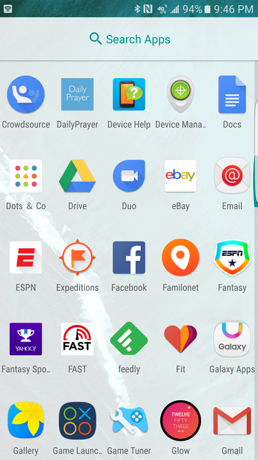
One strength of the app drawer is that all the apps are listed in alphabetical order.
Some launchers, like Touchz (the default option on Samsung phones) allow you to put folders inside of the app drawer. I always found this to be cumbersome. The beauty of the app drawer is supposed to be that if you can’t find it on your home screen, you always know where it is in the drawer because of the alphabetical arrangement.
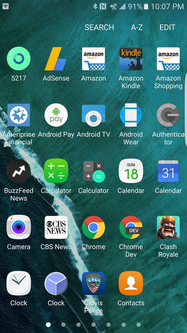
To fix this with Touchz, go into the app drawer touch the A-Z label. It will then reorganize all of your apps into alphabetical order.

Touchz gives you some more choices for organization.
Unfortunately, you’ll have to do this every time you download a new app.
Going minimal on your home screen is pretty easy to do. But if you want to go a step further, you may need to get a better launcher.
Get a smart launcher
Android lets you put on a custom launcher, which is essentially what gives you control over the look layout of your homescreens app drawer.
My current favorite is Action uncher 3. It sticks pretty closely to the design of the Now uncher, but throws in a ton of customization that will help you create your own workflow. For example, you can program the launcher to perform specific actions based on a swipe. I like to have a vertical swipe down launch search a swipe up take me to the app drawer.
Many of these same type of customizations can be found with other launchers like Nova uncher. th such actions just a swipe away, it takes away the onus to build a complex set of home screens that are filled with apps folders.
But maybe you want a more hs-off approach where the phone does the thinking for you. In that case, Microsoft’s Arrow uncher is an excellent choice.

Arrow uncher will perform a lot of organization for you.
The launcher analyzes your app usage automatically puts key apps in a group on your home screen. The other screens show a collection of widgets that feature your recent conversations, Office documents, contacts. You can also swipe up to get to the app drawer perform a search…with Bing. Microsoft’s search engine isn’t bad, but I’ve always found to be vastly superior. Beyond that, Arrow uncher is pretty good at giving you a clean experience without forcing you to make a million decisions.
Search, search, search
No matter your home screen, there’s another key strategy that underpins any recommendation: search. The search bar inside of the app drawer is a rapid-fire way to find the specific app that you’re looking for.
Even better, also retooled its search feature to investigate more deeply into your contacts, apps, other pieces of data. You’ll see Search one at the bottom of the autosuggest list. Touch this you may be able to find a relevant Keep note or Doc about what you’re after.

Android has some built-in search tools to help you find apps or content inside of them.
By embracing these two capabilities you can swipe around your phone less just find what you need by searching. The process isn’t as smooth as Spotlight on iOS, which automatically searches app names other content that’s been catalogued by Spotlight on your device. But ‘s search, of course, goes more deeply into your account can always use for a web search.
No matter your method, there’s a better way than just going through grid of grid after apps. cking a method is going to depend on preference, but you can find what you need go for a sleeker look with rather minimal effort.


