Aesthetics
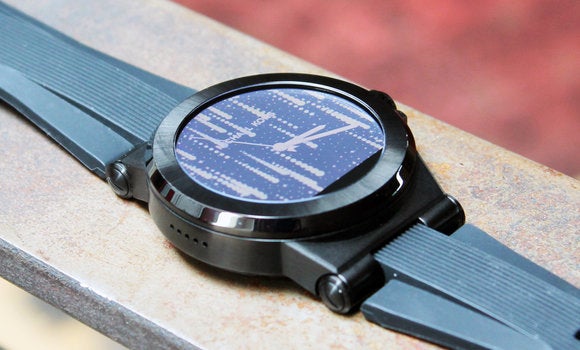
Nonetheless, the Access version of Dylan looks very similar to the analog Dylan, more or less the same case silicone strap, but with two fewer buttons, of course, a digital display for Android Wear. The Access also comes pre-loaded with various watch faces that preach the Kors aesthetic a bit more loudly. So, you can’t lower yourself to buy a smartwatch from a tech-first manufacturer. In that case, you can jump aboard the Kors train. Confident that one of the designer’s watch faces will telegraph your brother’s affinities. And the Access costs only $350 for the Dylan model, which I reviewed. That’s a notable, but not egregious, pricing premium compared to Wear watches from tech companies.
Big, Bulky Br-correct
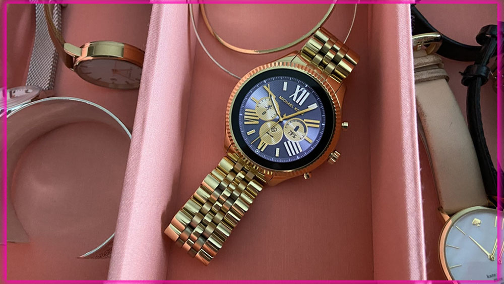
The Dylan version of Kors Access has a bulky 46mm case. It’s big. There’s also a 44.5mm shaw version that’s more gender-neutral. Both watches have stainless steel cases, but you can choose from various finishes and straps. My review specimen came with a black case and silicone strap. But the Dylan is also sold with silver and rose gold colored cases and a leather strap.
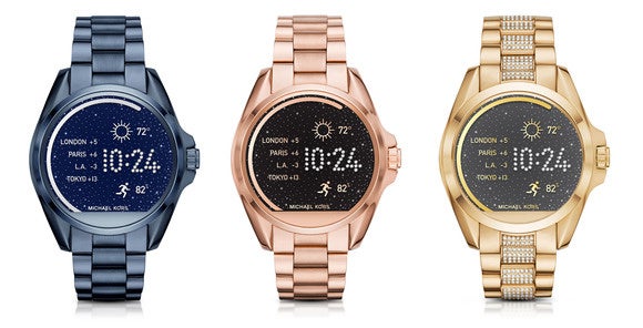
The shaw has a much wider variety of case colors and comes with either metal bracelets or leather straps. Prices vary across the line-up. The most expensive version is a $395 shaw model with a gold-tone case matching pavé bracelet. Do you want more than one strap? Kors says the only supported options are Kors silicone bands at $40 a pop and leather bands at $50. For what it’s worth, the lug width of the Dylan model is 28mm, but its strap pins measure 12.5mm.
It’s Heavy
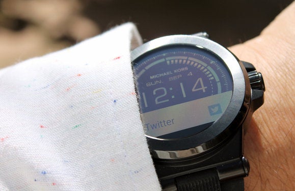
But let’s go back to that enormous case. Because the Dylan is so thick, about 12mm. I found it difficult to fit inside the cuffs of some long-sleeved shirts. That’s a first for me; I’ve worn scads of analog watches, smartwatches activity trackers. The Kors Access is also the heaviest wearable I’ve ever put on my wrist. Android Wear supports a few gestures that let you navigate its user interface with a flick of your wrist. None of them are comfortable with a watch this heavy. Maybe if I had the wrists of a wrestler, I wouldn’t mind. But with my tech journo anatomy, I see repetitive stress disorder in my future.
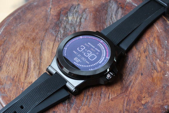
If you can get past the size and weight. You’re left with a design that aligns with Dylan’s $350 price tag. The black steel case looked almost glossy. But held up very well when I whapped it repeatedly with the sharp edge of a metal ruler. I also like the silicon strap. Its grooved texturing helps give the watch a bit more visual ID. I love all silicone straps for their form-fitting grip. Just be prepared to keep it clean, as those grooves are magnets for dirt debris. For my own watches, I pick much more traditional, classic designs. But if I styled my hair with a razor-fade pompadour or maybe listened to Pitbull, I could see myself wearing the Dylan Access.
Strong Battery life a Sun Friendly Display
OK, let’s get into the guts. I won’t rehash Android Wear software specifics. Still, I will share that the Kors Access was running Android Wear 1.5. So it’s definitely not a launch platform for the imminent Android Wear 2.0, which you can read about later. But there’s still a surprise hiding inside the watch: Qualcomm’s Snapdragon Wear 2100 processor.
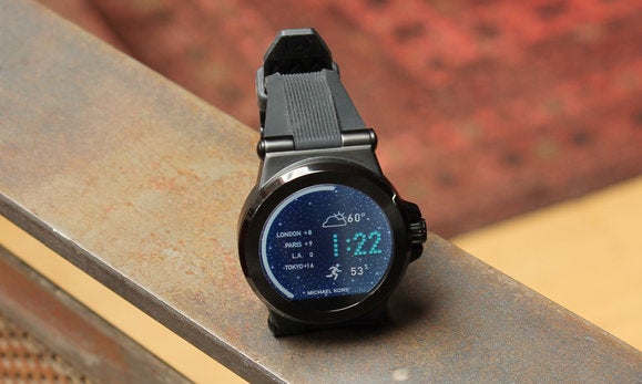
As the name suggests, this chip was designed expressly for next-generation Android Wear watches. In theory, it’s 30 percent smaller than Qualcomm’s previous-generation chip, allowing thinner case designs. However, clearly, Kors still needs to get the message. The Wear 2100 also has built-in Bluetooth and Wi-Fi support and consumes 25 percent less power than Qualcomm’s previous silicon. I never hammered the watch excessively. I was happy with the battery life and finished all my days of testing. With at least 30 percent of the battery capacity remaining.
Like all other Android Wear watches, the Access comes with 4GB of storage for apps and music files. The watch is water resistant to only 1 ATM, so it’s definitely not as rugged. Say, the Nixon Mission, which is suitable for 10 ATMs.
The Star of the Show
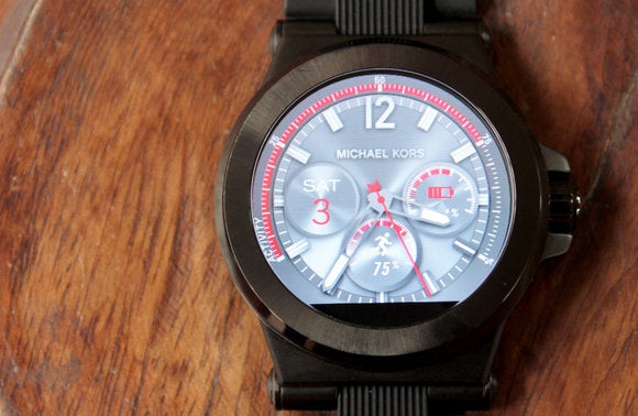
In terms of raw components, the watch’s 1.4-inch TFT LED display may be the show’s star. With a resolution of 320×290, it has a flat tire of missing pixels at the bottom of the display. The touch display is also a tad slow to respond to swipe gestures. These are negatives, for sure, but damn, this watch is legible in sunlight. For this, we can thank the transflective display tech. Colors are washed out under a bright sun. Still, you can easily read the screen, which fixes a significant pain point of first and second-generation Wear watches.
Customizable Watch Faces, Heavy on Glitz
You can only add many design elements to a watch case before the hardware gets too loud and flashy. The watch face carries at least half of the visual ID; this puts all digital display smartwatches at a disadvantage. Lacking moving hands and dials, they can look like sci-fi movie props instead of sophisticated accessories.
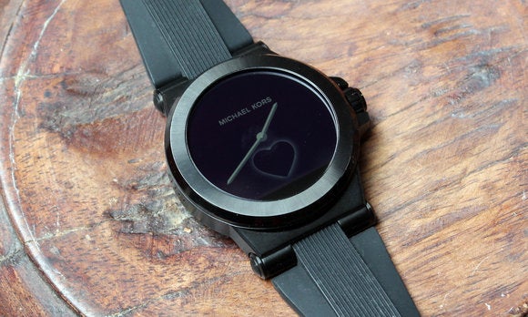
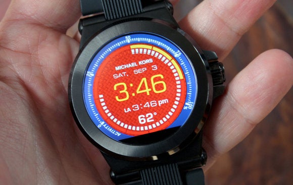
Kors tries to shore up the deficit with a collection of bred watch faces. That communicate the designer’s somewhat cheesy Real Housewives aesthetic. The faces aimed at men look techy and mechanical. The ones aimed at women are heavy on costume glitz, with many gold accents rendered pavé insets, even brief animations. They’re unapologetically trashy, but like NeNe cakes, Kors appears to be in on the joke.
What You Can Do
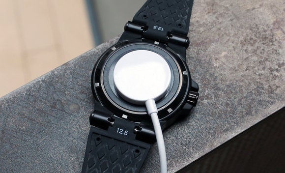
You can customize the watch faces for different colored backgrounds and hand accents in the Access settings panel. You can even define auto timing modes that set one watch face for daytime, 6am to 6pm. And another look that runs at night. It’s a great idea that should be built directly into Android Wear itself. Unfortunately, Kors’ customization interface is confusing; the app has no help notes for customization. I was also irked by the Access’ feeble charging system. It’s just a flimsy, floppy little puck that attaches to the back of the watch with a weak magnet. It doesn’t sit comfortably on a nightstand until you plop on the watch. I always had to check twice to ensure the watch was actually seated on the puck, charging.
What’s in a Name? For Some, Everything
The available models were painfully frumpy when Android Wear was announced in 2014. Even the original Moto 360, the most stylish of the bunch, looked more like a tech toy. Thanks to its bizarre lug-less design. But that was more than two years ago. Tech brands like Motorola have improved their looks dramatically. Android Wear watches like the TAG Heuer Connected $1,500 Fossil Q Marshal $295-$315 provided options for consumers with a lifestyle brand on their wrists. This is the competitive environment that Kors finds itself in. Despite a fair number of drawbacks, Access accounts for itself reasonably well.
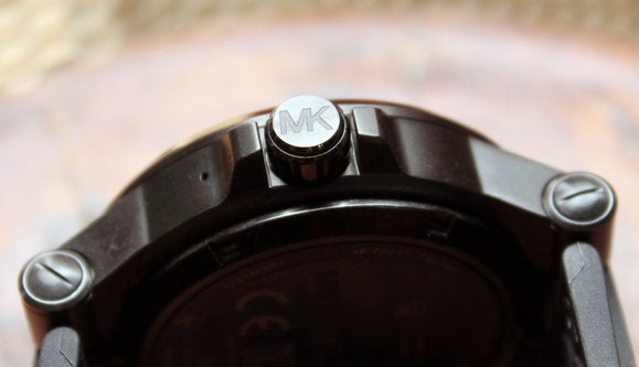
The Access is big and bulky, and its charging adapter feels like an afterthought. But I give props to Kors for imbuing the Access Dylan with the same design as the analog Dylan. Releasing a wide range of woman-friendly Wear watches via the Access shaw. The Dylan is also made of hardy, durable materials, boasts solid battery life and is easy to read outside.
Are there better values in Android Wear? Most definitely. Do other models offer more features? Sure. But those watches can’t claim a fashion-first pedigree; for some consumers. However dubious their logic may be, that could be a deal-breaker.


