otos has come a long way from its early days as a basic photo storage service. The app now serves as a fast useful one-stop shop for editing, sorting, searching through the scores of photos you take with your phone. And while it’s not meant to be a robust high-end image editing suite, even its basic tools have sometimes felt a little unpolished.
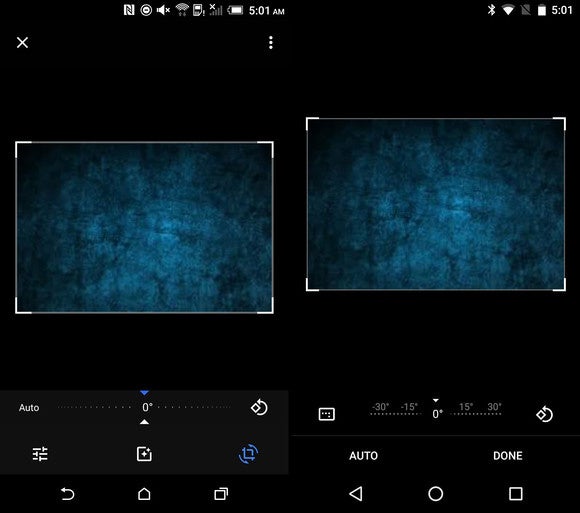
The annoyingly cropping interface is the recipient of the latest tweak in the new 1.24 version, rolling out to Android phones now. The confusing array of icons has been rearranged re-labeled to be more clear, which should give you the crop you want with less hassle.
 Android lice
 The old cropping interface (left) was a little confusing. The new arrangement (right) is a bit more intuitive.
so new in 1.24 is an option to sort the photos in an album by “recently added.” en you’re in an album, just look in the overflow menu (the three dots in the upper right) to find it. It’s not a major change, but it’s incredibly useful, honestly it’s hard to see why it wasn’t there from the start.
The impact on you at home: If you’re using an Android phone, you should probably use otos for no other reason than because it has unlimited storage (at somewhat reduced quality) for the gobs of images you take with your phone, with the option to use your Drive storage space for unaltered full-res images. The search functions of otos is second-to-none, too. These small tweaks aren’t game-changers, but they make life a little easier for those who use the service for more than just photo backup.


