Samsung’s Touchz interface has been derided for years as a steaming pile of ugliness. For many Android fans it’s been a classic example of how third parties muck up Android with less-than-stellar design, excessive software, sluggish performance.
Things have changed. Not only is Touchz not worth hating anymore, it has some smart ideas that ought to “borrow” integrate into stock Android. There are still some issues, as there are with any interface, but Samsung has done a lot to make Touchz snappy useful. These specific features would all be welcome in some form within future versions of Android.
Game uncher
At first I thought this would be a shameless gimmick, but it actually turned out to be one of the features I like the most with my Galaxy S7 ge. I’m OCD enough that I like to have all of my games in one folder. But that means dragging them there one-by-one whenever I download a new one (I know, the horror).

The Game uncher keeps all your titles neatly organized in one folder.
The Game uncher automatically places them in one spot, putting the most recent download at the top. But there are a few other tricks, like disabling notifications while playing reducing your phone’s power use by limiting resolution frame rate. The Top Charts Featured Videos duplicate what you get from ay Games, but that kind of overlap isn’t uncommon in the world of Samsung (there’s a separate Galaxy Apps store, after all).
The bottom of your batch of games also features a suggested title, so you’re not totally free of advertising influence. But the whole package is worth it if you play a lot of mobile games.
A neat trick for moving apps
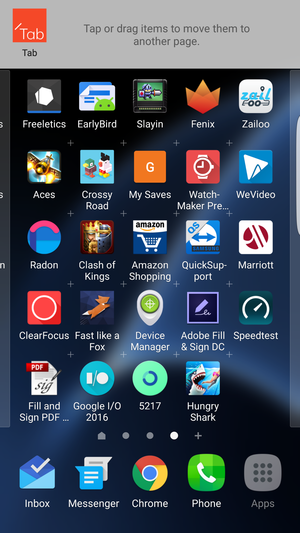
Another innovation that I use regularly is a tool that makes it easier to move apps around on the home screen. en you touch hold an app, you can drag it to a waiting area at the top of the screen where it stays until you pluck it out.

This “holding pattern” offered by Touch z is very useful for rearranging your home screen.
This allows you to move apps to from pages that would normally be full with most other launchers. could easily add this capability into the Now uncher, which it’s able to update through the ay Store.
A battery percentage gauge you can actually read
It still boggles my mind that the official method for displaying the battery on stock Android is a hacky solution: you have to enable the System UI Tuner. Even then, the numbers are pretty small, crammed inside of the battery icon.

Touchz does a much better job at making the battery life easy to read.
So score one for Touchz, for making the battery percentage number a size that doesn’t require a high-powered microscope to read. This area probably hasn’t been a huge priority for , as the overwhelming majority of Android devices run some type of custom interface. But the Nexus faithful, of which there are many, deserve a little better.
uncher customization
Touchz may not look as Material-smooth as the Now uncher, but it offers a tad more customization. en you press hold on the home button, you’re able to change up the grid of app icons to 4×4, 4×5, or 5×5. You can also load up a custom theme to give your phone a very original look.

Touchz trumps the Now uncher in how you can customize the interface.
Yes, you can always use a custom launcher, there are plenty of good choices in the ay Store. But this is something that ought to offer by default on all devices, especially since the Now uncher is desirable already for its tight integration with the company’s services.
ways-on display
I’ve been surprised by how much I enjoy the always on display on my Galaxy S7 ge. Even though I wear a Moto 360, I find myself looking at the phone as the first method to check the time. It’s an old habit that’s tough to break.
 Barbara Krasnoff
An always-on display (left) means you can see the time calendar without the need to fire up the lock screen (right).
You’re able to add a calendar on the screen, which has become an invaluable way to check the current upcoming date. does a pretty good job on the Nexus 6 5X with a display that comes to life when you pick up the phone off the desk or take it out of your pocket, but that’s not the same as being able to glance at your phone on your desk or charger get useful information without even touching it.
A neat contacts trick
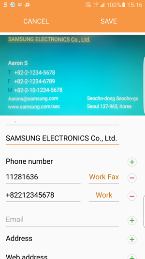
Managing contacts are a pain. Samsung tucked in a neat trick that lets you scan a business card directly enter the details into whichever service you’re using to sync up your contacts.

Scan a business card the details will appear in your contacts, synced right to your account.
The first time you do this you’ll be prompted to install a Samsung-built app to do this, but after this step you’ll be able to zap them right away. It’s a clever inclusion that is practically a necessity since business cards just won’t die. I was recently at a conference came back with a giant stack of them. There are third-party apps for this, but having this native to Android would be rather great.
A little less z
It wouldn’t be Samsung without a few features that still need to be dialed back. The app drawer should embrace what has done with the Now uncher, with vertical scrolling instead of the never-ending screens you must swipe through.
Right now, Touchz puts the newest app you download on the very last page of the drawer, which means the apps aren’t always in alphabetical order. You constantly have to reorganize this if you want the same effect of relying on the app drawer to find apps you don’t put on your home screen.
so, the Settings are still kind of a mess.

Settings are faster to navigate in stock Android, particularly with the N beta.
Stock Android is much smoother in this regard, as the Samsung layout doesn’t always make sense with where the different capabilities are organized. Android N is even stronger with the slide-out navigation menu, which would be a welcome edition for Galaxy devices.
But you have to h Samsung credit for turning things around. Touchz has some solid ideas, many of which would benefit all Android owners. Samsung has never been shy about incorporating others’ ideas into its products, so this time around ought to return the favor.


