I never thought I’d write this about any phone, but the G5 just feels a bit desperate. It feels rushed. It feels like ’s designers were locked in a room, working on what could be a very good phone, then someone bolted out the door roy nkins-style, unleashed the G5 on the world before the concept was fully realized.
Check it: In the transition from last year’s G4 to this year’s G5, moved to a nearly all-metal design, added a fingerprint sensor, overhauled its battery swapping system. The company also added an always-on display, a second rear-facing camera for taking wider-angle shots. On face value, these all sound like interesting, welcome additions. But dig a bit deeper, you’ll find some of the changes are quite incremental, not always well-executed.
And then we have ’s new Friends accessories: two hardware modules that snap directly into the G5’s body, giving the phone an upgradability story that’s similar to what imagines for oject Ara. The Friends are ’s bid to show that the company is still thinking big in the mobile space, pushing the edge of what a smartphone can be.
 Masaoka
The G5’s removable battery, along with the phone’s stock chin (bottom), Hi-Fi us (middle) Cam us (top).
These are admirable goals. st one problem, though: The two Friends I tested—the Hi-Fi us digital audio converter Cam us camera controller—just aren’t very good. They drag down the G5’s score, which is already imperiled by poor execution dubious decisions.
It’s a shame, because the G5 ($689 unlocked on BestBuy) does improve upon last year’s G4 in a few areas. But for this review we have to look at the entire G5 concept—the full experience, what it says about ’s smartphone development.
Finally, an (almost) all-metal body
For two years running, we’ve had to diss for shipping its premium flagship phones with plastic shells. Apple has had a metal unibody design since the ione 5, Samsung made the jump to full metal cladding for its Galaxy flagship two generations ago.
Of course, has always had a defensible excuse: Its earlier flagship phones required a plastic back panel to facilitate the company’s battery-swapping scheme. The opportunity to swap a depleted battery for a fully charged battery has been a unique selling proposition for , but owners have had to accept the compromise of a downmarket design—along with the possibility that their back panels will fly away into oblivion when they drop their phones. Indeed, those back panels were difficult to pry off for battery swaps, but eager to pop off during spills.
 Masaoka
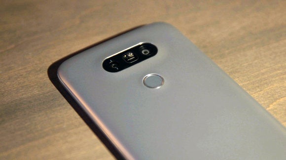
Here’s a good look at the G5’s dual cameras rather tiny fingerprint sensor. so note the almost glowing luster of the case edge.
In the new G5, finally improves its system for battery swaps, introduces a mostly all-metal body in the process. As explains, the phone’s body is made from “microdized” aluminum—a die-cast aluminum shell covered in primer, which is then covered by a metal pigment. Our pre-production unit (which I cover extensively here) came in pink, has a bit more glowing luster than the silver version I tested for this final review. But both the pink silver bodies look feel more high-end than the plastic-backed G4 I reviewed in 2015.
st be aware that the microdized surface will scuff scratch under abuse. I would have preferred a more durable finish, maybe that’s something can improve in next year’s G6.
A better approach to battery swapping
The company’s materials choice notwithsting, I think has finally led on a good compromise for its battery-swapping scheme.
In the new system, you power down the phone, press a button on the side of the body, wiggle out the “chin” that serves as an end-cap for the chassis, then slide out the cartridge that holds the G5’s 2800 mAh battery. From here, you unseat the battery by sort of “breaking” it off the chin. It feels like a violent motion that will damage the chin’s seating point, but I tested the procedure ad nauseum, the materials appear to hold up. I have confidence in the new swapping system, overall.
 Masaoka
It requires a rather violent snap to remove the battery from its chin.
At first glance, the chin doesn’t look horribly incongruous with the chassis to which it connects, especially when you’re looking at the front of the phone. However, if you look at the back of the phone, you’ll see a prominent seam between the two pieces—it immediately telegraphs that you’ll never be dunking the G5 in water.
If you go one step further, hold up the G5 to a bright light look very closely, you’ll see that there are slight gaps between the chin the unibody. I can imagine some loose clothing threads—or, in my case, dog hairs—getting snagged in these crevices. I think the real-world impact of the gaps is marginal, but simply from a philosophical design perspective, this is the kind of thing that would have gotten an Apple designer fired during the Steve bs era.

Note the gap. so note that non-hi-tech flosses will fit in the gap as well. It’s just not an elegant design.
I never found myself swapping batteries with the G3 G4 because prying off the plastic back panel was a pain in the ass. So, for this reason alone, the improved system might compel me to finally to get with ’s swapping program. But here’s an even more compelling reason for battery swaps: The G5 falls behind its competitive set in terms of raw battery life.
th a time of 6:33 in the battery life test, the G5 has noticeably less longevity than the Galaxy S7 (7:15) Galaxy S7 ge (8:17). Accordingly, the G5 lagged behind in the Geekbench 3.3 battery test as well, lasting for 6:03 to the S7’s 6:56 S7 ge’s whopping 7:59.
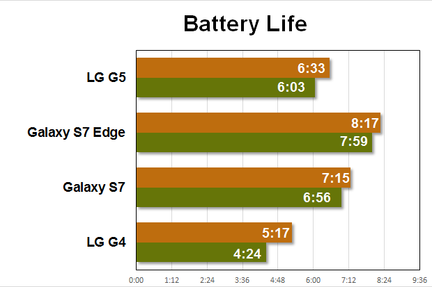
The G5 beats the battery life of last year’s G4, but falls behind its current Samsung competition. The orange line represents ’s battery life test. The green line refers to Geekbench 3.3’s battery life test.
Beautiful display with a near-useless always-on feature
’s battery has to drive an insanely high-resolution 5.3-inch “Quad HD” display. st year’s G4 has the same 1440×2560 resolution, but measures 5.5 inches. I typically like my phones as large as possible, but during testing I never noticed the G5’s slight dimension decrease, ’s I D display is as beautiful as ever. I did notice a small amount of backlight bleed with the Fullscreen Display Test app, but my review unit didn’t suffer enough bleed to be a tangible problem issue during real-world use.
On the flipside, ’s new always-on feature—which shows the current time notification icons when the phone is sleeping—is insanely dim compared to the Galaxy S7’s similar implementation (which benefits from Samsung’s Super AMOD screen).
 Masaoka
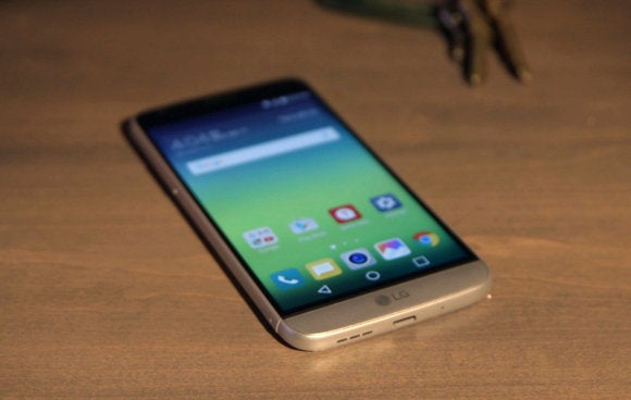
The G5’s display measures 5.3 inches, boasts a breathtaking pixel density of 554 ppi.
st as troubling, ’s always-on feature doesn’t share helpful information: You can only see which apps have waiting notifications. I much prefer ’s Ambient Mode, a similar feature in pure Android Nexus phones, which presents much more granular detail, like the content of texts Hangouts messages.
still supports its Knock Code feature to wake the display from sleep, but now the system requires six screen taps (instead of four) to unlock the phone. I’ve always loved Knock Code, but throughout testing I used ’s new fingerprint sensor almost exclusively to unlock the phone. ke the Nexus 6s sensor, ’s is superfast accurate, sits on the back of the phone.
It’s a slightly less convenient position than the front-of-phone sensor orientation you’ll find on Samsung Apple phones, but it undoubtedly helps preserve the G5’s compact dimensions. Indeed, ’s display seems to make use of every millimeter of available space, putting the sensor in the front would probably just increase the G5’s height.
 Masaoka
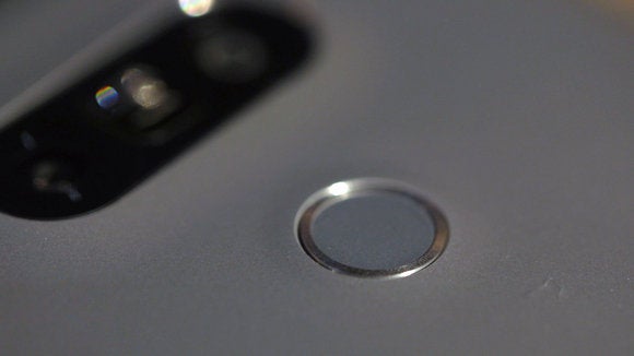
’s fingerprint sensor is small but that doesn’t seem to impair accuracy in the least.
’s fingerprint sensor is smaller than the Nexus 6s sensor, but the decrease in size never posed any problems during a week of use. ’s sensor also integrates directly with the power button—which means the power button remains stuck on the back of the phone. But at least finally moved its volume controls to the side of the body. This makes adjusting music volume during the middle of a workout a bit less awkward.
Strong performance with a missing app drawer
Armed with the same Qualcomm 820 processor that appears in Samsung’s Galaxy S7, the G5 performs similar to its direct competitor. In ’s rk rformance productivity test, the G5 scored 5686, where the Galaxy S7 hit a slightly higher 5774. In 3D’s Sling Shot ES 3.1 gaming test, the G5 scored 2309 to the Galaxy S7’s 2554. Throughout all our other benchmarks, the G5 trailed the Galaxy S7 by similarly small margins, none of the performance deltas were wide enough to be of any concern. More importantly, the G5 doesn’t stutter or lag during real-world use.
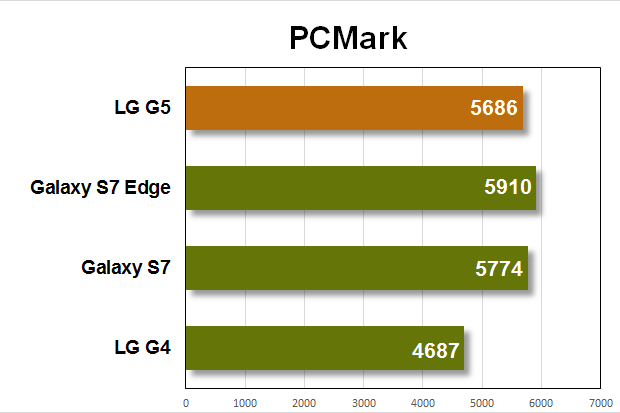
This is how the G5 performs in ’s basic productivity test. It clearly beats the G4, runs within a margin of error of Samsung’s latest flagship phones.
On the software side of the equation, mostly executed small tweaks to its skin of Android Marshmallow. There are some changes to the Settings interface, but they won’t piss you off. You’ll just think, “Hmmm. That’s different.”
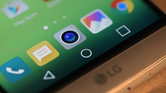
But when you get to the bottom of your home screen, brace yourself. Out of the box, the G5 ships without an app drawer— that’s just madness if you’re a long-time Android user who’s come to rely on the app drawer for finding, sorting, simply storing apps.
In its reviewer’s guide, under a section titled “Advanced UX,” says managing apps has become more more complicated, asserts its new “integration” of home screen app drawer is “expected to provide a more straightforward approach to app management.”
 Masaoka
See anything missing? Yeah, the G5 ships without an app drawer. If you want it back, you’ll need to install a separate launcher.
In ’s new world order, you can sort apps by name or download date; create different grid arrangements (4×4, 4×5 or 5×5); hide apps by checking which ones you want to banish from the home screen. But, no, you can’t have an app drawer unless you download a separate launcher.
Installing the Now launcher brings back the app drawer. You can also download Smartrld, do a search for Home 4.0, install that add-on to bring back the app drawer. tells me this will become an over-the-air update later this month, so, clearly, ’s roy nkins foray into “Advanced UX” is being reconsidered.
 Masaoka
You can get the app drawer back if you download a different launcher from .
Is a wide-angle camera a real innovation?
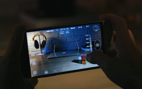
One of the best features of last year’s G4 is its 16-megapixel rear camera with f/1.8 aperture laser autofocus. The sensor itself is great, but the phone’s manual software controls are even better. The G4 lets you manually adjust white balance, focus, exposure, ISO, shutter speed—from 1/3200ths to an insane 30 seconds. You can even save your shots as RAfiles. The upshot is that you can execute a wide range of effects treatments with editing software that were heretofore only available in expensive st-alone cameras.
The camera package is one of the reasons I recommended the G4 so highly. And now that very same package is back in the G5. But this time it’s augmented by a second rear camera… which is more gimmicky one-dimensional than impressive.
 Masaoka
The G5’s manual camera controls give you DS-caliber options, like controlling ISO.
The second camera is only 8 megapixels the aperture drops down in quality to f/2.4. But where the stard rear camera is limited to a 78-degree field of view, the second camera can capture a more panoramic image with a field of view of 135 degrees. Both cameras share a single software interface, you switch from one to the other by pinch-zooming on your camera preview screen.

The front straight at guna Seca, shot from the flag station with the G5’s stard 16-megapixel camera at its widest (78 degrees) field of view.
It’s an easy system to use, but the wide-angle camera introduces significant fish-eye distortion, has limited applications. suggests using it to get more people into a group shot, but your friends on the edges of the photo will look like they’re being stretched by a fun-house mirror.

The front straight at guna Seca shot with the G5’s 8-megapixel wide-angle lens at its widest (135 degrees) field of view. Note the buildings that suddenly come into view—as well as the distortion of the white line in the lower left.
You can also use both cameras together to create “pop-out pictures” where an image from the wide-angle camera is surrounded by an image from the stard camera. Add in wacky filters like Fish Eye ns Blur, you have the kind of horrible decoupage that only appears in third-grade art projects. It’s another feature that would have made Steve bs apoplectic.
The dual-camera feature feels like another missed opportunity—or wild shot in the dark—from ’s engineering team. You can tell they’re trying hard to innovate, but the results just aren’t classy.
th Friends like these, who needs accessories?
To put a kicker on the entire confusing G5 story, the two Friends accessories left us wondering why created them at all.
t’s start with the Cam us, a somewhat chunky module that boasts physical controls for toggling on the phone’s camera interface, snapping the shutter, starting stopping videos, adjusting zoom. The Cam us includes a 1200 mAh auxiliary battery (giving you a total of 4000 mAh with the module in use), has a grippy texture that’s intended to make the G5 a more comfortable, secure shooting device. You install the Cam us with the same procedure required for battery swaps.
 Masaoka
Using the Friends modules also requires battery swaps. Note that the Cam us shown here includes a 1200 mAh auxilliary battery.
It all sounds intriguing, but I found the Cam us’ed G5 to be too bulky in my pocket, I always feared losing the phone’s original chin. But even worse, the physical camera controls just don’t provide enough benefit to justify the accessory’s $70 price. I appreciated the ability to quickly toggle back forth between ’s camera software home screen, but that was about it.
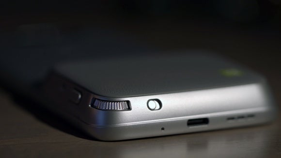
The jog dial for the Cam us zoom feature lacks resistance, is difficult to use for smooth, gradual zooms. It’s just inexplicable that such a feature-limited accessory would foul up this one function so badly. Beyond that, all I can say is that a much more useful Cam us would provide physical adjustment for all of ’s wonderful manual camera controls.
 Masaoka
The Cam us Friends module is a clever but poorly executed idea. The jog wheel for controlling zoom just isn’t easy to use.
Next up, we have the Hi-Fi us with B&O ay, a digital-to-audio converter (DAC) that’s supposed to improve the G5’s sound quality. It’s not currently cleared by the FCC for sale in America, probably never will be. But that’s okay, because when I tested the Hi-Fi us with the pre-production Korean version of the G5, I couldn’t hear any improvement in sound quality whatsoever.
uld the DAC suddenly make a difference if the G5 was feeding its signal to an external Dset-up? rhaps. But who’s going to do this? For that matter, who will tolerate cold-swapping ’s chins just to listen to slightly better sound fidelity? Fact is, the G5’s stard audio is quite good loud, so who needs more?
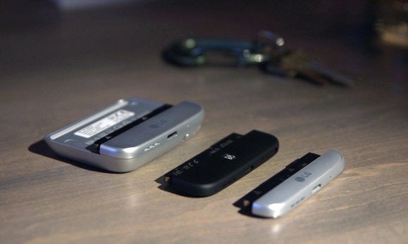 Masaoka
The three chins. From left to right: Cam us, Hi-Fi us, the stard chinny-chin-chin.
It’s also worth noting Hi-Fi us introduces an even wider “chin gap,” only works with wired earbuds, which I no longer use in this age of Bluetooth headsets. Finally, the module slightly lengthens the G5’s total package, , like the Cam us, forces you to find a home for the chin that came with the phone.
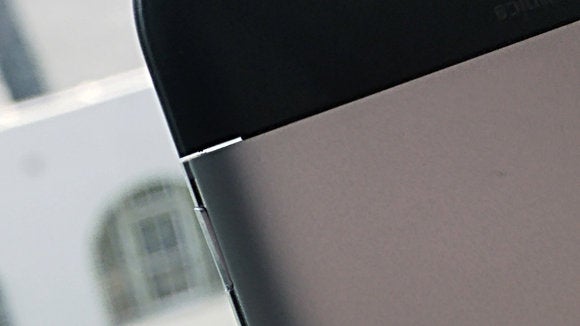
Here’s the chin gap with the Hi-Fi us installed. You can see daylight through the other side.
ying the price for bold ideas
I was more enthused by the G5 when I wrote my 24-hour impressions of the pre-production unit. But now that I’ve spent quality time with the phone, have had a chance to play with the Friends, I’m left disappointed.
have to applaud for taking so many risks—overhauling battery extraction, ditching the app drawer, adding a second camera, beating other manufacturers to the modular accessory punch. But each of these innovations is flawed to one degree or another, casting a dark shadow on a phone that otherwise does have a lot of offer.
If a friend said she was thinking of buying the G5 for its state-of-the-art processor, breathtaking screen, killer manual camera controls, removable battery, I wouldn’t try to dissuade her. But this is still a phone that earns 3.5 stars. It’s just got too many problems to earn a higher score.


