It’s been a little over four years since rebred the Android et as ay, bringing all of its apps digital offerings under one roof.
The ay Store is a key piece of ’s digital strategy, as it’s the hub for Android apps games, eBooks, TV shows, movies. In many ways it’s quite good, with an appealing design continual improvements to try to improve app discovery boost the number of installs.
But like anything, there’s always room to grow. The ay Store app website could use a few tweaks to address some nagging issues. The five issues I’ve described below are my main grievances. If there’s a problem you’ve noticed let us know about it in the comments, we can at least commiserate with your pain.
Improve the mobile app’s stability
I’ve used a number of different Android devices over the past few years. And one constant remains: the ay Store app crashes from time to time. I can’t speak to the precise code or other engineering issues as to why that’s happening, but as just a consumer I can say that it stinks.

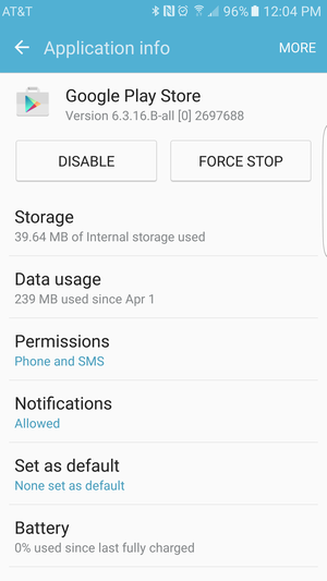
Too often you need to force stop the ay Store start over to solve stability issues.
Usually it’s when I’m doing something with another app, I’ll get the pop-up notification that the ay Store has crashed. The best fix then is to clear the cache or even restart the device.
It happens too often for such a crucial application. atever behinds-the-scenes work is required to bring this under control needs to happen, quickly.
lish the web experience
One of my favorite things about the ay Store is that you can quickly launch a browser tab on the desktop jump right in. th Apple’s App Store, you have to fire up iTunes, go make a swich, maybe by then you’ll be able to look for apps.
But there are still a few places where experience could be better. One is in re-installing apps you’ve already downloaded. Recently I changed phones again (hey, I do this for a living) bought a Galaxy S7 ge. I decided to go the clean install route since I had a billion apps on my previous phone that I didn’t want to reinstall.
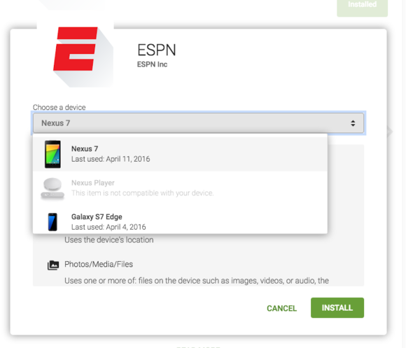
So when browsing the ay Store I came across ES—which was listed as “installed” on the web, even though it wasn’t on either my GS7 ge or Nexus 7.

Is the app already installed or not? You have to click through to find out.
You have to then lick the Installed button to find out if it’s actually on one of your devices or nowhere to be found. It seems a better method would be eliminate the Installed notice if it’s not actually active on any device, or maybe your most recently-used device. Or just tell us that it’s installed on some of our devices, but not all of them.
And it seems that order in which the toggle displays devices is haphazard. Sometimes the one I used most often is at the top of the list, other times it’s the Nexus 7 that has sat on the coffee table for a week. More consistency, please.
Kick out the dormant apps
At last count ay had over 1.5 million apps. Even though says it now tests everything before the app goes live, that’s a wide open market to run. So there are going to be some issues.
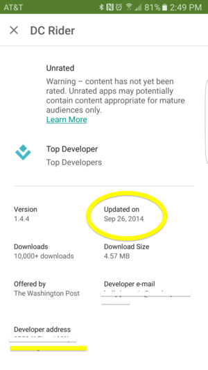
One place to start would be apps that haven’t been updated in, you know, three years. The ones with screenshots from Android Gingerbread (2.3).

Some really old apps are still hanging out in the ay Store.
There ought to be some type of enforcement mechanism that kicks out apps that have been aboned. They just clutter up the store when you’re trying to find an app that you really want. And such apps ruin the experience for less tech-savvy users who may not realize they’re downloading a relic instead of an up-to-date functioning app.
Improve ay Store search
It’s surprising to see a product that needs to improve its search capabilities, but that’s certainly the case from time to time.
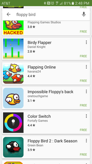
Oftentimes some apps just don’t seem to match up with the search terms. Or you have to be very specific about the title of an app to find it, particularly if it’s new. Reddit finally released an app, but it wasn’t the top result if you searched for “Reddit.” Or some odd apps will appear in a seemingly unrelated search.

it, why is Color Switch in this list?
Search is ’s speciality, but it seems at times even with this area it could be improved. Autosuggest also will start finishing your phrase based on what people have been searching for, not necessarily the name of an existing app. It’s an unfortunate tease, one way that could improve the experience.
Improve the app update madness
enever a new app launches or there’s a major update, particularly to a app, you’ll find the following announcement: it’s rolling out to the ay Store in the “coming weeks.”
it, what? It just seems odd that in 2016 they can’t just flip a switch make something live much faster than the current staggered-rollout system. This is the whole reason sites like A Mirror exist—there’s an excessive wait for new app updates to roll out.
It should take less than an hour for app updates to distribute across the global ay distribution network, no device should have to wait more than a couple hours before the latest version is available to it.
I’ve also found that when I restart the ay Store app or my phone, there will magically be a series of updates that weren’t there before, even though I just checked. It’s all an inconsistent process, it could certainly be smoothed out, given how important it is to have the latest version in order to improve an app’s stability or security.
The ay Store does a lot right, especially features like allowing developers to respond to a review how you can install an app directly the web. But it can definitely get better, these little annoyances are good places where could start.


