Image by
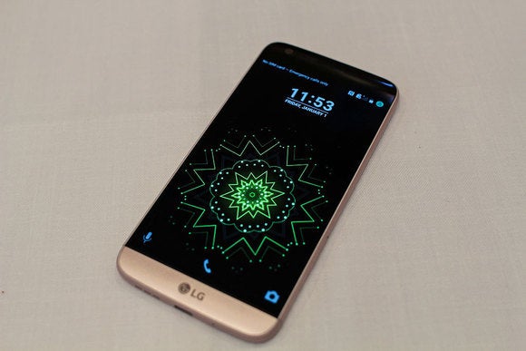
Of all the Android skins out there, ’s has typically been the least offensive. ke the G4, the G3 before it, maintains a relatively simple, easily distinguishable version of Android that pairs well with most third-party Android apps, though our pre-production unit of the G5 shows that there’s still a little bit of work to be done before it’s really in keeping with Material Design principles stards.
There are plenty more features to come in ’s UX 5.0, even detailed some of its new features in a press release over the weekend. But until the phone is officially released on April 1, here’s a quick trip through the G5’s interface what it looks like to tide you over before the launch.

If you’ve any familiarity with any of ’s smartphones these last few years, then you know about Knock Code, a security feature that allows you to set a “knock on” code to wake unlock the phone with a fingertap pattern.
th the G5, you’ll have to set a Knock Code with a minimum of six taps (the G4 set the minimum at three taps the maximum at eight), which can be frustrating to do when you’re attempting to quickly check on something, or just want to make a phone call. Thankfully, the G5 offers a rear-facing fingerprint scanner, so you can simply lay your index finger on that to get past the ck screen.
At the very least, the camera’s Quick unch shortcut in the bottom right corner of the ck screen works even when Knock Code’s defense is engaged.

The Home screen on the G5 (seen here on the right, compared to the G4’s Home screen on the left) is calm serene. I’ve planted just ten apps on the front page for quick access, though you certainly have room to add more.
en you glance down at the dock, you’ll notice there’s no button to launch the application drawer, that’s because there isn’t one. At least, not on our pre-production unit.

attempted to simplify its interface by completely eliminating the app drawer (as seen in the screenshot on the right), supposedly to help “minimize cognitive load” remove any confusion you might have had about whether or not you actually deleted an app from the device. But if anything, I think the combination of application icons splayed everywhere widgets on the Home screen will create even more of a mental overload.
The good news is the option for the application drawer will be back in the final version of UX 5.0. said in its press release, “Users who prefer the traditional style can download the Home & App Drawer directly from the settings menu on the G5.” On our pre-production unit (left), we only have two options. Upon release, G5 owners should see a third choice that brings back the app drawer.

Okay, so this feature has me scratching my head. The G5 lets you reinstall any application you’ve recently uninstalled for up to 24 hours after you’ve dragged the icon to the trash. It remains disabled during that period of time.
I don’t know that I’ve ever accidentally uninstalled an application—except in a fit of rage over how much it slowed down my smartphone (Sorry, but I hardly used you, ze). rhaps this feature exists solely for those users who make emotional decisions regarding their applications.
Anyway, you can bypass this feature entirely if you go straight to the Settings panel to uninstall the app. It’s also unclear if will offer this in the final version of UX 5.0.

Those of you who relied on the G4 (seen here on the left) or G3’s multitasking features will be bummed to learn that has removed dual-window support from the G5 (pictured on the right). It’s also done away with its Q Slide applications, which were a number of small utility apps that lived in the Notification shade.
However, it added a new nning feature to the Recent Apps screen that allows you to pin an app so that it’s never cleared. I suppose that’s helpful if you’re cycling back forth between applications, but I would have much rather had the dual-window feature.

There’s nothing that grinds my gears more than an inefficient Notifications panel. Thankfully, that’s not the case with the interface on the G5, seen here on the right. shifted over from neon buttons on a dark background motif (as seen int he G4 screenshot on the left) to a color combination that’s easier on the eyes. You can also long-press on a menu item in the Quick Settings to go to that particular option in the Settings panel.

It’s nice to see that also did some spring cleaning in the Settings panel. It’s been pared down to a stoic, black–white aesthetic, as you can see in the G5 screenshot on the right. I like it in st view, but you can choose to have it divvied up by sections if that’s how your brain works.

The G5’s camera application might look barebones, but it’s so feature-packed that everything had to be compartmentalized. You can choose between a Simple mode, seen here on the left, which lets you automatically snap a photo by tapping on the screen. There’s also an Auto mode, on the right, which displays all the basic features of the G5 camera, including the ability to shoot a norama, e-pse, or Slow-Motion video. And like the G4’s camera application, there’s only a Back button present, so that you don’t accidentally hit the Home button while snapping a photo.
There are a few other camera effects as part of ‘s new camera app, including a Film Effect, which adds an analog feel to photos, the ability to pinch the screen to switch between the stard 78-degree lens shot a 135-degree wide angle shot.

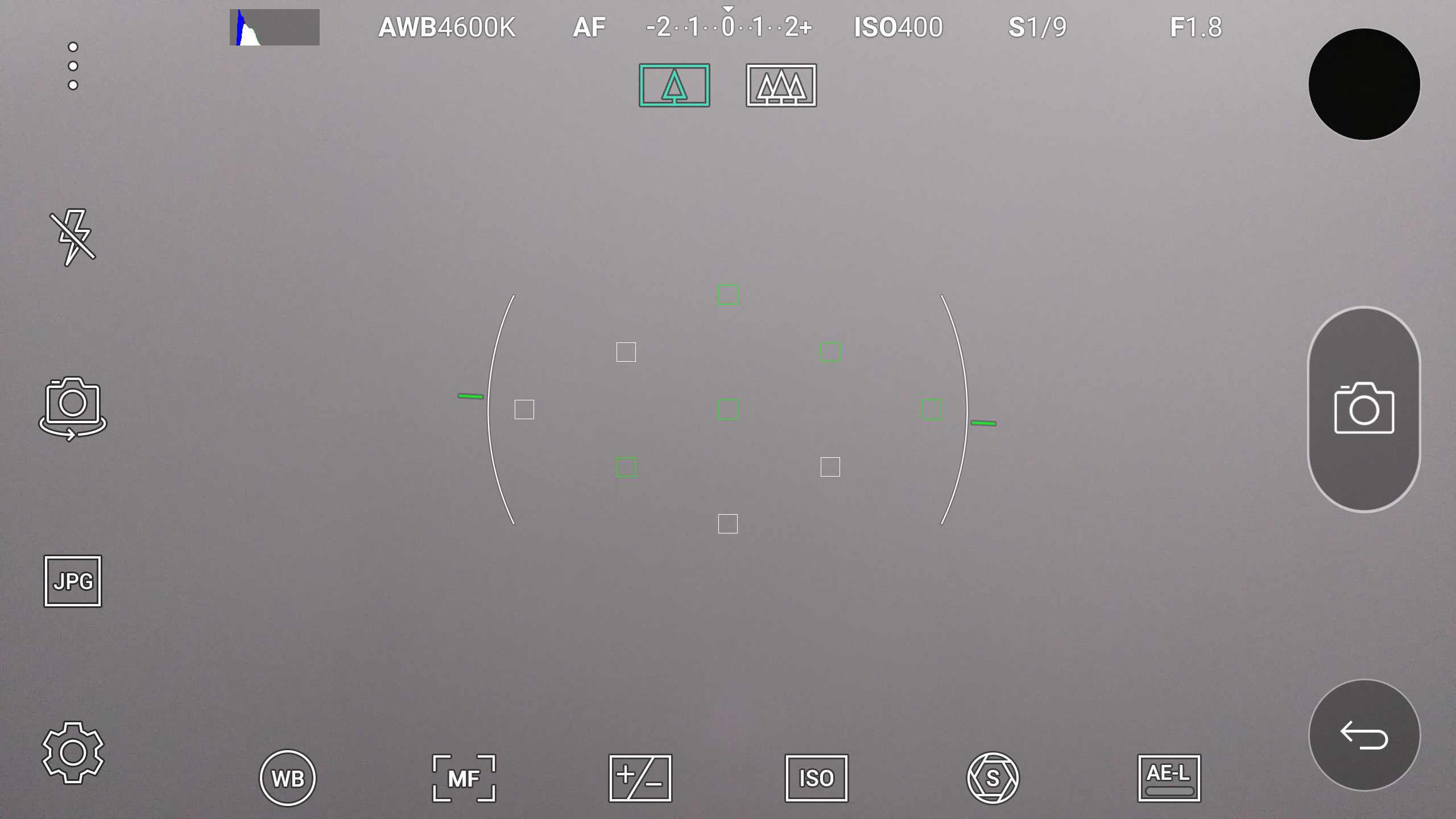
also brought back its infamous Manual mode to the G5, this time it polished up the icons to make them appear more modern.

Image by Straus
There’s more to UX 5.0 on the G5, but we can’t fully get into what’s changed until we receive our finalized review unit. If you’re wondering how the phone performs, be sure to check out our performance preview of the G5, if you’re curious about what will be new with UX 5.0, be sure to check out ‘s promotional video.


