Our G5 didn’t come with any Friends modules, like the Cam us or Hi-Fi us. It’s not even a reviewable unit— cautions it’s “pre-production preview” hardware, the user experience could be different in the final shipping version. And on top of all that, we got the pink iteration of the G5. Too bad we ran out of Hello Kitty stickers, because they’d look perfectly at home on this phone.
Yeah, the G5 I’ve been using for the last 24 hours comes with a few caveats—but none of them are serious enough to prevent me from drawing some early conclusions. has done a lot to reimagine its flagship Android phone, while not all of its design decisions are successful, they’re all bold inspired. Indeed, in this age of Android samey-sameyness, we have to give props for relentless innovation.
 Straus
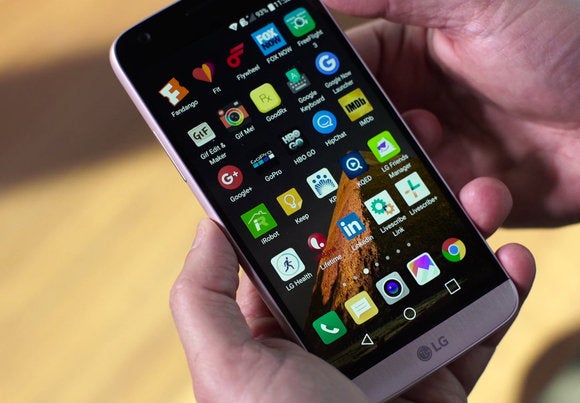
th 554 pixels per inch, the 5.3-inch display looks great. But we lament ‘s decision to ditch the Android app drawer.
Stunning new industrial design
st year, I used the G4 for about five months as my daily driver, so I’m fully versed on that phone’s strengths weaknesses. As such, the G5’s unibody metal shell emerges as ’s biggest improvement.
Sure, I sort of miss the G4’s funky leather back-panel. Ditto the G4’s more angular ( interesting) body lines. But there’s no disputing that finally has an expensive-looking, premium-feeling smartphone in the G5. The “microdized” metal surface has a soft, almost glowing luster. And with just the hint of texture to it—a certain, undefinable toothiness—the G5 feels a bit more grippy than its arch-rival, the Samsung Galaxy S7.
 Straus
The G4 (left) has character thanks to its leather back panel, but that material picks up dirt, the entire look feel can’t match the panache of the G5 (right).
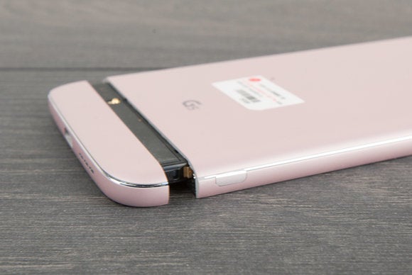
The move to a unibody construction certainly wouldn’t have happened if hadn’t first overhauled the phone’s approach to battery swaps. The ability to replace a dying battery with a fully juiced battery has long been an selling point, the G5 makes this operation even easier. Instead of prying off the back panel with a credit card, fingernail or spork, now you just press a button on the G5’s side, wiggle out the 2800 mAh battery module, then pop in a fresh cell.
Removing the battery module isn’t as easy as, say, ejecting an SD card from a card reader. It does require a bit of negotiation. But do you really want it to be much easier? It’s not a headphone plug or power cable. It’s a battery, needs to stay locked down under challenging circumstances. The bottom line is I’m impressed by the clench muscularity of the battery lock. I think it will survive many more drops than than the G4 ever did. The new clamping scheme also speaks well for the G5’s Friends accessories when those eventually arrive.
 Rob Schultz
This is where the battery section snaps into the body with a confident click. Note the release button on the side.
Accurate fingerprints, barely on display
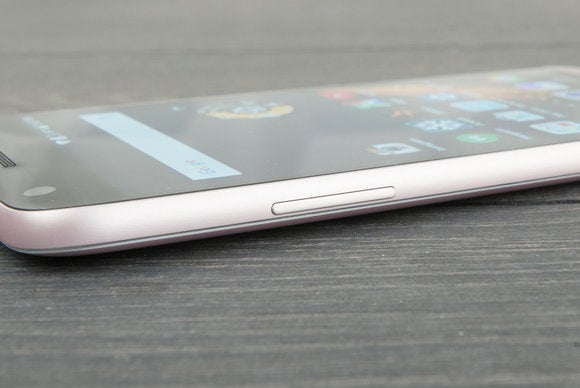
ong with the new metal body, moved its volume rocker off the back panel, onto the side of the phone like a proper piece of consumer electronics. The power button remains in back, but that’s perfectly fine, as it now integrates a fingerprint sensor. You can still unlock your phone with ’s fun-to-use Knock Code feature, but I’ve been finding myself using the fingerprint reader instead. It’s at least as fast accurate as the sensor on the Nexus 6 though the sensor itself is notably smaller than Huawei’s.
The upshot? Both the new volume rocker fingerprint sensor bring ’s flagship line firmly into 2016.
 Rob Schultz
The volume rocker in its new happy home.
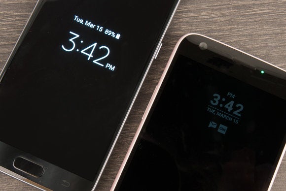
Unfortunately, I can’t sing the same high praise for ’s ways-On display. This feature shows you the current time (ostensibly) notifications, even when your phone is sleeping. says the hit on battery life is minimal, using just 0.8 percent of battery capacity per hour.
l that sounds great on paper, but the ways-On Display is so dim, I found it to be almost useless. The idea is that the G5 will show you easily grokked, glanceable information when the phone is sitting on your office desk. But the screen is almost illegible, instead of seeing full notifications, all you get are icons of the apps that need your attention.
 Rob Schultz
An always-on display is great in theory, but ’s application (right) is too dim to be useful—at least compared to Samsung’s almost identical feature.
The bottom line is that Samsung’s always-on feature is much brighter, the Ambient Display feature built into pure Marshmallow phones (like the Nexus 6 reveals much more detailed notification information. Hopefully will address these issues in the final shipping version of the G5. If nothing else, it would be nice to have a brightness control for the ways-On Display—assuming thinks the average smartphone user can be trusted with such fearsome power.
Bye-bye app drawer, hello wide-angle photos
Another disappointing change is ’s decision to ditch Android’s app drawer, which I’ve always found essential for accessing recently used apps running searches for apps. explains its decision: “Managing apps has become more more complicated. The G5 integrates the previous home screen app drawer to enable users to keep their apps intuitively organized, easy to find, use. The integration is expected to provide a more straightforward approach to app management.”
Except that it doesn’t. Or, at least it hasn’t over the last 24 hours of testing.
 Straus
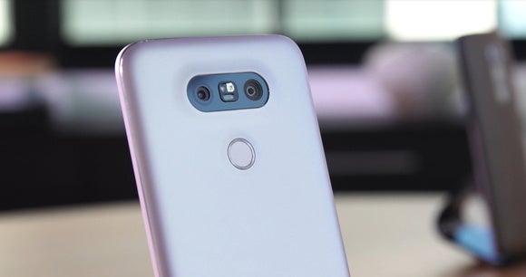
th dual cameras a fingerprint sensor on the back panel, is moving its flagship phone line forward with new tricks.
For what it’s worth, you can now organize your home screen apps by alphabetical name or download date. I haven’t found these sorting controls to be a fair replacement for the app drawer, but, hey, makes them available. And on the plus side, you can ditch ’s home screen entirely, pick the Now uncher, which keeps the app drawer intact. exposes this launcher directly in a Select Home setting.
Other interface changes can be found in the camera app— they’re big, big changes.
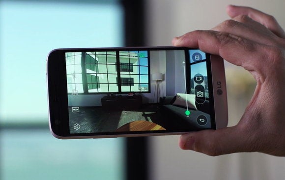
The G5 comes with two rear-facing cameras. The main camera has an f/1.8 aperture, shoots 16-megapixel images with a relatively traditional 78-degree field of view. But let’s say you want a wider angle shot. t’s say you want to get more people into the frame, or want to shoot a sweeping vista. Simply by pinch-zooming in the camera preview, you can automagically switch to the second camera. It has a f/2.4 aperture, shoots 8-megapixel images in a 135-degree field of view.
 Straus
Here we see the wide-angle rear camera in full effect with a 135-degree field of view. Note the slight distortion on the edges of the image. At the very top of the preview interface, you can also see how the wide-angle icon is lit in green.
I haven’t done any serious photo testing (remember: we’re looking at a pre-production preview unit). Still, I can see people using the second camera—its poorer specs notwithsting—for certain situations. I also give props to for continuing to deliver the best software camera controls in the smartphone space. (Because, yes, all the amazing manual cameras controls that made the G4 so great—including manual focus, ISO settings a 30-second shutter speed—remain in the G5).
In the image above, note the little green bar toward the bottom of the zoom slider. This is the point at which one camera hs off duties to the other. en you’re pinch-zooming, the software also “catches” at the point of the camera transition, requiring extra pressure before you make the switch. See, it’s the little things that separate great design from merely good.

The dual-camera p-Out cture mode is probably best avoided… unless you’re rushing to complete your 6th grade class project on ugly things.
OK, so that’s the basic dual camera concept. But it can also be used with more malevolent intent. A new p-Out cture mode let’s you combine two images taken with both cameras on a single click. The interior image comes from the wide-angle lens. The exterior image is shot by the stard lens, here you can apply all sorts of special effects. BUT SE DON’T. st look at the screenshot above. It’s worse than Snapchat.
Early benchmarks, with so much more to come
Once again, I have to remind you that we tested a pre-production preview unit. The final user experience could change. Still, we did run some benchmarks, found that from a pure performance perspective, the G5 ran in the same ballpark as the Galaxy S7, which shares the same Qualcomm Snapdragon 820 processor.
Actually, it’s perhaps unfair to say they were in the same ballpark. They were practically sitting in the same seat.
In the 3D Sling Shot OpenGES 3.0 test, the G5 mustered a score of 3276 to the GS7’s 3315. In the 3D Sling Shot OpenGES 3.1 test, the G5 hit 2530 to the GS7’s 2554. In the rk rformance test, the G5 hit 5780 to the GS7’s 5774.
These are essentially 1 percent deltas. Or less. ’ll do more testing with the final review unit, along with the all-important battery rundown test, which is what really matters if you’re a typical smartphone user. Regardless, the G5’s interface was speedy as hell, everything felt faster than my Nexus 6running the Snapdragon 810.

The Cam us accessory adds manual camera controls a second battery to the G5.
tells me that we should see final hardware in the next two weeks. Even better, I’m told they’ll be shipping two of the Friends accessories—almost certainly the Cam us (which mates manual camera controls a supplementary 1200 mAh battery to the G5’s chassis) the Hi-Fi us (which mates a Bang Olufsen-powered digital-to-audio converter for a richer sound experience).
These could be the truly useful innovations that adds to the smartphone scene. Or they could just be expensive add-ons that only look good on paper. But, hey, whichever way they go, they’re bound to be interesting. Again, we have to give kudos for thinking big rolling the dice.


