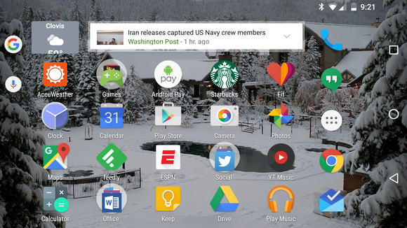
Updated 1/14/16: Icon normalization has been removed in a small update from version 5.8.45 to 5.8.47. The feature may have gone live prematurely, as there was no toggle for icon resizing in the settings.
As we’ve pointed out before, ’s apps are always a work in progress, particularly on Android. If you’re running the beta version of the app, an update to version 5.8.45 brings some cool new tricks like an auto-rotate home screen feature more uniform app icon sizing.
This before–after GIF shows you how the launcher now reduces the size of apps with oversized icons in order to give a more consistent, grid-style layout.

th icon normalization, the sizes are automatically tweaked to give a more consistent look.
The Now uncher will do this automatically once you update the app, provided you have the launcher installed, too.
The other new trick is an auto-rotate feature, which reformats the home screen layout when you turn your device sideways.

ile the auto-rotate feature is rather useful, widgets may not resize all that well.
This can be turned off if it’s not to your liking. From the app go to Settings > Home Screen > low rotation toggle it off. You may find some widgets don’t hle this new layout all that well. Since this is a beta release, expect developers to find workarounds for this weirdness.
The impact on you: The app icon resizing will bring some needed smoothness to your Android home screen. Developers have more freedom on Android than iOS in how their app icons look, but that has lead to home screens that look too crowded. The next upgrade needs to find a way to make the widgets resize better when switching to lscape mode for a more optimized experience.


