
enever I get my hs on a new operating system, I get just as excited by the small tweaks as I do by the major talking points. And Android M doesn’t disappoint: though it looks like llipop on the surface, it comes packed with all sorts of refinements additions that promise to make your Android experience that much more enjoyable. Here are 19 to check out in the developer preview.

The lock screen received a slight refresh in Android M: The text used for the clock is bolder than it was with Android llipop. It’s a very minor change, but you may find the heavier text to be easier to read at a glance.

The notification panel on the lock screen was a little wonky with Android llipop, as ’s noted—it basically showed you what you were already looking at on the lock screen itself. Android M improves on things somewhat—instead of merely showing another instance of your notifications, it’ll open the quick settings panel instead. Your notifications will slide down appear below the quick settings panel.

apparently realized that people don’t make phone calls as much as they used to: The dialer shortcut on the lock screen has been replaced with a shortcut to Now’s voice search functionality. Simply swipe from the lower left corner to start a voice search.
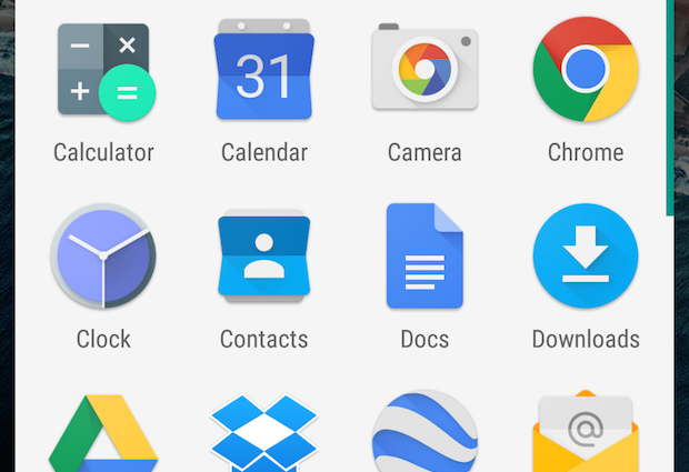
The app drawer gets an overhaul in Android M. First off, it’s now a scrollable pane rather than a series of pages. so, apps are grouped by which letter of the alphabet they start with, which makes it a little easier to find the app you’re looking for. These changes may be a bit jarring for long-time Android users, but they’ll make finding apps that much easier for everyone else.
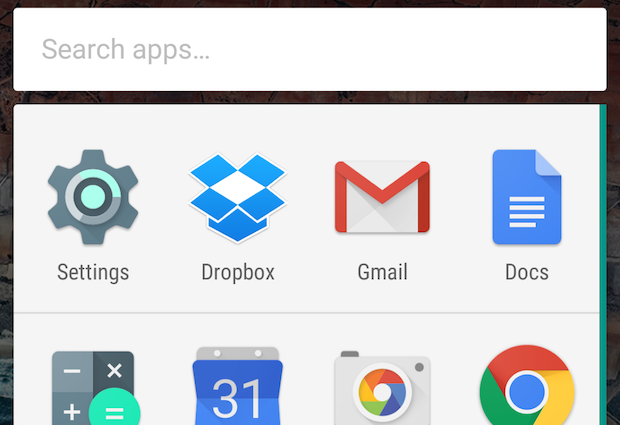
The app drawer has another pair of tools designed to make finding apps easier. The first is a quick-access bar that shows your four most frequently used apps. This panel also appears when you use the search box on the home screen or Now screen.
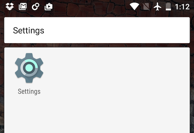
so new is a search box in the app drawer, so you can quickly easily go to the app you want to use without having to scroll through the list.

Uninstalling an app on Android M no longer requires you to go digging through Settings: Simply drag an app to the homescreen, then to Uninstall. Similarly, you can view app info or remove an app from a folder by dragging an app’s icon to the appropriate comm.

How often have you wanted to temporarily lower your ringtone notification volume, but still keep blaring your music at full blast? Android M now comes with separate volume control sliders for media playback notifications. You used to have to set these individually in the Settings menu.

The Share menu gets a new look in Android M. Instead of a traditional list of menu items, it now displays sharing options in a grid of icons.

Have you ever found yourself puzzled as to why Settings—where you would go to change your preferences for various services—lived in a separate app instead of, you know, in the Settings app? Under Android M, Settings live within the Settings app: st go to Settings > .

In the first Android M developer build, a new setting tucked away in the hidden developer options let you switch from llipop’s generally light-colored theme to something less glaring. In the second developer build, though, the dark interface theme is nowhere to be found. It may reappear in a future build, however, so watch this space.
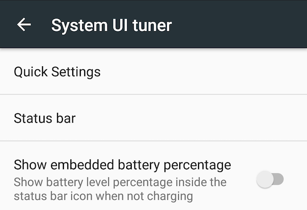
A hidden developer tool called SystemUI Tuner lets you tweak various aspects of your phone’s interface, like what appears in the quick settings drawer status bar. The demo mode may come in useful if you take screenshots for publishing online or in print—it hides extra icons in the status bar, shows a default time, shows your battery as fully charged.
Go to Settings > Developer options flip the SystemUI Tuner toggle to the on position. Go back to the main Settings screen, then tap SystemUI Tuner.

My favorite System UI Tuner tool might be the ability to customize Android’s quick settings drawer. Tap Quick settings, rearrange quick settings options by dragging dropping the icons.

Android llipop has a battery-saver mode that you can switch on to save precious power when your battery gets low. Android M builds off of llipop with an enhanced “doze” mode , which limits certain background tasks when your phone’s been inactive for a period of time.
If you want all background tasks to continue for a given app, though, you can turn “doze” mode off on a per-app basis. Go to Settings > Battery, then go to the Options menu (the three dots in the upper right) ta Ignore optimizations. Tap the downward-pointing arrow, then tap l apps. Tap an app’s name, then toggle the Ignore optimizations slider to the on position.

If you dislike the so-called “heads-up” notifications that slide over on-screen content in Android llipop, Android M is here to rectify the situation—at least a little. To turn off heads-up notifications on a per-app basis, go to Settings > Sound & notification > App notifications. Tap an app you no longer want heads-up notifications from, then toggle the low peeking switch to the off position.

Android’s Notification iority Downtime features for silencing notifications got some love in Android M, as well as a new umbrella name: Do Not Disturb. New granularity lets you set different quiet hours for weekdays weekends, lets you set one-time notification-free periods for events—you can even set your phone to automatically silence all notifications when you accept a calendar invitation.
The quick settings drawer’s new Do Not Disturb item has a few tricks worth checking out. th it, you can also now toggle Do Not Distrub on or off, set a duration, specify which notifications you want to see.

You might already know that you can have your phone use nearby -Fi hotspots to improve its location accuracy, but in Android M, you can set Bluetooth to improve G accuracy as well. Go to Settings > cation, then tap the Options menu (the three dots), then tap Scanning.
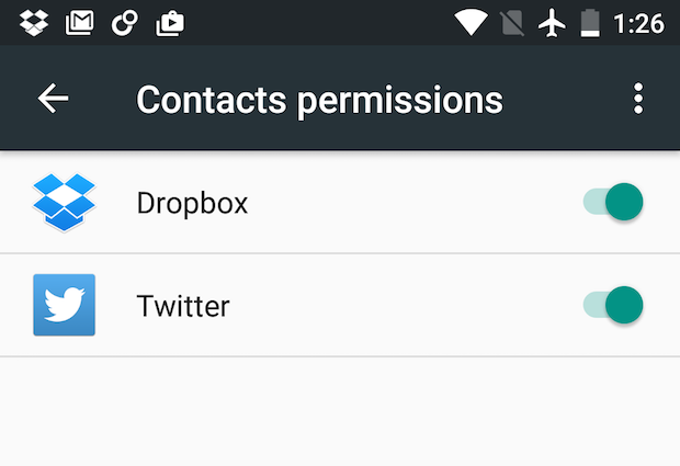
nt to see which apps have access to your camera or microphone? You can easily do that in Android M. Go to Settings > Apps, tap the gear icon in the upper right corner, then tap App permissions. From there, you’ll be able to to see which apps have access to what— revoke permission if you want.
By default, this view shows only third-party apps with access to your information. To show bundled apps services, tap the Options button (the three dots in the upper right), then tap Show system.
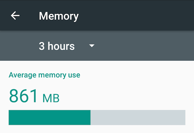
The Memory Manager screen gets a refresh in Android M, provides an at-a-glance view of how much memory each app uses up on average, as well as their maximum memory usage. go to Settings > Apps, then select Advanced from the Options menu (the three dots). Tap memory to get an overview of system memory usage; tap on any app to get more details on that app’s memory use.

Android M has one more change that promises to improve app management: a new, one-stop shop for setting default apps for various tasks. Using the new Default Apps settings pane (Settings > Apps, select Advanced from the Options menu), you can change your default browser, phone app, SMS app. It’d be great to see more options in the future, it’s too bad this useful feature is buried in the Settings app.
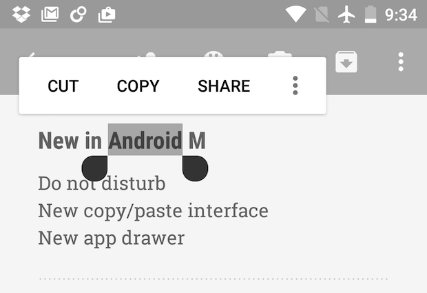
At I/O, showed off a new interface for hling text in Android M. This new interface was missing in the first developer preview, but it’s present in the second preview build.
Instead of the toolbar that appeared at the top of the screen, as was the case in prior version of Android, text editing comms now appear in a floating toolbar directly above the text you’ve selected. Tap the Options button (the three dots) to view more comms.
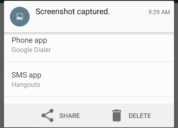
Have you ever snapped a screenshot only to realize that maybe you didn’t need it? Android M lets you delete it right away—just pull down the notification panel, look for the “screenshot captured” notification, then tap Delete. Tapping Share brings up a share sheet, so you can easily email the screenshot to someone or upload it to your Dropbox account.

In Android M, you can have your homescreen rotate when you flip your phone to lscape orientation—oh happy day! Unfortunately, this feature is buried in the Settings app. Go to Settings > > Search & Now, then toggle low rotation to the on position. The homescreen rotation feature respects your orientation lock settings, so it won’t rotate if you have your phone locked in portait orientation.


