shbullet gave its apps a substantial remodel on Tuesday that focuses on consistent design fewer steps to perform common actions.
The other big addition was a messenger feature, which can be used for casual chats or to discuss content you shared through shbullet.
 shbullet
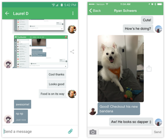
 shbullet’s new messenger feature is designed for everyday conversations to share content from the desktop.
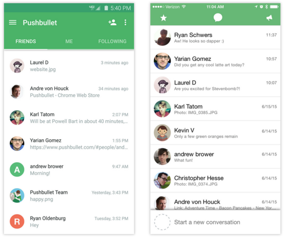
shbullet’s blog explains that the redesign keeps a similar look across the Android iOS apps, although there are sufficient tweaks to make them look native on their respective platforms. shbullet for iOS is consistent with Apple’s design scheme, while the Android version makes heavy use of ’s Material Design.
 shbullet
 The new messenger feature has a clean layout on both Android iOS.
The overhaul extends to shbullet’s browser extensions for Chrome, Safari, Firefox, along with native apps for ndows OS X (shbullet says the Mac app overhaul is still in the works). The desktop browser apps see a similar layout as the mobile versions to keep with the works-the-same-on-any-device philosophy.
shbullet exped drag–drop capabilities for sending files says pushes are now more reliable.
The impact on you: If you haven’t tried it out, this is a great opportunity to introduce yourself to shbullet. It adds a lot of different functionality to your device beyond just sharing files. The app includes customized channels so you can get push notifications about Android updates, Apple news, or other topics of interest. And because shbullet works as a cross-platform experience, you don’t have to fret about owning devices on multiple platforms.


