I’m struggling to underst Huawei’s strategy for making it big here in the U.S. Huawei president Zhiqiang Xu admitted in an interview with us earlier this year that U.S. consumers tend to buy their phones on-contract from their carriers, buy more premium phones than other countries. So then, why is the company’s latest phone to come to our shores, the te, an unlocked, carrier-free mid-range phone?
That’s not to say Huawei’s te doesn’t offer some perks. It packs in a good deal of hardware for only $250. It has a 5-inch 720p HD screen, an octa-core Snapdragon 615 processor, 16 GB of storage, 4G E connectivity on T-Mobile AT&T’s networks, a 2200mAh battery pack. This perfectly affordable mid-range phone also looks more high-end than some of its competitors. But I would have expected Huawei to try on a different strategy besides the unlocked route, I was hoping for a phone with better software.
It looks more premium than it is

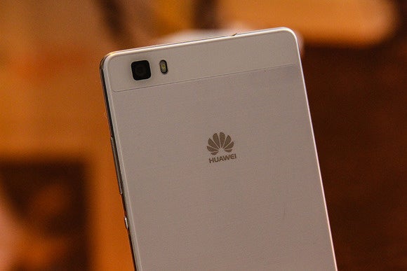
The te is sleek stylish.
st because you’ve settled for a mid-range device doesn’t mean it has to look like one. The Huawei te looks great for a $250 phone—so much so, that all I want to do is gush about it.

It actually looks like it costs more than it does.
Huawei has always been particularly focused on phone design—it’s what helped it gain marketshare overseas in the first place—so it’s no surprise that the te is an attractive device. It features a sleek chassis, a 5-inch display covered by edge-to-edge glass, a chrome trim that makes the phone look more costly than it really is. It also feels good in the h—as good as my gold-toned Samsung Galaxy S6 ge— though it’s thin, it doesn’t feel slippery.

The edge-to-edge display is nice, too, though there’s some significant bezel on top bottom of the phone.
The current crop of mid-range devices offered in the U.S. are pretty lackluster when it comes to design. The Moto G, for instance, is a solid device, but its design is dated basic. The te, on the other h, looks like it costs more than it actually does.
A camera that hopes to compete with the rest
If this year’s spectrum of flagship phones have taught me anything, it’s that the camera is the second most important feature of any smartphone, after its overall usability. I’m embarrassed that, as Android users, we’ve made compromises in that particular department.

The lite’s 13-megapixel camera is capable, but is it capable enough?
I’m hoping the te doesn’t ask us to compromise. It has a 13-megapixel rear-facing camera a 5-megapixel front-facing one, the former of which is equipped with enhanced low-light capabilities an “l-focus” feature that lets you adjust the image focal point even after the photos has been taken. There’s even a quick-launch shortcut that starts up the camera directly from sleep mode. l those features sound helpful to have on h, but those things can also come from a third-party application. They don’t prove the true capabilities of the phone’s camera.
I didn’t have very much time in my initial hs-on with the device to really test its camera capabilities, we’ll delve into that when we review the phone. I did snap a few selfies, however, appreciated all the software features available to edit my face, as well as how quickly the camera launched snapped photos. It’ll be fun to take it around San Francisco to see how it really shoots.
Software that’s just a bit behind

How do you feel about bubble icons being a part of the interface on your Android device?
I’m annoyed by OEMs skinning the hell out of Android, though I’ve sort of resigned to the idea that it’s par for the course. (I know, that’s very Stockholm Syndrome of me, isn’t it?) Huawei could be worse about it. At the very least, its Emotion UI 3.0 software supports theming, so you can try on a bunch of different icon packs wallpaper pairings to find something else you’d rather look at.

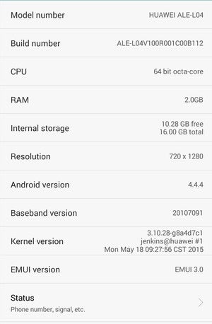
Oof. Android 4.4.4? In this day age?
One other thing I noticed: the Huawei te runs Android 4.4.4 KitKat. That means the phone is two software iterations behind on Android, which is absolutely not on par with how ’s attempts to shore up the platform. at’s worse: Huawei attempted to make parts of the interface look like llipop, even though it’s clearly not.

They look like llipop navigation buttons! But they’re not.
I asked Huawei about this they replied that they’re working on its update strategy. I know some Android users won’t mind being behind on software, but with Android M having just been announced pushing forward on all these neat new Android features, how could an OEM dare to launch a phone that’s not even on Android 5.0? Do you really want to buy a phone from a company that is “working on its update strategy?”
uld you like a fitness b with that?

Another fitness b, in case you’ve already tossed aside the fitness tracking wearable you bought last summer.
Huawei’s joined forces with the fitness-tracking masters, wbone, on the Talkb B2. It’s a pretty basic fitness b that looks just like every other fitness tracker on the market, it works with wbone’s Uecosystem. The b is selling for $180 including all the basic fitness tracking features you’ve come to expect, like a step counter sleep tracking. I wasn’t particularly blown away by its feature set, nor its design, I’m beginning to feel like fitness trackers are the low hanging fruit of wearables for every manufacturer these days. The partnership is a win for Huawei, which will likely leverage this relationship to receive some clout with U.S. consumers.
Still waiting for the main act

It’s a really nice looking phone but the dated software seriously bums me out.
Huawei is attempting to carefully dip its toes into the frigid U.S. market, for the most part I think that’s a smart move. The U.S. is the second largest smartphone market in the world, though we don’t necessarily consume the way other countries do.
I’m a bit underwhelmed by the te its accompanying fitness b, however, I was hoping for a bit more fanfare. I’m struggling to underst what will be its major selling point. Does Huawei think I really want a heavily skinned Android device that’s behind on Android for $250? That’s still quite a bit of cash for a soon-to-be outdated product, especially without the promise of an update to Android M, which will be here sooner than you know it.
Maybe my review of the device in the coming week will inspire a different opinion. For now, I hope Huawei pays close attention to how this particular product performs takes notes on what it needs to do to resonate with U.S. consumers.


