is again tweaking the look of its mobile search results, now making it easier for fingers of all sizes to manage the interface.
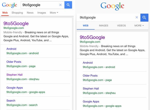
The latest retooling, spotted by 9to5, show Material Design-style tabs that push some information off the page in order to increase white space, make tabs easier to touch, bring the interface into line with ’s new look.
The results, which is only making sporadic appearances for now, follow ’s new guidelines for spacing out tabs. It’s part of ’s effort to make all its own products third-party apps on Android follow the new Material Design aesthetic.
 9to5
9to5 ’s mobile search results page gets several drops of Material Design (right) in comparison to the old interface (left).
The revamp also pushes the search query off to the left, means one less visible tab less results. However, the goal of Material Design is responsiveness, clarity, using enough space so you’re less likely to touch the wrong word or image on a mobile screen.
The story behind the story: search is still the company’s main cash cow, so is never quite satisfied to leave it alone. Recently we learned is going to add a “buy” button, so you’ll be able to part with your money right from the search results page. Other recent adjustments include highlighting site names bread crumbs over UR.


