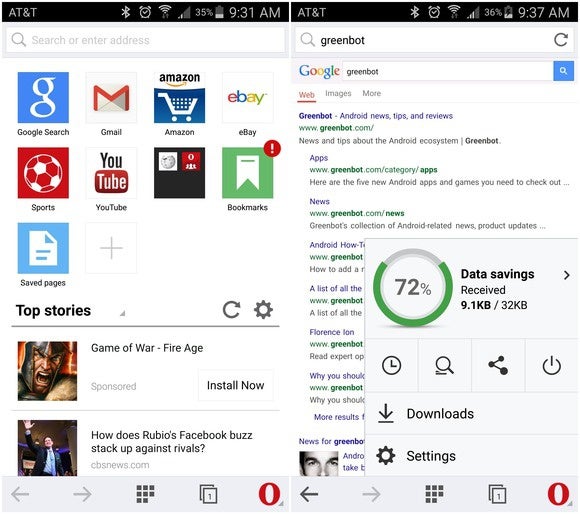
Opera Mini is getting a cleaner look while playing up how much data it can save you while browsing the web.
It’s not quite Material Design, but it’s a good visual overhaul that makes the speed dial screen a bit cleaner helps the overall interface fit in better with Android.
One of the browser’s claims to fame is that it saves you data by routing web content through Opera’s own servers, where it is optimized before being sent to your device. A button on the bottom right now gives you one-touch access to how much your data savings are.
Opera also now has a private browsing option, much like Chrome’s Incognito Mode. There are also new gestures, such as swiping up to initiate a search.

Opera Mini has a much cleaner layout with its newest update.
Some may not like the sponsored content in the homepage, which prompts you to download an advertised app. Other sites, such as ’s search page, could also use a more mobile-friendly makeover.
Opera Mini 8.0 is live in the ay Store.
y this matters: Chrome may rule its home turf on Android, but for the sake of competition keeping the platform open it’s good to see other companies still hard at work on their own browsers. Android developers have significant freedom in making an Android browser, whereas on iOS they’re restricted to using Safari’s rendering engine.


