Months after its official release, there are still dozens of popular third-party apps that have yet to adopt llipop’s new Material Design aesthetic. Evernote was one of those lagging behind, though today’s update brings those flat icons bold colors to the note-hoarding app.
Evernote’s interpretation of Material Design follows ’s new design paradigms almost to a tee. The app looks fresh clean, it fits in nicely with the rest of ’s suite of apps. It’s almost like Evernote is a native part of Android.
st like intended
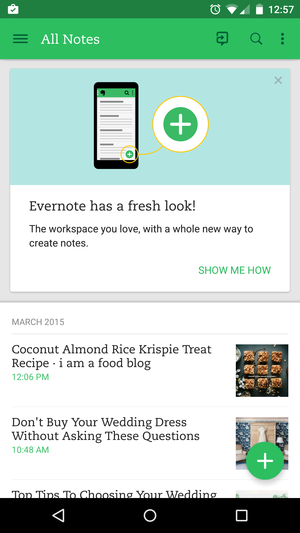
lcome to your new, improved Evernote.
en you first fire up the app, Evernote displays a Card-like alert at the top to remind you that you can email yourself a link to access your notes from another device. As you scroll down, you’ll see your notes in chronological order, from the most recent to the first note you pinned. Each entry is separated by month year.
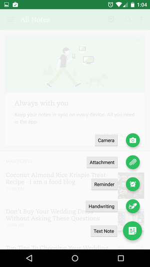
Evernote’s newly updated app uses Material Design’s pop out menu.
Since it’s been tweaked to match Material Design, Evernote for Android now uses the same plus sign symbol to add a new note. Tap it a menu springs up, allowing you to pick which sort of note you want to create. You can choose between snapping a photo, adding an attachment, or setting up a reminder, for instance.
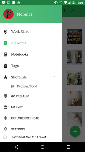
Evernote’s hamburger-style menu uses the same user icon motif as ’s apps.
There’s also a hamburger-style menu hiding to the left-side of the screen. Drag it out to switch between rk Chat or your various Notebooks. You can also access shortcuts for your favorite notebooks from this part of the app—mine is my Recipes notebook, for instance.
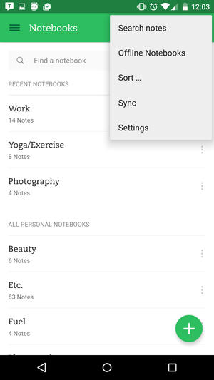
Need more options? The Settings are hidden behind the More Settings button, or you can access them from the hamburger-style menu.
Elsewhere, Evernote utilizes the same More Settings button as other apps that have abided to Android’s new design stards. From here you can search through notes, see which of your Notebooks have been synced for offline use, get quick access to the main Settings page.
It’s about time
There are still a heaping of apps that desperately need to upgrade to llipop’s Material Design, but those that have are better for it. llipop may not have been the smoothest of Android rollouts, but the Material Design aesthetic works. It’s bold, beautiful, easier to use, it makes the Android OS match. Now when you switch between a app Evernote, for example, you can use the same navigation scheme across the board. That’s exactly what intended in the first place.


