llipop is Android’s biggest release in over three years, but it feels like this is just the beginning. It’s packed to the brim with new features an improved user interface, it’s also the debut of a new design philosophy for Android. But it still feels like there’s still so much more work to be done.
I won’t be covering the newly redesigned suite of apps, since most of them were updated before llipop went live to everyone, they’re independent from the operating system. And like my Android 4.4.4 KitKat review last year, I won’t give it a score because Android is always changing, is frequently modified by device manufacturers.
Introducing Material Design
“Design wasn’t a focus of for many years,” ’s incipal Designer ley said at the Gigaom Roadmap conference in November. “Beauty…wasn’t one of the functional pillars of product creation.”
That’s been to its detriment, as it has made Android seem somewhat detached from the apps you’d use with it, woefully behind modern interface conventions. Applications like Gmail + looked vastly different from one another, at one point, the Dialer Settings app appeared to have been plucked from two entirely different operating systems.
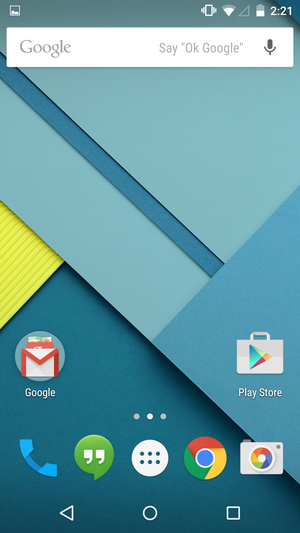
lcome to your new Home screen.
th llipop, it’s a whole new beautiful ballgame. Android has never looked as cohesive, functional, aesthetically pleasing as it does dressed with ’s new design guidelines, called Material Design. Its bold new color palette makes the interface pop, it nicely complements the decidedly plain design of Nexus devices. And since can’t control all of the hardware designs made by third-party manufacturers, it put together a universally pleasing software interface to go onto each device without that feels neither dull nor busy.

Apps like the Dialer app have all been made over to match the new Material Design aesthetic.
Android’s new design paradigm doesn’t rely solely on the new version of Android, either. You know that if you have a stock Nexus device you’ll get the whole kit caboodle, but even if you’re stuck with a heavily skinned or Samsung device, you’ll still have those redesigned apps that began rolling out months ago. Some aspects of Material Design—certain transitions animations—rely on technologies present in Android 5.0, but updated apps that stick to the guidelines will get most of the basics, even on older versions of Android.
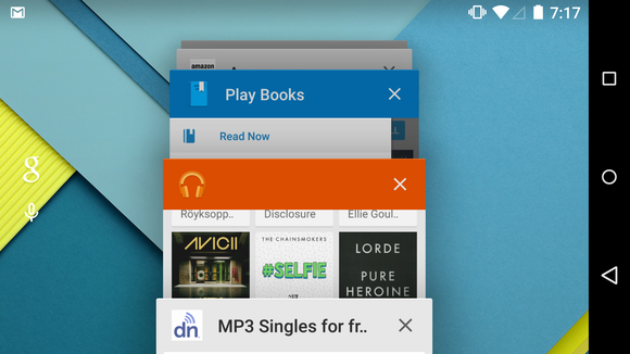
Shuffle through apps as if you were shuffling through a deck of cards.
Another aim of Material Design is to make it so that the interface has a physical element to it, which is why it employs what I call “shelving.” It’s very similar to the cards motif utilized in Now, where each panel sort of shuffles in an out as if you were hling a deck of cards. You’ll see this exhibited fully in the redone Notifications panel.
llipop’s animations
en the developer preview for llipop came out, there was some skepticism about whether or not its new animations would give users a headache, or whether they actually added to Android’s overall user experience. I think they’re a symbol of how much Android has matured since its beginnings.

llipop’s dancing animations.
ley described it as “a stage play…everything serves a purpose there’s actually a logical progression from one state to the next.” As you swipe down from the Notifications panel to bring up the Quick Settings, it feels like you’re unearthing a panel with very relevant information. And when you swipe it back up, it’s as if it’s going into its little sleeve, waiting for when you’ll need it again.
After switching back forth between KitKat llipop, I feel like the new animations are a much needed addition. The animations make you feel like you’re flowing from screen to screen, rather than statically tapping buttons panels waiting for the action. It also lets you know that you’re transitioning from one element of the interface to another, so that when you do go for that back button, you’ll instinctively know where you were last. Users want to feel like their device—especially a smartphone or tablet—is an extension of themselves.
Improved notifications sound profiles

dies gentlemen, your new notifications shelf.
Android llipop’s new Notifications shade is more than a just a shade—it’s essentially a shelf, with multiple layers of toggles information presented as you need it. Slide down once from the top for all of your most recent notifications, then slide down again to access the Quick Settings, which change as you use your device. (Yes, you can still go right to Quick Settings with a two-finger downward swipe.)
There’s no longer the confusion of having to slide down from just the right spot to get to the information you want—as with past versions of the Android tablet interface—or tapping another button to flip over to the Quick Settings. It’s also nice that there’s finally a dedicated button to turn on the rear-facing flash to use as a flashlight. I’ve tripped down the stairs too many times because my smartphone screen wasn’t bright enough to light the way, nobody should ever have to download a dedicated flashlight app.
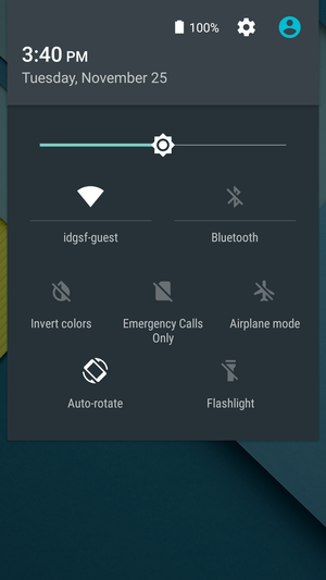
Easy to access Quick Settings are now available on the ck screen.
llipop also brings both Quick Settings Notifications to the ck screen. Messages will come through to the ck screen, unless you specify otherwise in the Settings panel, though it will require more than one tap before you can read it in its entirety or tap out a reply.

Use the new sound profiles to shut people up.
The volume slider has a new function now, too. You can use it to both adjust the volume change sound profiles. So if you’re in a meeting, just tap the volume rocker once then choose from either of the three profiles that match the importance of the meeting. You can even set how long you want to remain undisturbed.
There are downsides to the way things have been moved around. You can’t customize what goes into the Quick Settings panel, the button that dismisses all notifications disappears if you have too many notifications, filling up the entire screen. You won’t see the button to dismiss them until you swipe up a bit to consolidate the column. It gets annoying repetitive after a while.
ck screen widgets are no longer supported, so if you’re on an older version of Android, enjoy them while you still can. I figure the reason for their omission has to do with the fact that both notifications widgets on the lock screen would have made things too crowded. ck screen widgets never really caught on with the general public, anyway.
Stepping up Android’s security game
Over the years, Android has been constantly disparaged for simply not being secure enough, so packed llipop with a heaping helping of new security features to help curb this unfortunate stigma.

Use one of the Smart ck features to keep your device locked down in Android llipop.
First, added a feature called Smart ck, which lets you instantly unlock your device with things like Bluetooth. en you turn on your favorite pair of Bluetooth headphones, for instance, the device will stay unlocked, knowing it’s in good hs. There’s also the Trusted face feature, which is similar to the old Face unlock, but works a little differently. The idea is to encourage strong locking pins, passwords, or patterns by making them less of a chore.

If your device is already encrypted, Android will tell you so.
rhaps the best most essential security feature is llipop’s forced full-disk encryption. l new devices that ship with llipop will be encrypted right out of the box, though you’ll have to manually encrypt your device if you upgraded from an earlier version of Android.

If your device isn’t encrypted right out of the box, you’ll see this option in the Settings panel. Encrypt it!
th a reputation for insecurty that’s been following Android around for years, it’s no surprise that opted to make it matory for all of its users to have protected data, whether they want it or not. You should be cautioned, however, that Antech’s lab tests have revealed a significant drop in storage performance with encryption. I definitely see a performance improvement with a non-encrypted version of llipop on my Nexus 5 versus the Nexus 9 that has three separate guest accounts has been encrypted from day one.
Guest mode: for guests of your phone
I can’t tell you how many times I’ve had a rom stranger ask to borrow my phone at the train station (no, thank you). Or how many times a family member has grabbed my tablet to watch something on Netflix. The people in my life seem to think that my devices are free-for-all, but at least now there’s a full-fledged profiles feature on Android llipop that I can use to keep my nosy Mother out of my Facebook page.
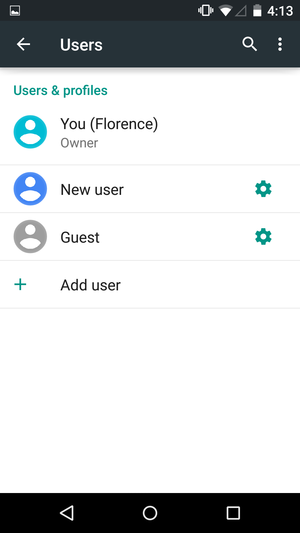
Got more then one set of grubby hs all over your device? Set up a guest account!
The new Users option lives in the Settings panel, it’s no longer limited just to Android tablets. If you share your phone with your kid, for instance, you can designate a profile for them where only apps that they’re allowed to use are displayed. You can switch to another user account from the notifications shade, it’s easy to do without it being too conspicuous.
There’s also a separate “n” feature that locks your phone to a single app. It’s perfect for hing your phone to a friend to watch a funny video or look at your photos without worrying about them posting to your Twitter account.
oject Volta’s lofty goal of improving battery life
oject Volta is ’s ploy to make Android more battery efficient. It’s a catch-all term for a collection of system-level battery features, including a Battery Saver mode which limits things like vibration, background data, display performance to help extend battery life when your device is on running on empty.
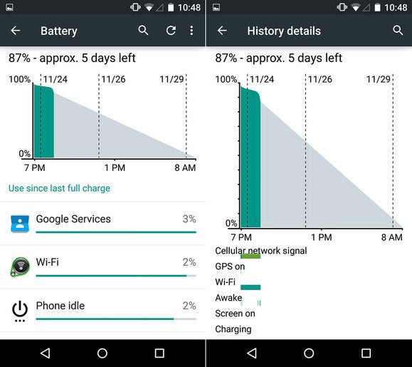
at’s up with your battery? You can check on it in the Settings panel.
llipop may be more power efficient than past versions of Android, but there’s still the third-party Android overlays forks to consider. This is something we hope to examine further at another time, when llipop has been more widely adopted.
A tablet interface in dire need of some T
Android llipop is a huge improvement over its predecessors, but that’s mostly limited to its smartphone interface, as its tablet interface has underdone a few too many makeovers that still make Android feel like a blank slate when it’s on a display larger than 7-inches.
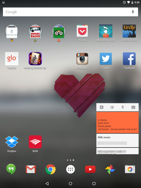
llipop on the Nexus 9 does not look or feel like a dynamic tablet interface.
I liked the Nexus 9, but llipop still looked out of place despite the tablet’s 4:3 aspect ratio. There’s so much empty space to cover, especially when a tablet is in lscape mode (the Nexus 10 actually fared worse). st versions of Android, like Android 4.1, at least utilized columns on larger screens.
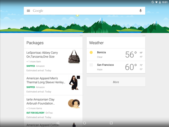
In lscape mode, there’s too much white space…
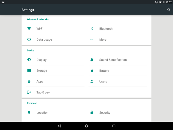
Even the Settings panel scales out to two columns, but there’s still white space on each side that could be utilized some other way.
If only would combine its smartphone interface Chrome OS into some sort of working tablet interface that didn’t just feel like a scaled up version of Android. It is high time tried something new with its mobile tablet interface. I’d even appreciate the addition of a Multi ndow mode, like the one featured on Samsung’s Touchz. At least then it would feel like was more committed to turning Android tablets into bonafide productivity devices.
An upgrade worth waiting for

llipop makes me want to say the most cliche thing ever: “It’s the sweetest version of Android yet!”
llipop is a clear example of how is changing directions for the better. Utility user experience is still a major concern for the Android team, but they now seem to be just as concerned about how their product looks feels as they are with its new technical features.
But while stock Android 5.0 is nice to look at, I’m more interested in seeing how HTC, Samsung, Sony, will end up interpreting it. ll they adopt Material Design to the fullest by following the new guidelines on their custom interfaces? Or will they stray away, throwing shade at ’s attempt to unify the Android ecosystem’s look feel? That’ll be the real test of Material Design’s effectiveness, because even though llipop is the most beautiful version of Android yet, it might not resonate with consumers if manufacturers stray too far from ’s design guidelines.


