Android 5.0 llipop is making its official, out-of-beta debut next week. It’s exciting not only because it’s an entirely new version of Android, but because it introduces a host of design changes that will make ’s mobile platform easier to use prettier to look at.
But for Material Design to really take off, developers have to follow ’s design guidelines, which the company reposted Tuesday in a hy checklist format. It encourages those who haven’t yet made the switchover a chance to do so before llipop hits devices.

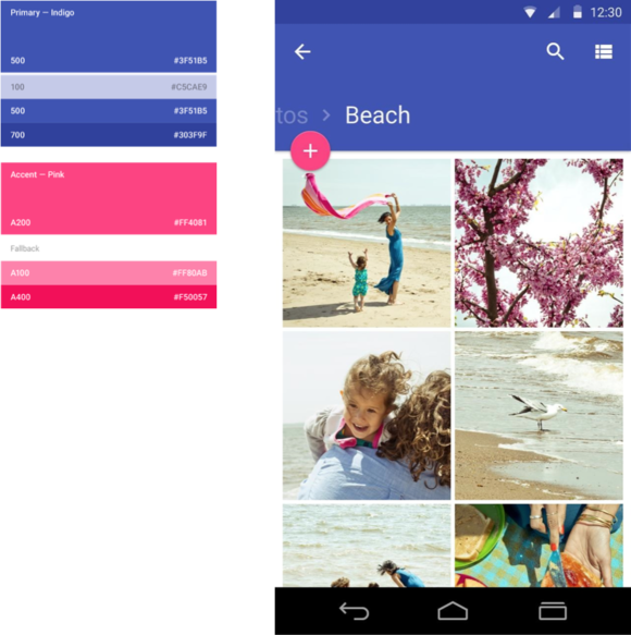
wants rich, bold colors to be present on all third-party apps.
reminds developers that there are four basic design principles to follow: Apps should have tangible surfaces; a print-like aesthetic; authentic motion; an adaptive design. Those four concepts may sound like throwaway buzzwords, but they’re actually all pretty straightforward. For instance, for an app to mesh with Android’s new design philosophy, it just needs to employ shadows varying surfaces, use bold, engaging colors.

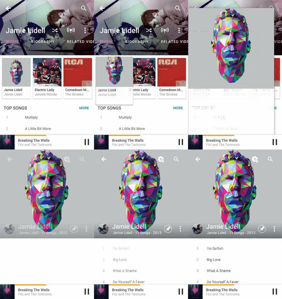
’s idea of an intuitive transition.
As for “authentic motion,” it imbues the interface with continuity, which is important when you’re navigating through screens with just a back button. It’s also more intuitive to see individual windows— how they move relative to where you are within an app—rather than simply shuffling back forth between screens with no inkling of where you came from.

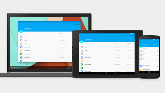
One size to fit all the screens.
Over the years, some third-party Android developers have been particularly lax in following ’s design guidelines, which is why is using llipop Material Design as a call to action. It’s time to get serious about design, people! Again.
y this matters: You’ve been hearing about Material Design for months now, you’re probably exhausted by all the explanation but no actual implementation, save for a few apps here there. th Tuesday’s blogpost, is practically insisting that Android developers follow its new guidelines, or else Android llipop won’t have a cohesive design.
The app makers that follow through will help Android improve its reputation—no longer will it be the fragmented, disjointed mobile interface it’s been accused for so many years. And no longer will be accused of being soft on lazy developers.
But Material Design evangelism efforts like Tuesday’s blog post are also good news for you, the user. You’ll be the one most affected by these design changes, will reap the benefits of a better-looking, easier-to-use mobile interface.


