Motorola was supposed to have this one in the bag.
en the first Android ar watches showed up in early ly, the near-unanimous opinion among reviewers was that you should wait before buying anything. A better-looking smartwatch called the Moto 360 would arrive by late summer, with its round face slick metal frame, it would make Samsung’s Gear ve ’s G tch look like awkward nerdware.
But Motorola blew it. The Moto 360, available now for $250, could have been far away the best Android ar watch of the year, but it’s dragged down by terrible battery life, weak performance hair-pulling glitches. If you want a truly great Android ar watch, you’ll need to keep waiting.

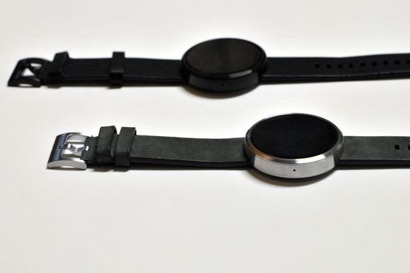
Tastes vary, but , our editor-in-chief, finds the all-black Moto 360 to be the more sophisticated design.
ke other Android ar watches, the Moto 360 pulls in notifications from an Android phone, prompts further action. You can reply to text messages by voice, control your phone’s music playback, get simple navigation directions, more. The platform also supports some basic voice queries, such as asking what the weather will be, pipes in information from Now. The system has its flaws, but it’s a helpful way to keep tabs on your digital life without constantly fishing into your pocket.
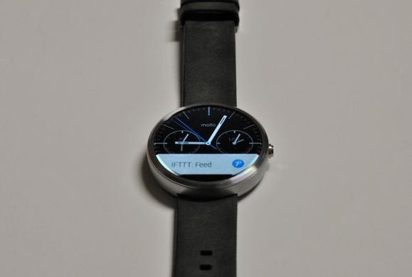
From afar, the Moto 360 could be the best-looking smartwatch on the market. Between its round design, metal trim, leather strap crown-like button on the side, the Moto 360 approximates the look of an actual watch. And with the right wrist size some business attire, you might be able to carry it off.
On my skinny wrist, however, the Moto 360 sts out a little too much. The watch body is about a tenth of an inch thicker than Samsung’s Gear ve—the slimmest of all currently available Android ar watches— the way the skinny strap runs through the bottom of the watch body only emphasizes the bulky frame. Of course, personal tastes can differ, but the lack of a smaller, slimmer version makes the Moto 360 a non-starter for many potential users.
At least it’s comfortable, though. Motorola makes a big deal about how its leather straps (from Horween) add a touch of class, but the real advantage is how good the watch b feels on the wrist. You get none of the stickiness sweatiness that comes with Samsung’s plastic strap or ’s rubber b. (Motorola is also selling a metal b for $80, but I haven’t tried it.)

Even if you’re satisfied with the Moto 360’s look feel, the watch’s battery life is a problem of deal-breaking proportions. The only way it lasts through a 16-hour day is if you disable the ambient screen setting, which completely turns off the display until you deliberately twist your wrist toward your eyes. Unfortunately, the Moto 360 has trouble detecting this gesture every time, so you’re often left tapping on the screen or crown instead. This defeats the purpose of even having the watch, as you can no longer just glance down at the display to see what you’ve missed.
Turning on the ambient screen setting—which keeps the display dim but not completely off—creates even bigger problems. The Moto 360’s ambient mode is much harder to read compared to the Samsung Gear ve the G tch, especially at off-axis viewing angles, the hit to battery life is significant. In my testing, with ambient mode turned on, the watch never had more than 15 percent battery life left after 12 hours. And after long stretches of inactivity, sometimes the screen turned off anyway.
It’s possible that the Moto 360’s four-year-old Texas Instruments processor is to blame for the weak battery life, but that ancient chip seems to cause general performance issues as well. ile Android ar runs fairly smoothly on the Qualcomm Snapdragon processors of other watches, the Moto 360 frequently suffers from stutters dropped frames.
I also ran into one other maddening technical glitch: On several occasions, the Moto 360 would half-lose its connection to my smartphone (a second-generation Moto X, also on loan from Motorola). I’d still get incoming notifications, but my attempts to interact with the watch—for instance, by deleting an email or issuing a voice comm—would bring up a “disconnected” error. Only turning the phone’s Bluetooth off on fixed the problem.
This is all so frustrating because of how much the Moto 360 does right. If only the watch could make it through the end of the day, because the included wireless power dock is as effortless elegant as it gets for nightly charging. st place the watch on the st, the screen quickly converts into a dimly lit clock for your nightst. In the morning, you just grab the watch by its strap slap it back on your wrist.

That black strip of missing pixels at the bottom continues to be annoying for various reviewers.
Then there’s outdoor legibility. ile other Android ar watches are all but impossible to read in direct sunlight, the Moto 360’s back-lit D display gets bright enough to shine through, it uses an ambient light sensor to dial brightness down in darker settings. (On the downside, the sensor display circuitry are the reasons for the Moto 360’s black bottom strip, which creates an imperfect circle on the display. That said, I’m not as bothered by it as other reviewers.)
The Moto 360 also includes an optical heart rate monitor that’s a lot more reliable useful than the one on Samsung’s Gear ve. ile Samsung’s heart rate results can be all over the map unless you stay perfectly still, the Moto 360 repeatedly spit back consistent results. More importantly, the Moto 360 keeps tabs on your heart rate at all times, feeds the data into an activity monitor that encourages at least 30 minutes of activity per day. It’s a far more practical use of the technology than Samsung’s highfalutin pulse checker.
So what’s an Android enthusiast to do? If you want to see what ’s smartwatch platform is all about right now, I still recommend the Samsung Gear ve. ile it isn’t as stylish as the Moto 360, you can actually use for a full day, you won’t run into technical snafus either. It’s also $50 cheaper.
As for Motorola, my hope is that the company has the tenacity to try again— quickly, even as it hangs in novo’s acquisition limbo. Except for maybe the G tch R, there’s nothing on the immediate Android ar roadmap that looks as promising as the Moto 360 did a few months ago.


