Choice is nice, but when there’s too much of it, it can become seriously overwhelming. That’s one major caveat of being an Android user; there are so many different interface overlays forced on you by the manufacturers that it’s hard to keep up with all of their features. It’s also what makes it such a chore to decide which phone is the right fit for you among the numerous manufacturers who make Android devices.
That’s why we’re here to help. laid out all the major differences between the five predominant Android interfaces: stock Android 4.4 KitKat, Samsung’s Touchz Nature UX 3.0, ’s Optimus UI, HTC’s Sense 6, Sony’s Xperia interface. used the latest flagship from each of these companies to do the comparisons so that they’re all up to date. It’s all here in one hy place to aid you in deciding which manufacturer’s changes to the Android interface suit you best.
ck screen

From left to right: stock Android 4.4 KitKat, Samsung’s Touchz, ’s Optimus UI, HTC’s Sense 6, Sony’s Xperia UI.
t’s start with the thing you see first when you turn on the phone: the ck screen. On KitKat, the ck Screen lets you pin up to four app icons in the dock for easy access. l the various skins offer a limited selection of convenient widgets you can pin to the ck screen, like one that starts up the camera app just as you unlock the device.
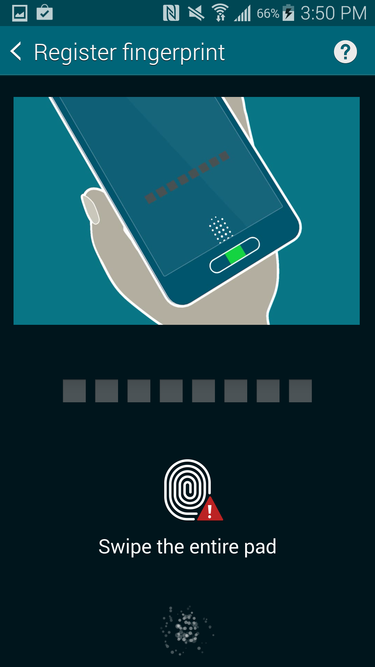
Samsung let’s you scan a few fingers to unlock your phone.
HTC, , Samsung, Sony all use Android 4.4’s native unlocking mechanisms, though Samsung also offers a fingerprint scanner on several models of its phones, including its latest flagship, the Galaxy S5. You can set it up in the Settings panel, where you’ll be asked to swipe a finger eight times, then enter a alphanumerical password as an alternative. You can program up to three different fingers.
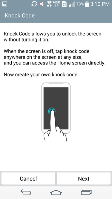
’s Knock Code is a new original way to unlock a phone.
’s Optimus UI offers a neat, different type of unlocking feature. It’s called KnockOn, this convenient addition lets you double-tap the screen to wake it up put it back to sleep. You can also use the related Knock Code feature to unlock the phone by tapping out a pattern without turning on the screen. As I noted in my G3 review, it’s simply less tedious than some of the other unlocking mechanisms.
Home screen

From left to right: stock Android 4.4 KitKat, Samsung’s Touchz UX, ’s Optimus UI, HTC’s Sense 6, Sony’s Xperia UI. Most OEMs will bundle added applications provided by them or the carrier.
By default, ’s stock KitKat Home screen is perfectly bare bones. It features a dock with four app shortcuts, a folder of the essential apps suite, a button for the ay store. There’s also a pinned Search bar at the top of the page that will take you anywhere your heart desires, though you can also shout out “Okay, ” directly from the Home screen.
If you swipe to the leftmost screen, you’ll give way to Now, which offers contextual information based on your account activity. Many other manufacturers have taken upon themselves to insert their own little informational app in this exact spot; Samsung’s, for instance, is called My Magazine, while HTC’s is called BlinkFeed. ’ll explain a bit more about the differences between these particular apps later on.
Application Drawer

The stock Android application drawer is just pure simple.
The Application Drawer simply houses all your apps. On stock Android, all of the applications are organized in alphabetical order by default.

Samsung’s Touchwiz UI application drawer wants you to choose, darn it! IT NTS YOU TO CHOOSE A VIE
The manufacturers have taken liberties when it comes to this particular area of Android. Samsung’s Touchz, for instance, organizes your apps in alphabetical order by default, but you can also create folders within the Application Drawer stick related apps in there, or set up your own custom view to you can create groups of apps based on your own organizational preferences.

’s application drawer has a lot going on, but at least you can easily access the widgets from it.
’s Optimus UI is the same: you can categorize apps in alphabetical order, by the date they were downloaded, or by your own organizational structure. You can hide or show certain apps, which is great for banishing carrier bloatware, then easily uninstall applications without having to dig into the Settings panel.
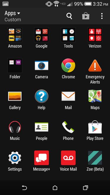
HTC’s application drawer is pure simple.
HTC’s Sense 6 offers a few viewing options, though not as many as its competitors. You can choose whether to display three or four apps per line, or you can rearrange apps in whatever order you want. So if, for instance, you wanted to hide all the apps in the Application Drawer, you could move up your eight most-used apps to the top for easy access rather than having them buried at the bottom of the fourth page. It’s a smart, simple addition to the Application Drawer that stock Android should even consider implementing.
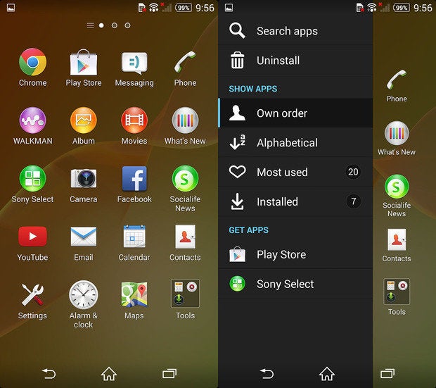
Sony’s application drawer features a whopping number of hidden settings.
If you like options, Sony’s got a whole whopping load of them. Swipe over from the left bezel to pull out the Application Drawer options on the Xperia Z2’s interface. There’s even a quick launch icon for the ay store or a direct link to Sony’s own apps services.
Notifications nel

The stock Notifications panel.
The Notifications panel is where you can peep all of the relevant information you’re looking for, like who’s pinged you in an app whether all of your animals are asleep in Disco Zoo. In stock Android 4.4, you can merely swipe down from the top to view all of this information, or tap a button to access the Quick Settings to adjust things like Airplane mode or display brightness.
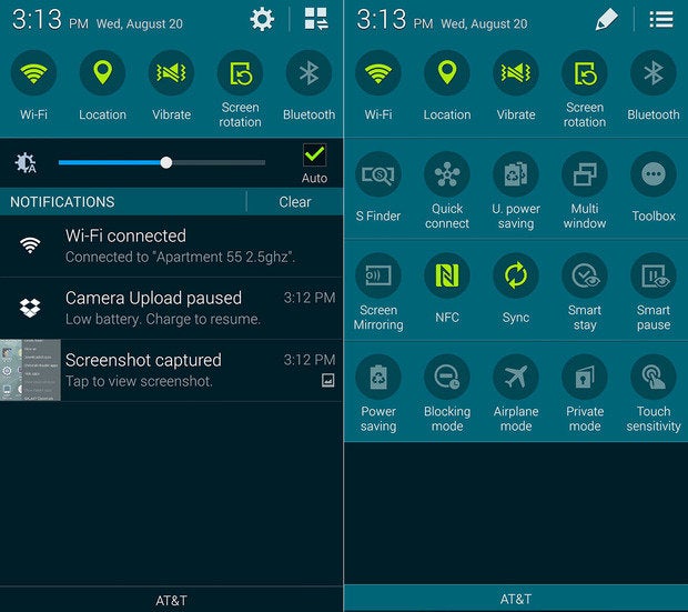
Samsung’s Notifications panel (left) Quick Settings (right).
The latest version of Samsung’s Touchz offers a scrollable Quick Settings bar within the Notifications panel. There’s also a display brightness slider below that, followed by the stard Notifications panel. If you flip it over, you’ll see an overwhelming number of Quick Settings buttons you can tap at incessantly.
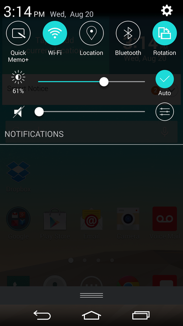
’s Notifications panel is pretty simple, with the Quick Settings residing at the top.
’s Notifications panel used to be so crowded that I would dread having to drag down the shade to dismiss any notifications. It’s not as bad any more, though there are still some remnants of its cluttered past, it gets particularly bad when you have a hoard of notifications waiting for you. There is also a slider inside the drop down shade to adjust the screen brightness hset volume, like Samsung’s Touchz, there’s a Quick Settings slider.

HTC’s Notifications shade is nice simple, just like stock Android’s.
HTC stuck with stock Android’s simplistic model by offering Quick Settings on one side of the drop-down shade Notifications on the other. Sense 6 also offers some Quick Settings that stock Android currently doesn’t.

Sony labels its Quick Settings in its Notifications panel.
Sony’s Notifications panel looks the most different from the other interfaces, but otherwise it’s just as plain as Sense 6’s stock Android’s. There are clear labels on each side of the drop-down shade that indicate Notifications Quick settings. The Quick Settings also feature text labels under each icon, you can add more as you see fit from the Settings panel.
Settings
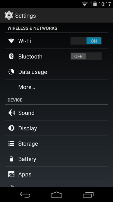
Stock Android 4.4’s Settings panel is as simple as I’ve seen on any mobile platform.
Android’s Settings panel are as straightforward as settings panels go. (I’d say they’re a bit easier easier to navigate than competing platforms, like iOS ndows one.) Everything is organized into categories, with only the expert options residing behind an extra screen of submenus.
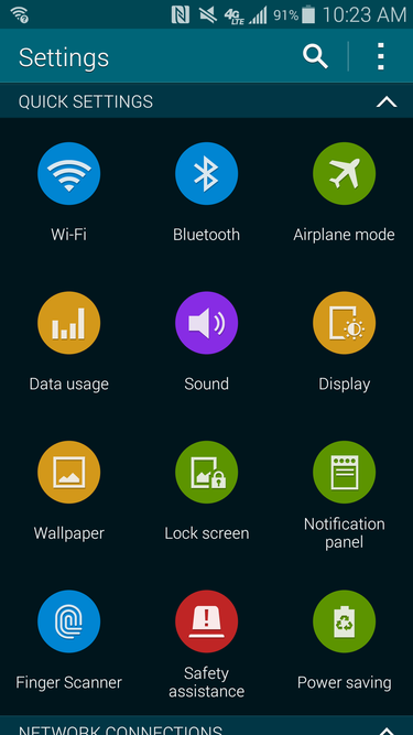
Samsung’s new Settings panel is a bit too overwhelming at first glance.
Samsung’s new Touchz Settings panel is meant to be more user friendly to those who resonate with symbols more than text, but it’s really just a crowded page of icons. Each individual Settings category is supposed to have its own designated color, but that’s not really apparent at first glance. Fortunately, there are at least three other options for viewing the Settings panel for those who want to organize it differently: grid view, tab view, list view.

features two viewing modes for its Settings panel.
offers two different views for the Settings panel, including a tab view a list view, while Sony’s Settings panel is chock full of options for its extracurricular features.

Sony’s Settings panel is chock full of options for all of the Xperia Z2’s added features.
HTC kept its settings panel relatively simple. Currently, Sense 6’s Settings panel is the closest to stock Android there is.
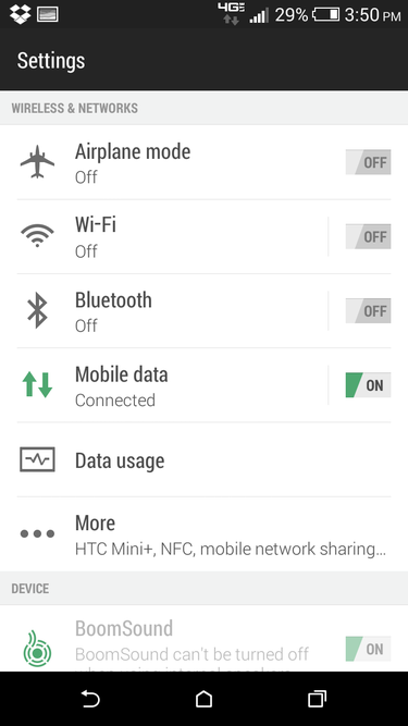
It’s basically Sense 6 on top of stock.
Dialer & Contacts
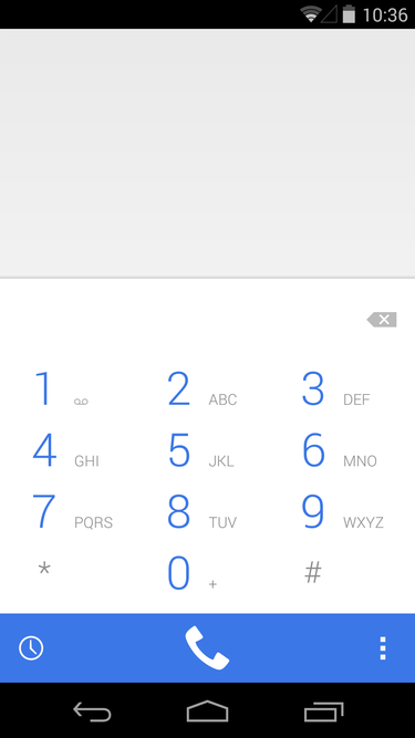
As simple as simple gets.
is still figuring out what to do with Android’s dialer, we’re not likely to see where it ls until the final version of Android hits the scene later this year. KitKat’s Holo ght UI themed Dialer app is better-looking than some of its previous iterations (I compared the two more thoroughly in my review of KitKat last year), but like some other parts of Android, it still feels incomplete. This is a part of Android where manufacturers took matters into their own hs made the Dialer app a bit better than ‘s version.

Gotta make a phone call on your Samsung device? Tap it in or choose from your favorites.
en you want to make a call on Samsung’s Touchz, simply tap the one app to launch the dialer to bring up the number pad. If you’re looking for a specific person in your Contacts list, you can type in either the first three letters of their name, or the digits in their phone number. There’s an arrow to exp for more options. This app also displays a log of all of your calls messages, enables you to designate a list of favorites.
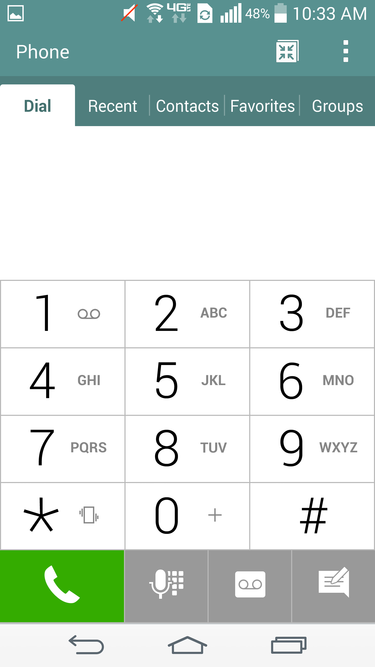
ke Samsung’s Touchwiz, offers a plethora of options for organizing your contacts. Or you can just use the number pad.
If you haven’t noticed by now, Samsung tend to have somewhat similar-looking apps for whatever reason. It’s the same here in the Dialer app: the number pad is the first to pop up when you launch the one app, or you can wer off into the other categories in your address book to find the contact you’re aching to connect with.

HTC’s is a bit easier to navigate if only because it isn’t crowded with options.
HTC’s dialer app is called the onebook, like the other apps it melds together your Contacts the dial pad. By default, Sense 6 will display the last phone call you made so you can easily tap call that number back again.
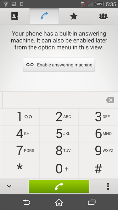
Sony kept it rather simple, too.
Sony’s dialer app may seem uninspired, but it’s just as simple to use as HTC’s. Type in who you’re trying to reach it’ll dig in to the contacts list you have set up—whether it’s on your SIM card or through your account—to give ‘em a call.
Camera
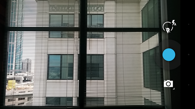
Three buttons—that’s all you need to take a photo.
Compared to the camera apps that come stard with many Android phones, the stock Android camera app is the easiest to use because it’s so straightforward, though serious photo takers might not like the fact that the camera options are hidden behind so many swipes.
Stock Android’s camera interface features three main controls: one to choose between camera modes, one to capture a photo, one for camera shooting options like enabling the flash. For even more options, you can tap on an icon to see settings related to it.
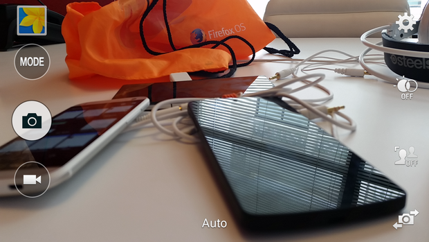
If you stuck with Samsung, you may be with more choice than you bargained for.
Touchz’s camera interface has gotten better over the years, but it’s still chock full of buttons that you’ll end up tapping just to figure out what purpose they serve. There are eight buttons total on the app’s main interface: four on one side four on the other, in addition to two symbols on either side that pop up from time to time to denote the modes you’re shooting in. There’s a button to launch the Gallery app, too, as well as a Settings button that can be rather overwhelming to use.
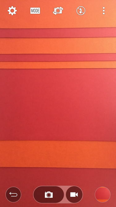
Fortunately, has a quick tap gesture that hides all these icons when you’re taking a photo.
paired down its camera application UI since last year’s version of the Optimus UI, but it still takes after Samsung in some ways. At least all of the settings icons are hidden behind a “more” button—it’s a smart way to keep the clutter away from the main camera app, though you’ll still have to navigate through the various buttons menus to get to the feature you’re looking for. You can also swipe in from the right bezel to switch to the front-facing camera. The G3’s bigger screen size works in its favor here as it allows for more breathing room between icons.
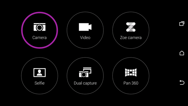
HTC’s all like, “ck a mode, any mode!”
HTC’s camera app is the easiest to use, though that doesn’t mean it’s devoid of features. There are five buttons on the viewfinder, but only the bottom three are prominent. The other two offer more settings to adjust things like exposure flash. And just like on both Samsung’s Touchz ’s Optimus UI, you can slide from the right-side screen bezel over to the left to switch to the front-facing camera.
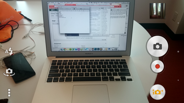
At this point, Sony’s like the median between stock Android Samsung’s Touchz.
Sony’s a bit like the middle point between stock Android Samsung’s Touchz. There are icons pasted on all over its camera interface, but there aren’t so many that you’re overwhelmed. And when you have a 20.7-megapixel camera that’s extremely capable, you’d want to show off what it can do by bundling a bunch of extra photo-taking goodies, right? Sony offers a lot of those, like Augmented Reality apps, which are really quite fun will garner you a lot of “likes” on Instagram.
Regardless, Sony’s camera interface isn’t too bad, though that huge Shutter button feels like an overkill when most of the Xperia hsets have their own physical camera button on the edge of the phone.
l those extra apps (My Magazine, BlinkFeed…)
en Android comes fresh new out of ’s proverbial factory, it’s normally devoid of any supremely fancy features, which is why most third-party manufacturers will bundle in extra apps gimmicks in an effort to entice you toward their flagship devices. It sometimes works, but other times it just contributes to a lot of bloatware.

Samsung’s My Magazines aims to deliver all the news you can use in one hy app.
Samsung’s Touchz is one example of what happens when add-ons just become too much. It used to be that Touchz was the worst offender, but it’s since been greatly pared down. You’ll still find apps like S Health My Magazine on a device like the Galaxy S5, though both serve some purpose: S Health is meant to help you stay trim fit with its built-in pedometer heart-rate monitor, while My Magazine is a custom version of the Flipboard app that aggregates news on topics that interest you, as well as your various social networking feeds.
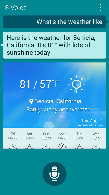
Samsung’s S Voice doesn’t do anything different than Now.
However, there are other apps that seem to exist only to replace stock Android offerings. For instance, Samsung’s S Voice is the company’s inferior version of Now; hold down the Home button you can ask it for directions, or to pen a reminder for you. It’s supposed to be as interactive as Apple’s Siri, while still providing the same utility as the Search app.

’s got apps, but they’re not all too bad.
In the past, I’ve accused of packing too much bloatware in its crowded interface, but it’s also scaled back significantly since then. You’ll find useful features on its new flagship device, like Guest Mode, which lets you set user account for different people who might need to borrow your phone, a Health app that counts your steps, tracks your running routes, calculates your daily calorie burn.

HTC’s BlinkFeed aggregates your news feeds your social media.
HTC has always been the least offensive with added applications—it’s only bloatware is what the carriers bundle with its devices. Both BlinkFeed the Zoe camera app are relatively harmless. You can disengage BlinkFeed if you decide you don’t really want to use it to aggregate your feeds social accounts, the Zoe camera application is so new that it’s technically still in beta.
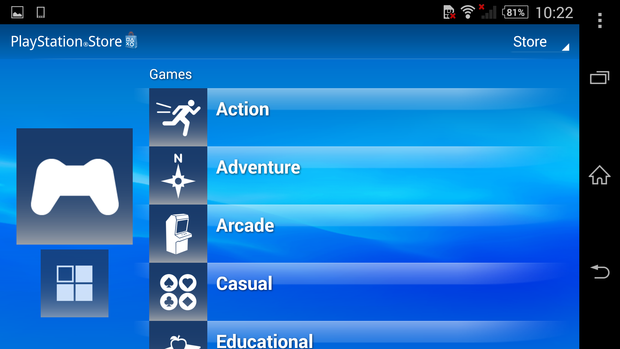
Sony’s aystation app will mostly be useful to you if you actually own the console.
Sony’s bundled stuff exists to help encourage you to stick to its ecosystem, whether its by putting a ayStation 4 in your living room or by subscribing to its unlimited music service through its lkman app. There’s also a Socialife app that pulls from all of your social media feeds, kind of like HTC’s BlinkFeed. They’re not that offensive, you can easily ban them to the Application Drawer if you have no use for them, or disable them entirely.
ich would you choose?
Each of these Android interface overhauls offers its own quirks bundled applications that you may end up getting attached to. That will likely change a bit as starts to slowly pull the reins on some of the more outlish overlays Android introduces the new Material Design stards. The manufacturers will still likely take as many liberties as they can in attempt to differentiate themselves from the competition.
But that’s the beauty of Android: you can choose from a giant library of devices, all from manufacturers who’ve taken their own spin on ’s open source mobile operating system. And if you just really, really hate what the companies are offering, you’re not on a carrier that supports any of ‘s stock Android (Nexus) or ay ition devices, you can always take an afternoon to yourself to root your device customize it just the way you like it.


