
Android /a> is a big release. promised thouss of new features As, as well as a visual overhaul with a new design language called Material Design. It took us no time at all to find a bunch of neat new changes in ‘s upcoming OS.
th such a dramatically changed Android, surely the Settings menu drastically different, right? ong! Surprisingly, the Android settings menus are very much like those in KitKat.
Android is sitll in a “developer preview” state, we likely haven’t seen all the changes in store for us this fall when the next version of Android is released. Here are some side-by-side comparisons so you can easily see what’s changed, what hasn’t.
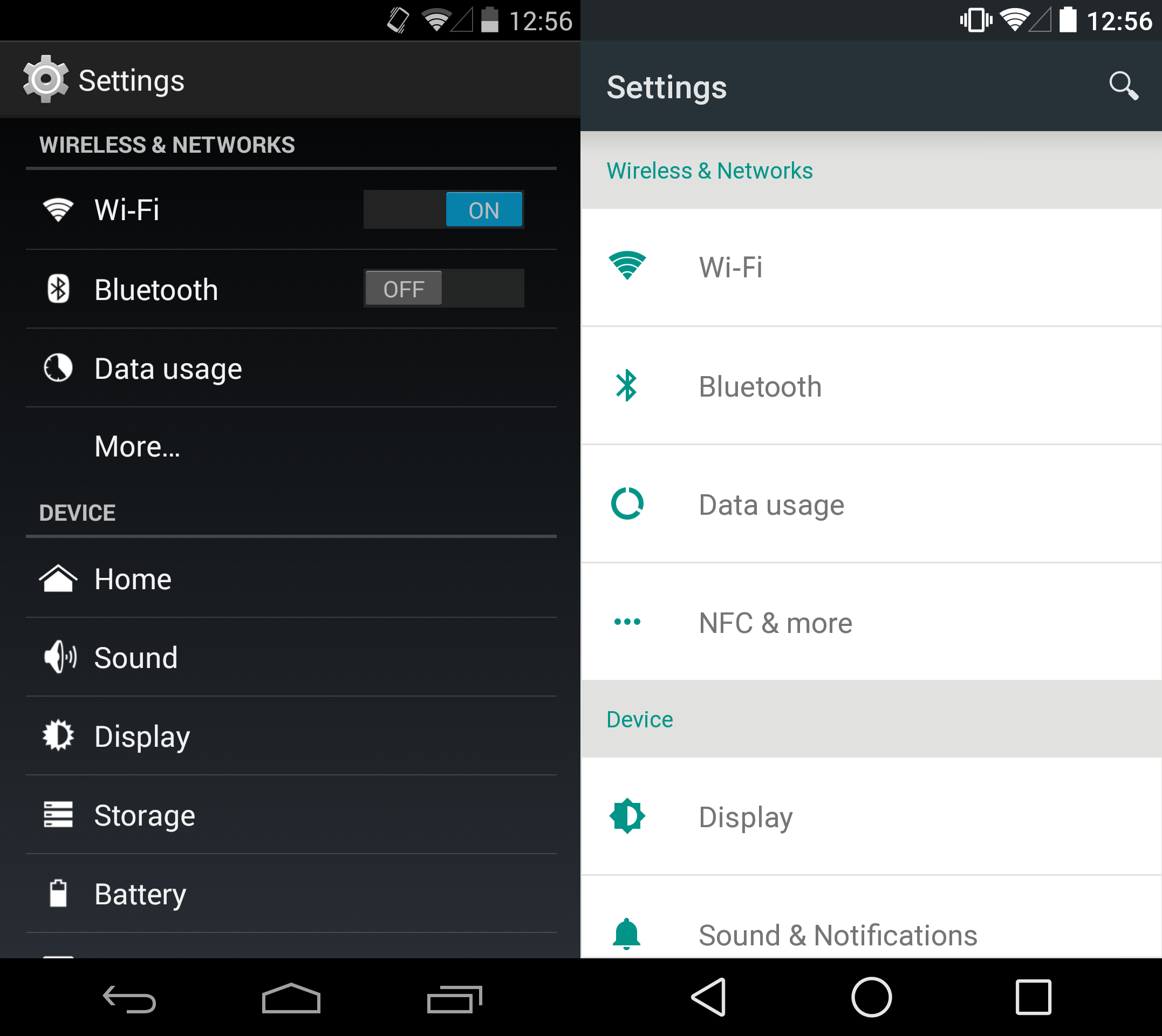
The settings menu in Android has received a facelift, including a lighter theme with more space, matching the design stards for the new OS giving each option some breathing room. Gone are the dedicated toggle options next to -Fi Bluetooth, requiring the user to dive into the menu itself or use the Quick settings option (accessed by dragging down the notification panel).
though a few things have changed, Android s settings aren’t going to alarm anyone. Remaining largely intact when compared to KitKat, primarily just gives it a nice spit-shine .

Android now has a lscape view with two settings next to each other, reducing the amount of scrolling you need to do. This new lscape layout is also reflected on the Nexus 7 with the Android developer preview.
th only two devices officially supporting the developer build, only time will tell if larger tablets will also adopt the layout, or if bigger tablets will get a three-column view. Given that larger tablets usually take advantage of Fragments to put the menu on the side of the screen, it wouldn’t be completely surprising if the current layout remains the same.
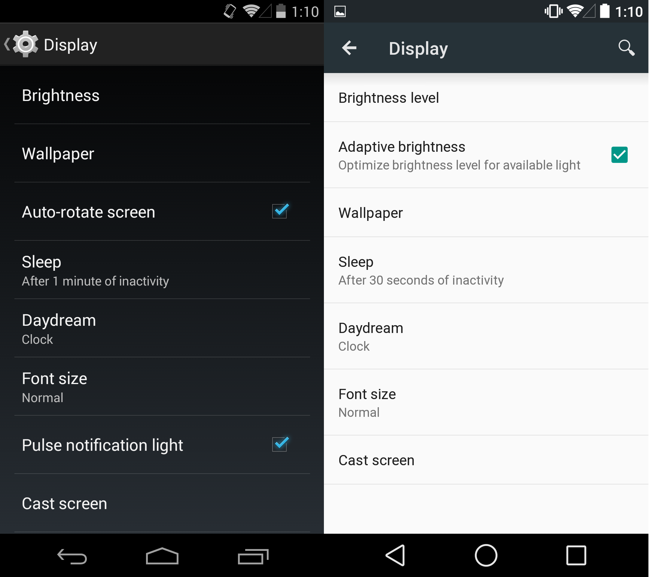
Gone are the options for Auto-rotate screen lse notification light in Android s Display settings, as both have been moved tucked away into other menus. The new OS introduces a check box for Adaptive brightness, which is just another way of saying auto-brightness, a feature Android has had for ages.
The lse notification light option is now buried in a sub-menu of the Sound Notifcations settings (where it makes a little more sense, as the light would only pulse when you got a new notification).
ile some options that have moved into different menus make sense, moving them to a deeper sub-menu is not necessarily an upgrade.
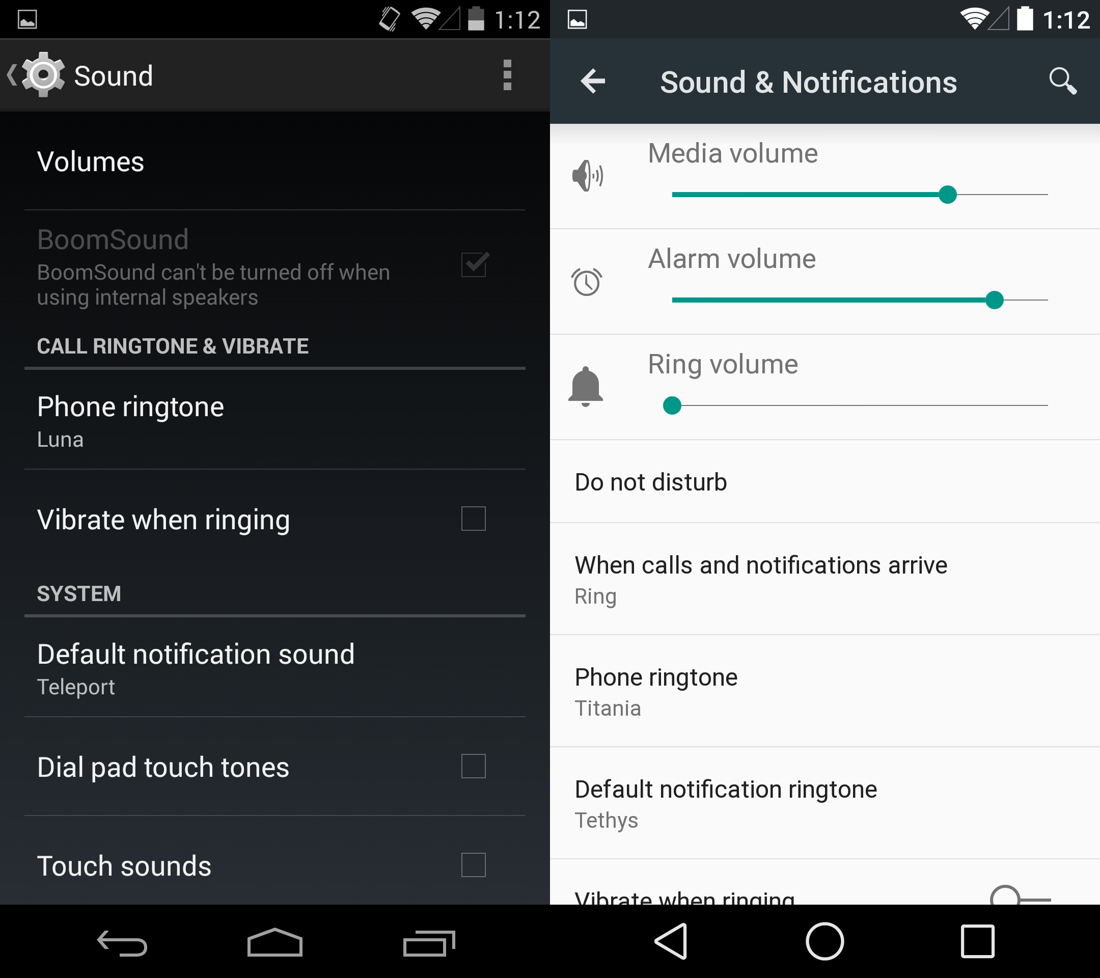
Sound settings have now been merged with notifications in Android so it’s not surprising to see things changed up quite a bit. The developer preview now includes sliders for media, alarm, ring volume right in the main Sound & Notifications menu. In KitKat, these sliders were tucked away in the Volumes option.
Android includes the new Do not disturb mode, more control over when your phone rings or vibrates when receiving a call or notification. The latest version of Android also includes new options for showing notifications other sounds.
Note: The phone with KitKat we used for screenshots was the HTC One M8 ay ition. Stock Android does not typically include a BoomSound option.
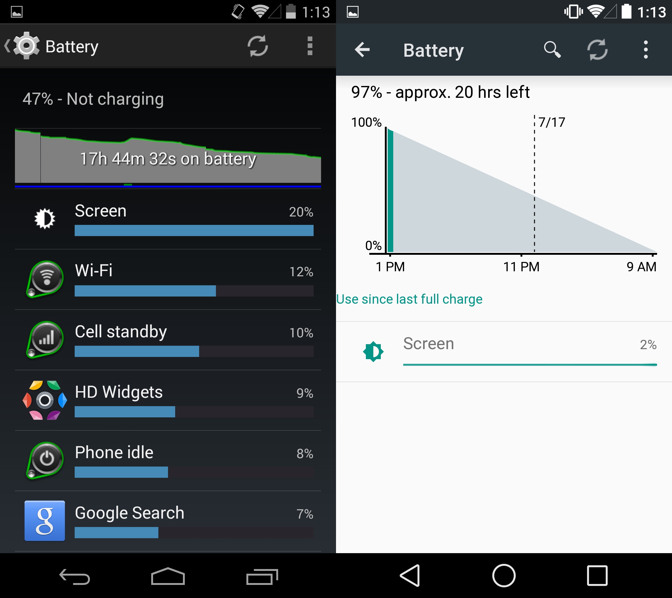
Battery settings have received a nice overhaul in Android as the menu will now predict when your phone will be finished charging when plugged in how long your charge will last.
The action overflow settings (three stacked dots in the upper right) is where the new Battery saver option is found, a feature many manufactuers add to Android, we’re excited to in stock Android.
Aside from the two aforementioned features, the obvious visual changes, the battery settings in Android are very much the same as KitKat.
Now that there is no quick setting for the battery settings, the menu take a bit more work to get to this menu.
And there’s still no option to display battery percentage on the menu bar, which is just remarkably dumb.
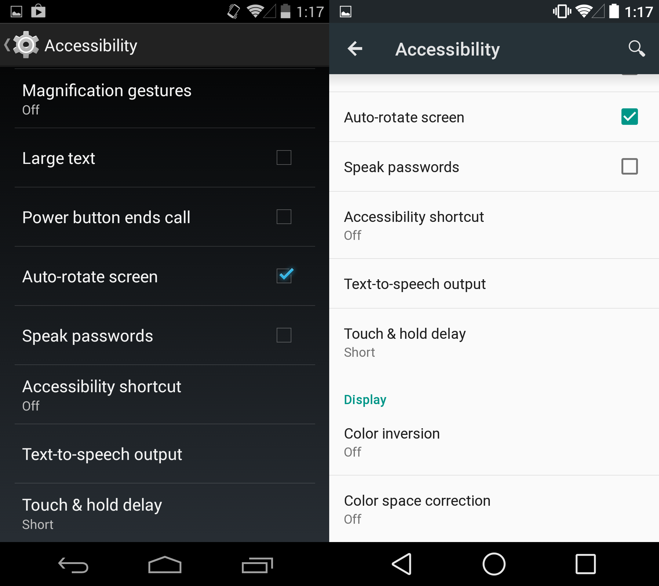
Accessibility options in Android now include two new features for the color blind: color inversion color space correction.
This is also the only place in the settings menu where you can choose the screen to Auto-rotate. The option is now officially baked into the Quick settings options, though it was previously found both in the Display Accessibility settings menus.
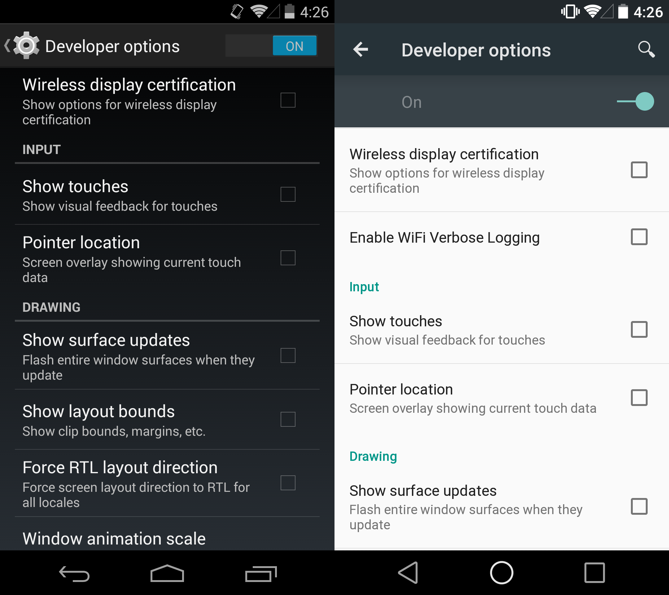
Developer options in Android haven’t changed a lot, but they’re not totally untouched. A new option to Enable Fi Verbose gging is included, as well as the optional ( experimental) Nuayer option.
The option to choose your own runtime is now missing in the Developer options, this is because Android uses the ART runtime as the new default, signaling the end of the Dalvik runtime that the operating system has used since it debuted. (Note that the ART runtime in Android is far more advanced than the experimental version in KitKat, so you can’t directly compare performance compatibility between them.)
By the time Android officially rolls out, there could be even more goodies in the developer options, but for now, nothing is all that different.


