The notification panel is one of the most-visited parts of a mobile operating system. It keeps you up to date with everything you’ve missed provides quick access to settings. The notification panel has been an important part of Android since its debut in 2008, it’s undergone many changes over the years, but nothing as dramatic as what Android brings to the table.
That said, while the latest version of the OS has tweaked the notification panel in a hful of ways, a vast majority of users will still feel right at home. It doesn’t take long to learn the new changes.
Quicker quick settings
ssibly the most obvious change in the notification panel is in the way you access quick settings. In Android 4.4 KitKat, you tapped on a small icon in the upper-right to reveal a grid of settings. You could also access this panel by swiping down from the top edge of the screen with two fingers at the same time.

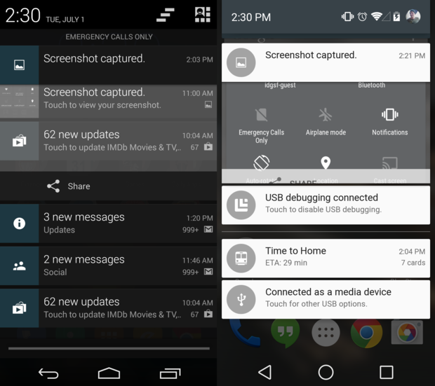
In Android there’s no need to use two fingers or tap an icon to access your quick settings. l you need to do is to swipe down from the top of the notification panel while it’s already open (the same gesture to open the panel in the first place). It’s a big improvement that will make it easier for casual users to find these settings.

Speaking of quick settings, Android brings a few more than before. Most notably, the option to toggle auto-rotate a ‘Cast screen’ button for the Chromecast other Miracast supported devices. There’s also a new dedicated brightness slider, though an Auto brightness toggle is notably missing.
A switch from black to white

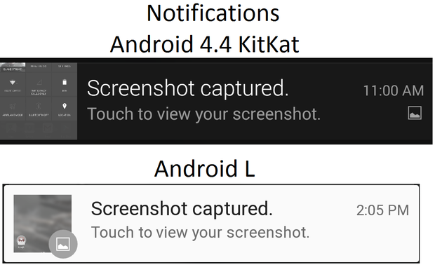
Notifications themselves haven’t changed dramatically. The main difference is that the background color of notifications is white the corresponding icon on the left of a notification is now a circle instead of a square, unless you take a screenshot (as shown above).
Dismissing exping notifications is the same as in KitKat: Swipe left or right to dismiss, drag down on the bottom edge of a notification to exp it. You can shrink a notification down by dragging your finger up on the bottom edge. If that doesn’t work, using a two-finger gesture will.

You’ll also find that the notification panel in Android no longer covers the entire screen when its been pulled down. Instead, there are small spaces on the left right. This is undoubtedly Material Design at work, as the subtle change in the panel give it the floating effect that is going for in the latest version of the OS.

Android s notification bar is more narrow than KitKat’s, the top corners are rounded on notifications.
Not everything has been improved, however, some functions in the notification bar that you may have become accustomed to are now missing. This includes the ability to clear all notifications with a single tap of a button. ile this may change as Android begins its ascent to a final build, for now, you’ll have to swipe away each every notification yourself if you want all of them gone from the panel. At very least, Android does a good job at consolidating notifications from the same application.
Heads up!
Android includes a new feature called heads-up notifications. This is a feature that shows is playing catchup in some respects, given iOS has a very similar implementation, not to mention a few Android phone manufacturer skins.
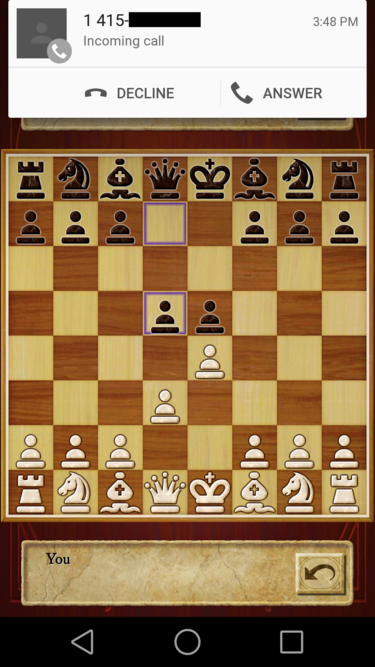
The feature currently works in very few applications at the moment offers a pop-up notification without requiring you to leave the app you’re currently in. In the screenshot below, I received a call while in an app. This heads-up notification gave me the option to answer or decline the call, but I could also swipe it away just like any other Android notification.

In the future, developers will add support for this functionality to their apps, allowing you to take action on your notifications without leaving the app you’re in.


