Third-party Android launchers are a great way to change your home screen layout without much effort. There are countless apps that can replace your home screen, some more feature-rich than others.
A new launcher, Terrain Home, has been announced through Samsung Accelerator. It aims to do what so many similar offerings claim to: make your home screen smarter. Terrain basically looks like a mish-mash of Now with a few features taken from existing third-party launchers, but using it is a different experience.
Home, home on the Terrain

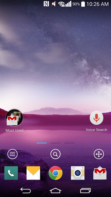
The starting home screen in Terrain is nice clean, with quick access to the essentials.
Terrain is broken into four areas: home screen, sidebar, apps, search. Once installed, the user is first given only one home screen to customize, but up to 8 can be added. The main home screen looks like your stard icons–folders Android affair, with the addition of three small circle icons near the bottom for navigating Terrain: sidebar, search, apps.
There’s nothing out of the ordinary with the way the main home screen panel works, but a quick swipe or tap will show what Terrain is really all about. Swiping from the left edge of the screen will bring the user to the Now-like sidebar.
Sidebar is a mix of Now BlinkFeed

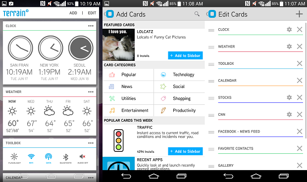
Terrain’s Sidebar is a mix of Now HTC BlinkFeed — with more options.
The Sidebar consists of several cards that you can rearrange or remove. Unlike Now, Terrain’s sidebar is less about giving you the right information at the right time, but more having all off the information you’d want to see at a glance at the same time. This makes the sidebar act a bit like HTC’s BlinkFeed, but more functional, given that the main focus isn’t always news social feeds.
nt even more cards for your sidebar? There’s a mini store for that. Simply tapping on the ‘Add‘ option will present the user to a decent helping of additional cards to add. From utility toggles to lCatz photos, the sidebar can be a nice mix of work play.
ere’s my app drawer?

th Terrain, your app drawer is officially gone in favor of a “neat organized” new layout. To some, this may be superior to the default layout, but it’s my least favorite part of the app.
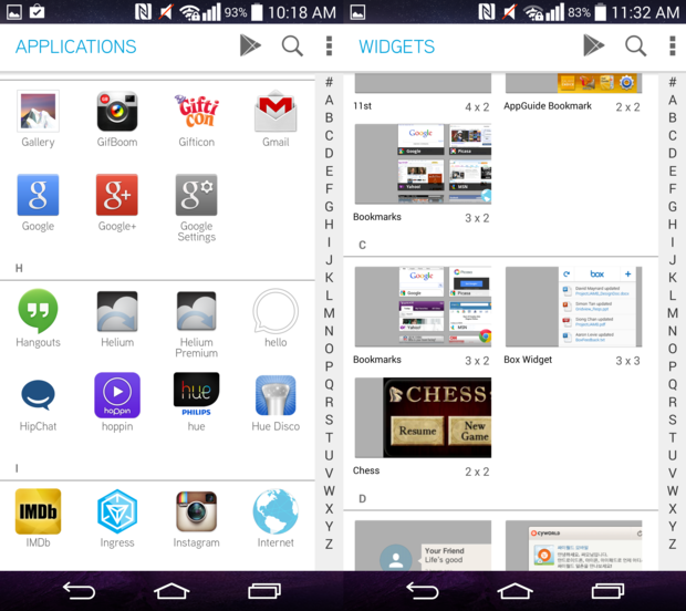
From the main home screen, swiping the right edge of the display will reveal your app list.
Applications are presented in an alphabetical list that features a fast-scrolling option on the right of the screen. The user can drag or tap their finger over the letters on the side to reach the application they’re looking for.
This screen also gives the option jump directly into the ay Store, search for a specific app within the list, gives access to Terrain’s settings menu.
A new way to search, only no one cares

The universal search is nothing special.
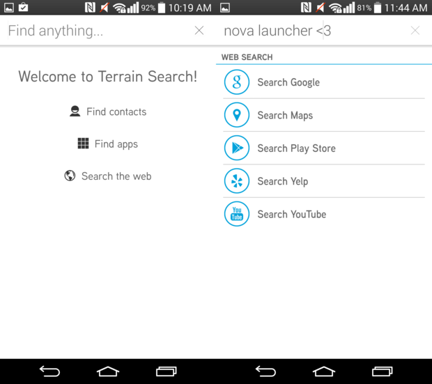
From the main home screen, Terrain Search can be accessed by swiping up or tapping on the dedicated search icon. From there, well, you know what to do.
Terrain Search allows you to search your contacts, apps, the web. ile I’d personally like to see predictive search items automatically appear, like in Search, the option for choosing where your search is performed could also be pretty helpful.
You still have access to Now, of course, which is probably the superior search option. st swipe up from the bottom of the screen, get your “OK ” on.
So far, so good
In terms of third-party home screen launchers, Terrain is an interesting option. ile I don’t see myself using it day to day, I may check up on how the development is going.
By far the most interesting feature about Terrain is the sidebar. th a SDK on the way for developers to build new cards, the sidebar will only get better in time, it’s already pretty good.
For an initial release, Terrain is looking pretty good it will be great to see it evolve. Be sure to check it out if you’re looking for a smart home launcher with broad device support that doesn’t require a major learning curve.


