‘s really into the idea of unifying all of its services into one overarching ecosystem. First it worked on making your + profile the de facto stard for logging in to its various services, now it’s tackling its disparate interfaces icon design.
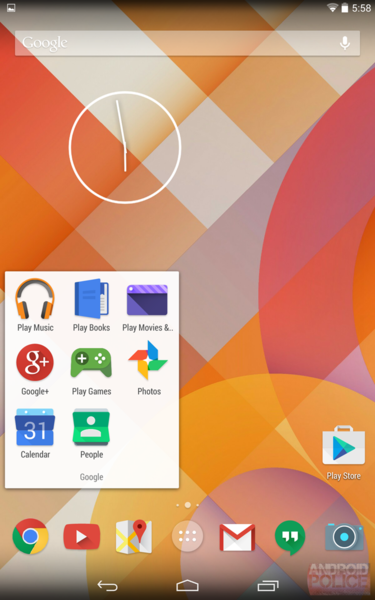
Most of ‘s web services corresponding Android applications don’t have matching iconography, but a new rumor suggests that the company is finally making it a priority to clean up this particular element of its business. According to Android lice, a few screenshot leaks a webpage screenshot suggest that updated, unified icon designs are in the works, though there is no software-based evidence yet.
 Android lice
The screenshot shows new icons for all of ‘s stard applications: ay Music, Books, Movies, Games, in addition to +, Calendar, ople, Chrome, YouTube, more. Android lice’s side-by-side icon comparison shows ‘s web icons its Android icons essentially meshing into one.
The rumor is by no means confirmed, but it makes sense: recent releases point toward an effort to make ‘s apps services carry a unified look feel, updated app icons would be no exception.


