There seems to be no end to the number of home screen launchers for Android devices. Most of them focus on adding an extensive amount of customization, letting you tweak the home screen its icons widgets any number of ways.
Aviate takes a different philosophy. Instead of offering hundreds of different ways to customize your home screens, it wants to make your life easier by doing the heavy lifting for you. Aviate streamlines the home screen makes it more context aware, offering different app groupings services based on your location the time of day.

I was able to test Aviate on my Nexus 5 after securing an invite to the closed beta test. The interface is a refreshingly simple solution to what can sometimes be a busy experience on Android, what with the broad array of widgets, apps, live wallpapers.
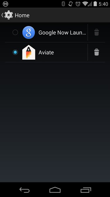
Aviate will walk you through the basics of its use upon launch, then reminds you to tell Android to make Aviate the home app instead of whatever you are running. To change this, go to Settings select a different launcher.

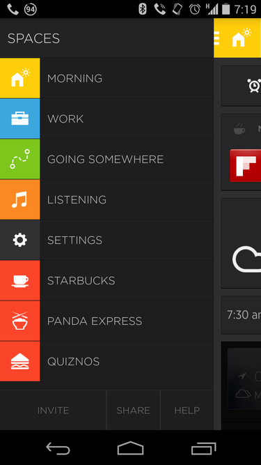
The basic Aviate home screen has a dock with space for 10 core apps room for widgets above these. A swipe to the right reveals the Spaces section, which has apps grouped by category along with some individual services offers based on your location. For example, the Starbucks app a promotion for Quiznos appeared when I was near them at a shopping center.
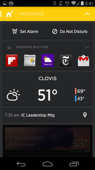
Aviate presents contextual widgets based on where you are what you’re doing. At home, you’ll see the weather, quick links to set an alarm or engage do-not-distrub mode. At work, those links change to sending an email adding an event to your calendar, while the weather widget is replaced by your upcoming calendar meetings. The idea is to automatically switch between several “spaces” that customize the at-a-glance info, actions, apps to those you’re most likely to use.
Swipe down to get a folder of apps that Aviate thinks you will want, based on your location. At work, for example, it will offer options like Dropbox, Drive, or Evernote.

A swipe to the left reveals a larger list of app categories, such as news, games, social. One further left-swipe brings you to the Aviate version of the app drawer, with all apps sorted in alphabetical order. From here tapping holding an app will then allow you to drag it into one of the app categories or a dock.
In general, navigation will take some getting used to, especially if your fingers have a strong muscle memory of where you put particular apps. However, using the Aviate philosophy of letting it do the thinking can be surprisingly pleasant. st swiping down counting on the right apps to be there is highly useful.
Of course, customization is needed to make it fit your workflow. For example, ay Music was not included by default in the music playing category, had to be added by h. Other tweaks will be needed along the way, based on your preferences.
ile there were some distinct advantages innovation with Aviate that I liked, I eventually moved back to the Now uncher. Despite this, Aviate is worth trying for anyone that wants to see how a context- location-aware home screen performs.


