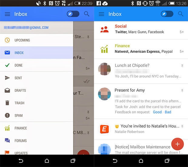
Apparently, the last major Gmail update wasn’t the significant interface change we were waiting for. It enabled automatic sorting into tabs, but the core interface remained mostly the same. A leak from Geek.com suggests that Gmail is about to get a more radical redesign, though. The shots show a decidedly KitKat-looking interface, with more color iconography than ever before.
 Geek.com
 There’s also a new inbox view, which borrows its flat aesthetic from Android’s current UI stards, but also implements +’s circular profile icons for each contact. Gmail will still use some of the iority Inbox categories, but parts of the message will be bolded. It’s unclear why, however.
so, it appears that is dumping the star for a pin for email the user deems particularly important. The leaked screenshots suggests that pinned messages will be automatically placed on top of all other messages in the inbox, with a toggle to put them back in their usual order. The action bar has also been eliminated, users will be able to hit a plus sign to compose a message, rather than the little Compose icon that’s become stard in Gmail.
Gmail has always been a priority for , for good reason: it’s the service that helped kickstart this whole user revolution, a Gmail account was essentially the predecessor to +. These leaked screenshots are unconfirmed, but it’s likely we could see the Gmail overhaul officially launched at this year’s I/O.


