On Android, launchers typically allow you to tweak customize your device’s interface without having to get under the hood. Everything.Me takes a different approach. Rather than just let you turn your Home screen into a hot mess of clashing icons wallpapers, the launcher suggests applications services based on what it thinks you’re doing at the moment.
The launcher generated plenty of buzz last year when it was first released. en I wrote about it, I was impressed by its contextual, pertinent nature. It’s since exited beta, so I spent a week using the launcher to see if its features are really worth dumping your default launcher for.
A Home screen that changes by the hour

Ta-da! Your Everything.Me Home screen.
The premise behind Everything.Me is that is it can anticipate your every move. Throughout the day, the prediction bar, which resides directly above the icon dock, will change to display the apps the launcher thinks you’re most likely to use. In the evening, Everything.Me will display apps that help you find recipes for dinner, or social networking apps so you can catch up with friends, the morning you’ll see the weather your schedule at a glance, as well as the day’s headlines.

In the morning, Everything.Me will offer up the weather the day’s headlines, in the evening you’ll the app suggestions change.
Some app suggestions were outlish. In the evening, Everything.Me suggested ay Movies & TV, Spotify, Hangouts, Verizon Tones, which is an annoying bit of bloatware that I don’t ever use. It’s likely that particular application is categorized with terminology that suggests it’s an entertainment app, but it’d be nice if the launcher were able to use a bit more discretion notice that I’ve never used it.
The rest of your apps are placed into pre-populated folders. Some of the folders are merely there to help you quickly locate a group of apps, while others offer up apps web apps you might find useful in a pinch.

Some of the pre-populated folders offer up tools you might not have an app for, like Utilities (right). Others, however, are merely a folder for apps, like otography (left).
Some folders will also take it a step further by contextualizing the page. The Recipes folder, for example, displays apps web apps to help you get a meal going, as well as recipes from the web. Everything.Me was not privy to the fact that I prefer to cook vegetarian dishes.

None of these recipes fit my diet.
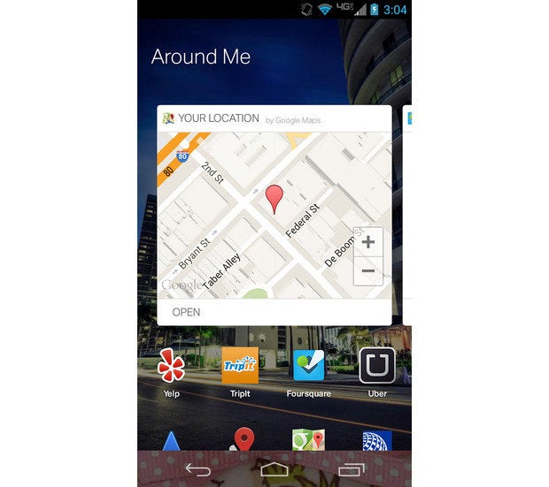
Other pages will also include widgets of their own, like the “Around Me” folder. There’s no way to search for directions from the widget, however, tapping it will just launch the Maps app. It’s easier to have Maps pinned directly to the Home screen.

This widget doesn’t do much.
You’ll eventually need to take some time to customize the Home screen, extract those apps you use the most, place widgets as you see fit. The various folders become annoying to dig through when all you want to do is launch your favorite music app.
Search that won’t rival ‘s
As part of the launcher, Everything.Me affixes a search bar at the top of the screen that lets you type or speak what you’re looking for.
If you’re looking for pizza, type it in you’ll begin to see the apps you have installed that can help you find it. It’ll also suggest relevant apps you can consider downloading from the ay store, like Domino’s zza or OpenTable, showcase links from the web that might be of use.

Search for “pizza” what do you get? zza!
The search feature was not always accurate, oftentimes it would take too many taps to get the device to do what I wanted it to. en I searched for “Tofu Recipes,” Everything.Me merely took me to the Recipes folder showed me the same meat-based recipes I was trying to ignore in the first place.

No, I was not looking to make “Mochiko Chicken ngs.”
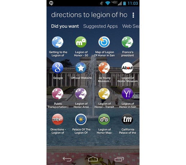
And, when I was looking for directions to a specific place, Everything.Me displayed links to exterior sites applications rather than a quick launch button to open up Maps.

en I searched for directions to a museum in San Francisco, I merely got web apps.
The search functionality worked better when I would ask it to search for contacts, apps, or other common search terms—like “pizza”—but for anything outside of the norm, I’d find myself reverting back to the Search app for help.
Still a little work to be done
At first install, the app seems neat, but over time I found myself constantly struggling to figure out how to use my device. I was especially frustrated at how many taps it took me to get to an app that could help me find directions. Everything.Me also relies too much on web apps.
For now, I’m going to stick with Now, which offers all the contextual information I want without taking over the Home screen.


