Google gave the Settings menu of Android a huge revamp with Nougat. Now, with Android O, the company is once again giving the Settings menu a huge makeover.
For this redesign, Google has taken a cue from the Settings menu that Samsung debuted with its Grace UX on the Galaxy Note 7. All the options are now properly categorised and can show under multiple categories as well. The hamburger menu that debuted with the redesigned Settings menu in Nougat is also gone.

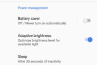
In addition to the Settings menu, Google has also redesigned the Storage and Battery sections. The Storage menu now has a cleaner layout and puts the ‘Smart Storage’ feature right up at the front. The Battery menu’s redesign is regressive to a certain extent since it does not show a graph for battery use from various apps and services.
- The Battery menu has been completely redesigned in Android O
The Settings menu in the first developer preview of Android O still clearly feels like a work in progress, so we should see Google make more improvements to it in the coming months. Hopefully, this will also mean that the company restores the lost functionality of the Battery menu as well.
Read: Android O Features: All the New and Hidden Features We’ve Found So Far


