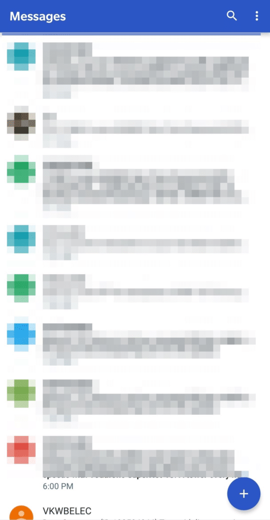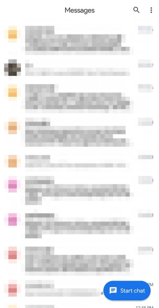
Google has started rolling out Android Messages v3.5 with Material Design 2 and Dark mode. The update brings about an almost complete revamp of the UI and adds a Dark mode which has been often requested by heavy users of the app.
Apart from a dark mode, the update also brings a more ‘white’ theme, with a big ‘Start chat’ button located on the bottom right. The new UI does look good on my Pixel 2 XL and the OnePlus 6, though it might not be appreciated by all.
My biggest gripe with the new UI is the color of the chat bubbles. All outgoing messages now show up in an off-white bubble with black text, while messages sent by you will show up in a light blue bubble with blue color text. It is not difficult to read, but it is not exactly as easy to read as the incoming chat bubbles.
- Before
- After
As for the new Dark mode, it can be enabled by tapping the 3-dot menu overflow button and selecting the ‘Enable dark mode’ option. The app now also uses the Product Sans font for a cleaner look.
- The new Dark theme
Google will roll out the new Android Messages update with Material Design v2 over the next few weeks. You can, however, download the latest APK from here for sideloading purposes. Once installed, make sure to force stop the Messages app to gain access to the new UI.
[Via Android Police]


