While we’re all eagerly awaiting Nothing to release the stable Android 13 build for the Phone (1), the London-based startup is rolling out an early preview of the Android 13-based Nothing OS via a beta program. We got our hands on the Nothing Phone (1)’s Android 13 beta release — and noticed many UI changes and new features, offering a new and improved experience after upgrading it from the stable Android 12 version. Here’s everything new in the Nothing Phone (1) Android 13 beta release.
Nothing Phone (1) Android 13
Lock Screen
To get started, we’re going to look at the lock screen, as some changes are here present in Android 13 on the device that wasn’t available in Android 12.
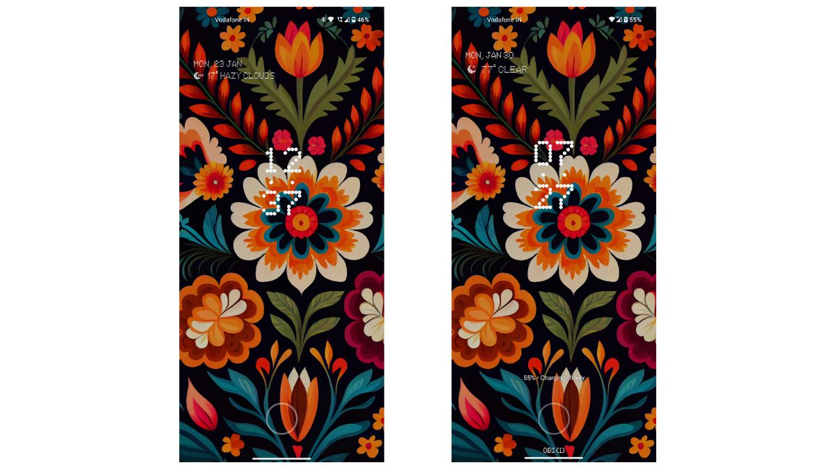
The first thing you will notice right away is the clock, date, and weather widgets on the lock screen. On Android 12, the date and weather are not as prominent as on Android 13.
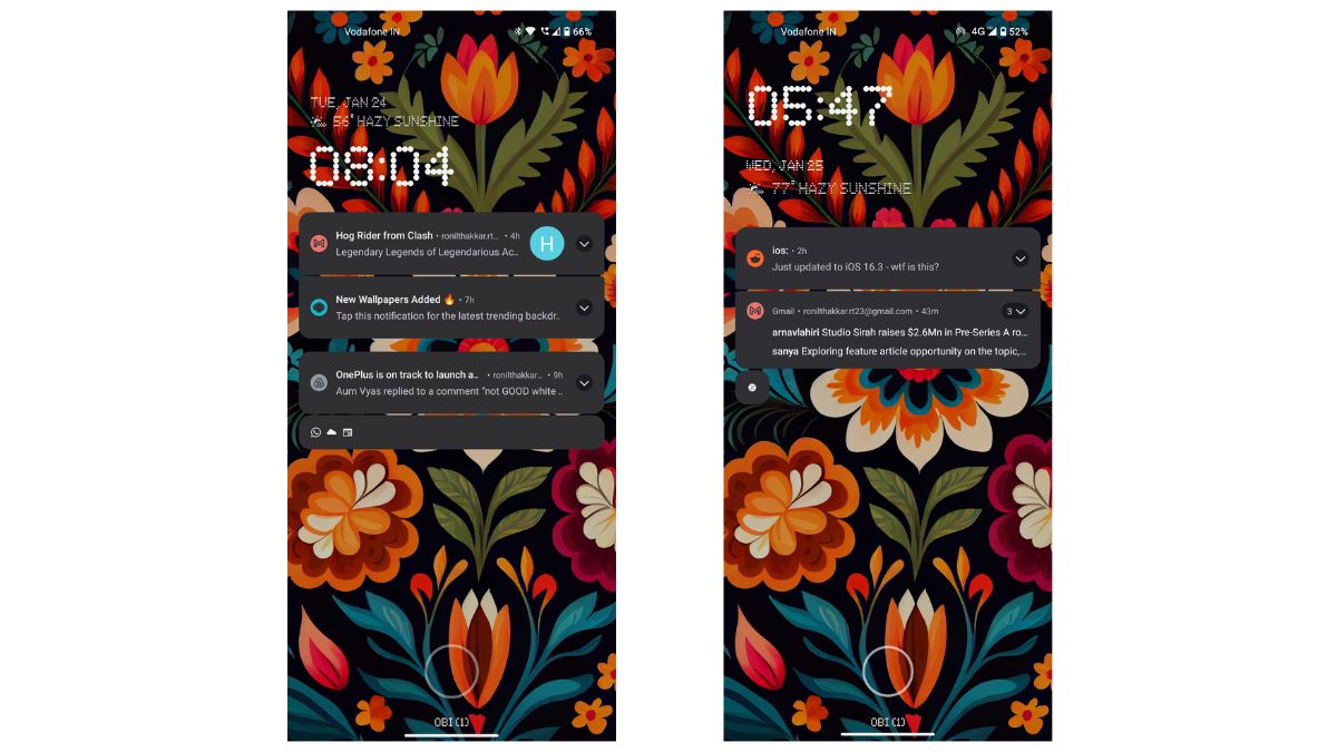
When you look at the notifications on the lock screen, it shows you everything, and they are all bundled together. On the other hand, with the Android 13, you can only see up to two to three notifications at once, and then the rest are bundled down with a slight overflow.
Quick Settings
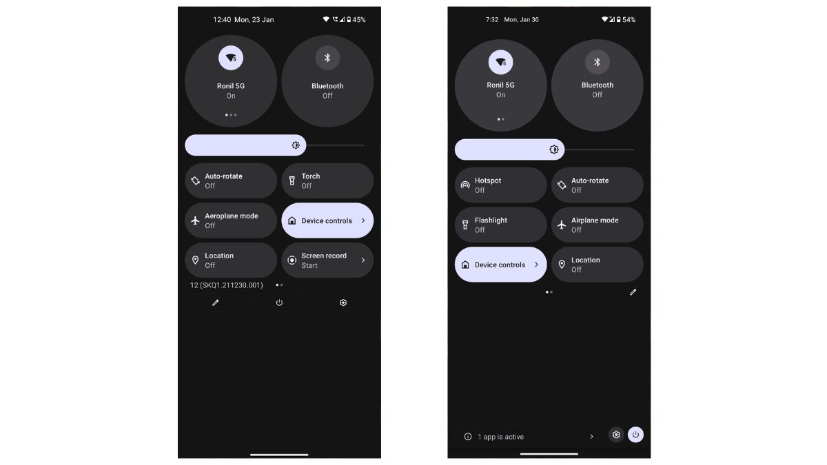
The first thing you will notice on the Android 13 is that the “No Notifications” in the quick settings is more centralized than on Android 12.
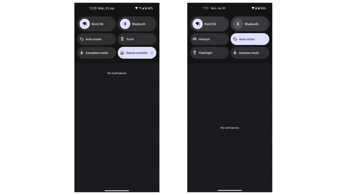
With Android 12, we get a unified toggle for Wi-Fi, mobile data, and hotspot. In Android 13, the hotspot has a separate button, and the toggle only includes Wi-Fi and mobile data.
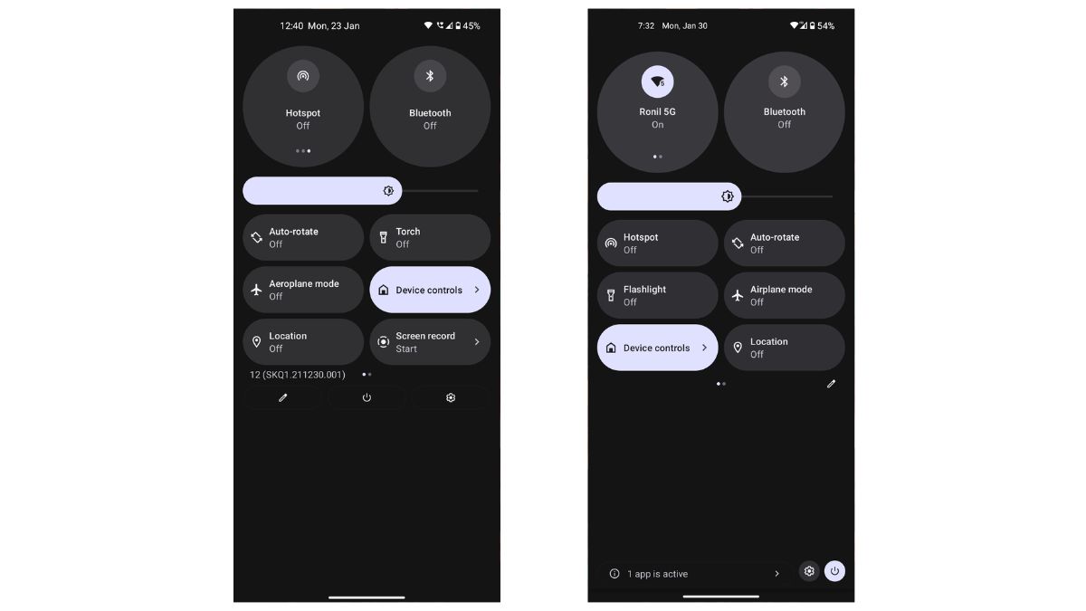
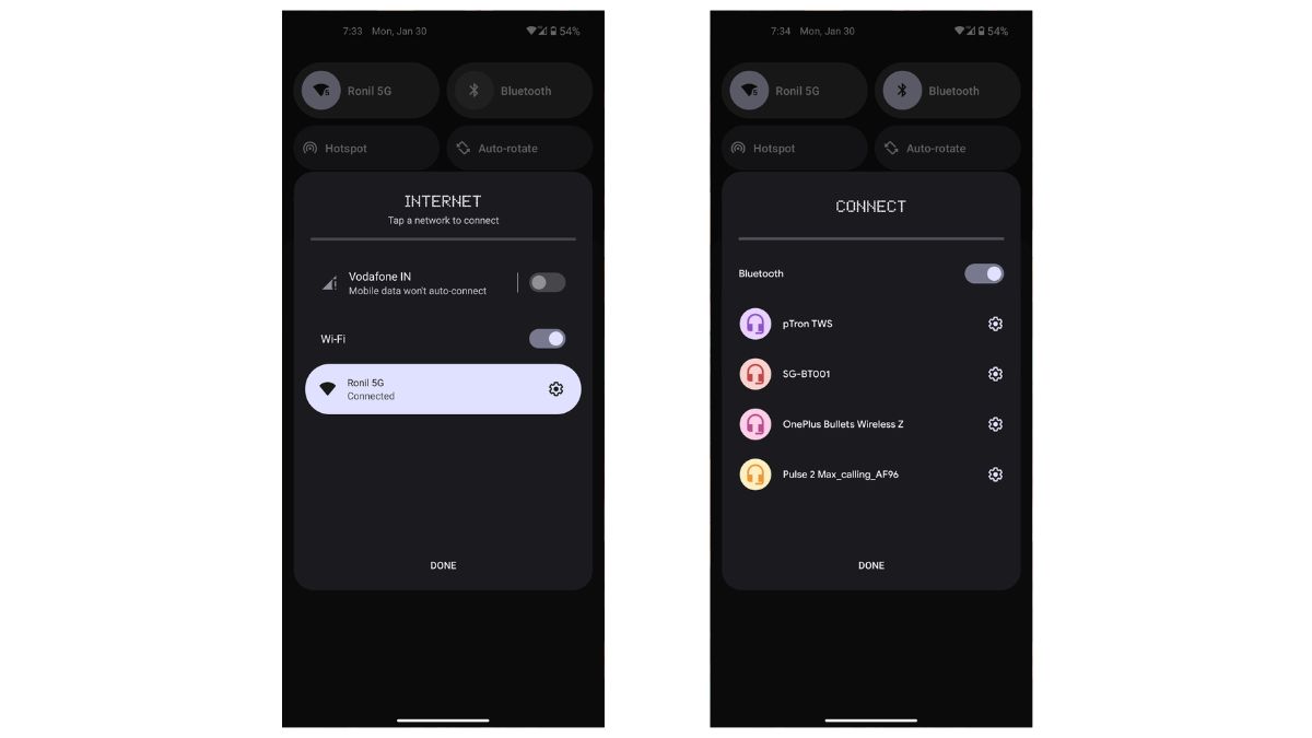
Another change you will notice with the Wi-Fi toggle is that on Android 12 when you click on the Wi-Fi switch, it turns on/off. However, with Android 13, you get a floating panel that shows you all the available Wi-Fi networks when you tap on the button. You can then click on the button to enable/disable the Wi-Fi, making it a two steps process. The same goes for Bluetooth.
Besides this, you also get a new option to quickly scan QR codes that let you activate Google Lens from the quick setting, which doesn’t exist in Android 12. There is also a new Active Apps functionality, showing all the apps currently running in the background.
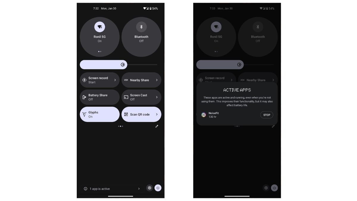
Next, the docked edit, power, and setting buttons are slightly changed, with the power and setting options now sitting next to the app activity feature.
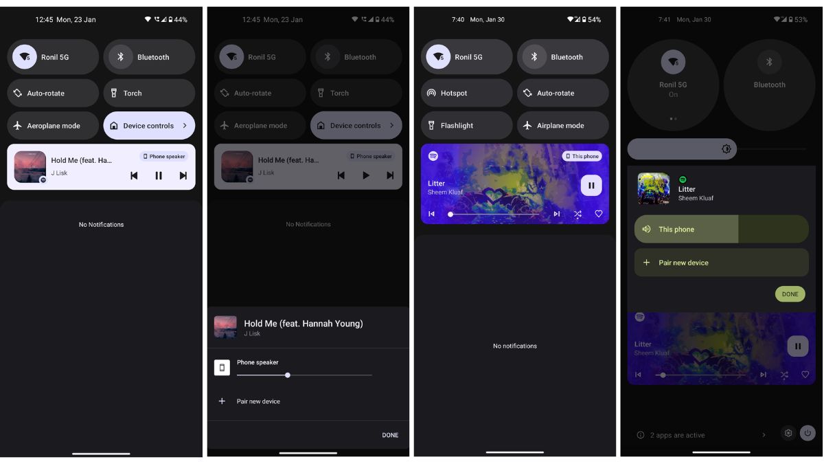
Those who often listen to music would immediately notice the refreshed media panel on Android 13. You now get a scrubber playback progress indicator with more control options. The Bluetooth picker’s UI also sees an overhaul with a floating panel, adding more output source options and volume control functionality. On Android 12, the playback is in the same ‘Material You’ color you set with the wallpaper, while the newer one flaunts the album cover.
Handy Tricks
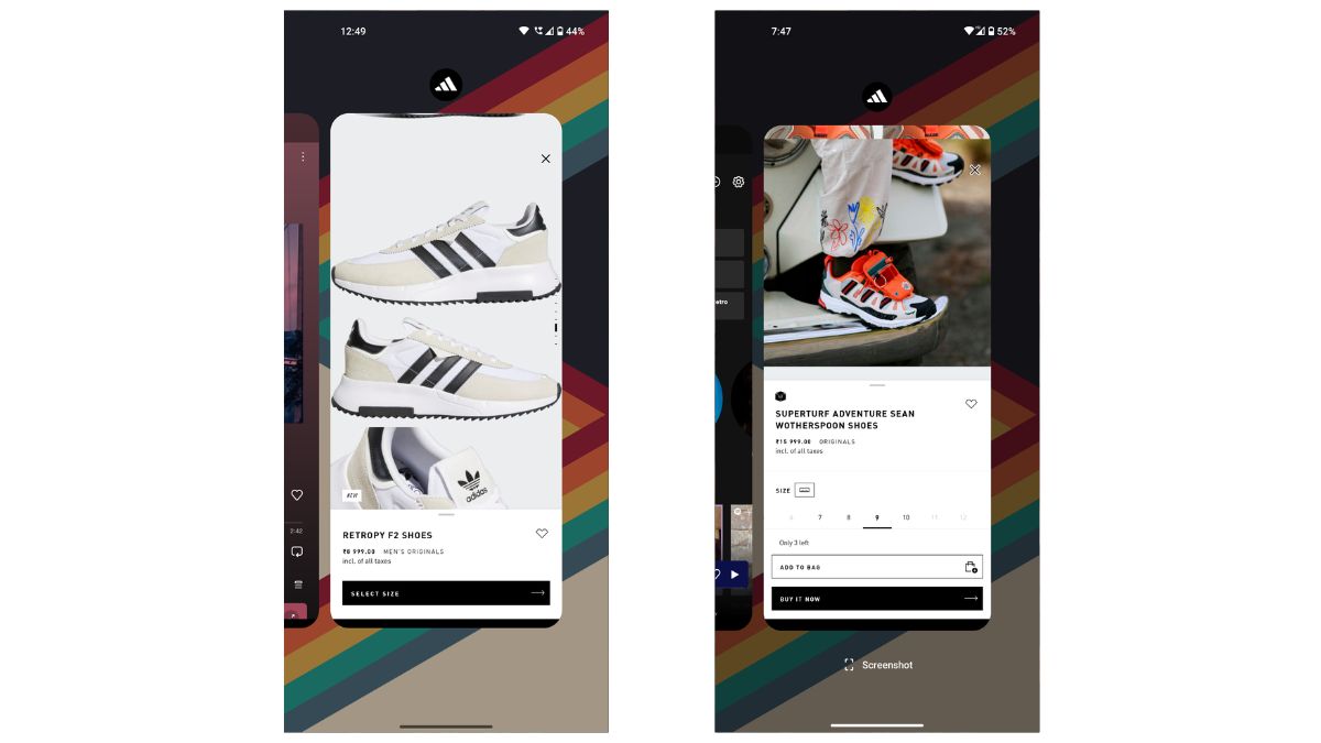
With the latest beta release, you get a dedicated screenshot button in the recent application menu section. The option doesn’t exist in the Android 12 build on the Phone (1).
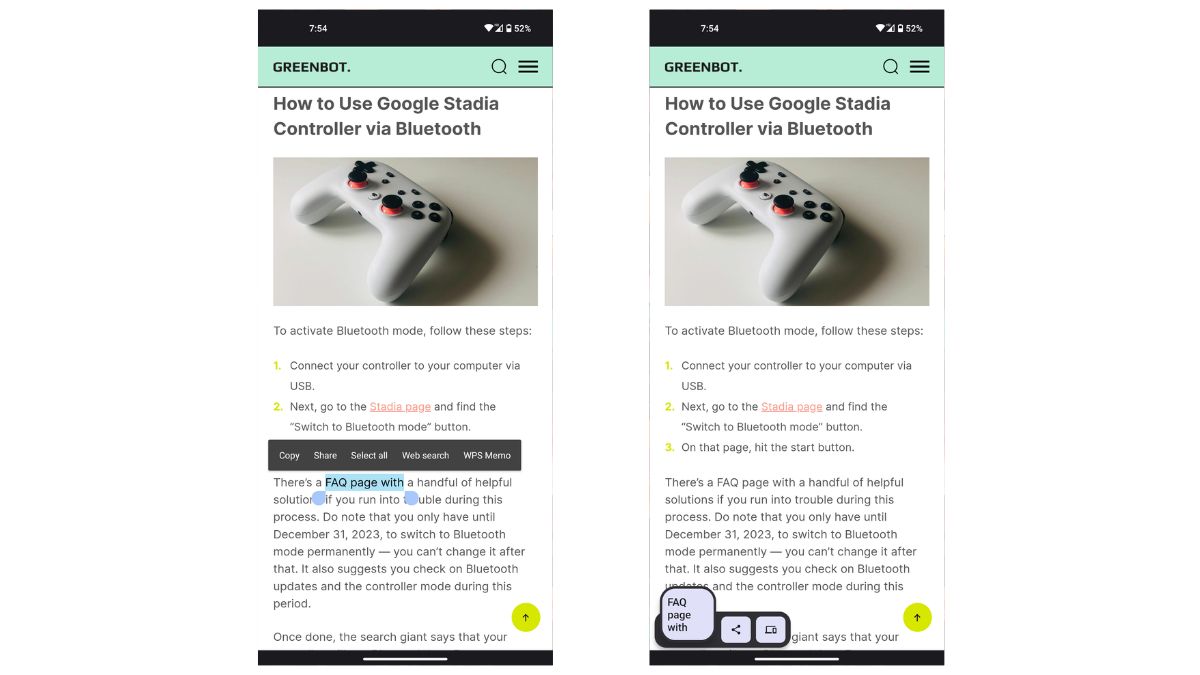
Another handy trick we discovered is when you go to a website and copy text — you now get a small pop-up menu for copied text, bringing up a share sheet.
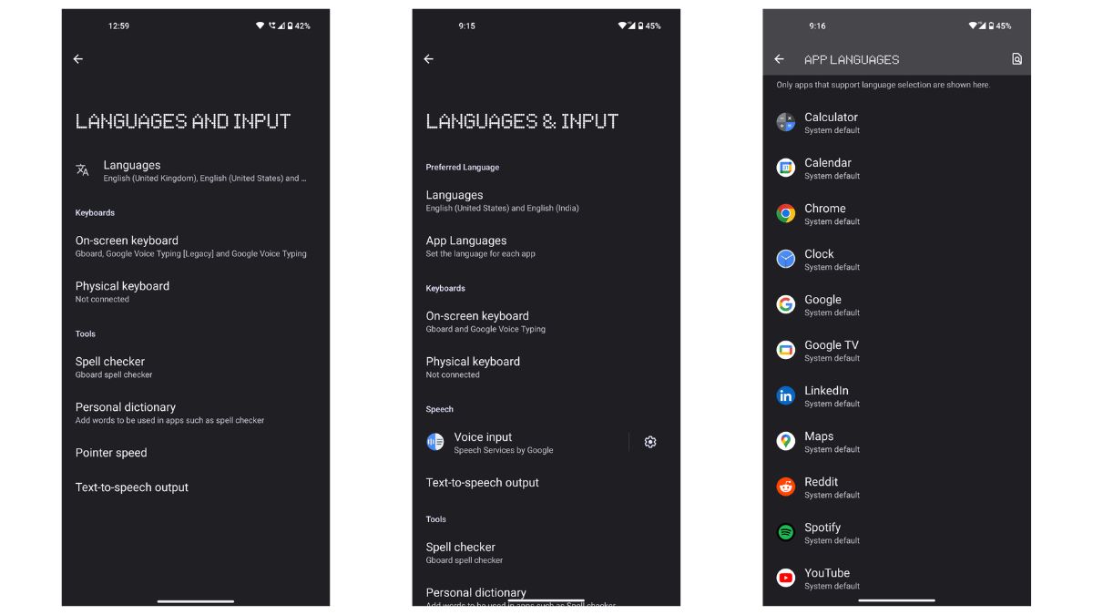
One more neat little Android 13 trick it got on its sleeve is the per-app language control option. If you go to the system settings and then to the language and input menu, you can set a different language for every app. On Android 12, you only get to pick a standard language for all your applications.
New Android 13 Features on Nothing Phone (1)
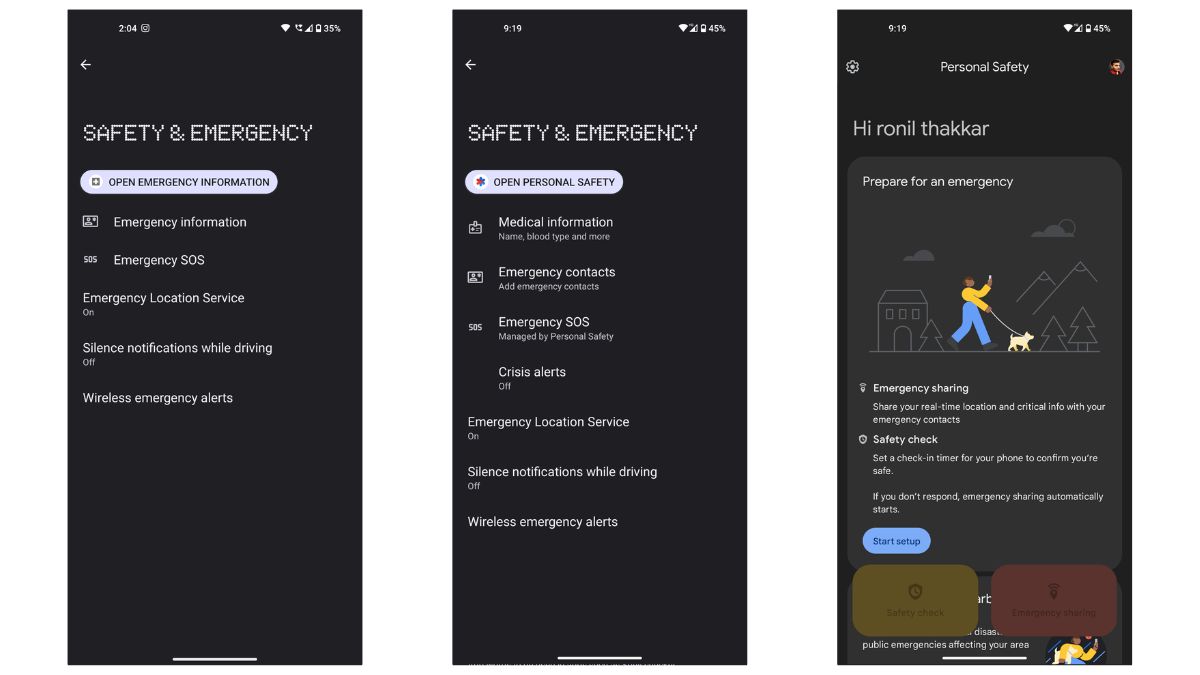
With Nothing OS 1.5, you get all-new safety and emergency application, giving access to features like car crash detection, emergency sharing, earthquake alert, and medical data.
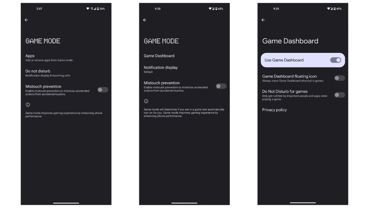
You now get more game mode options than you had on Android 12. It offers an enhanced game dashboard and tools to access improved game functionality.
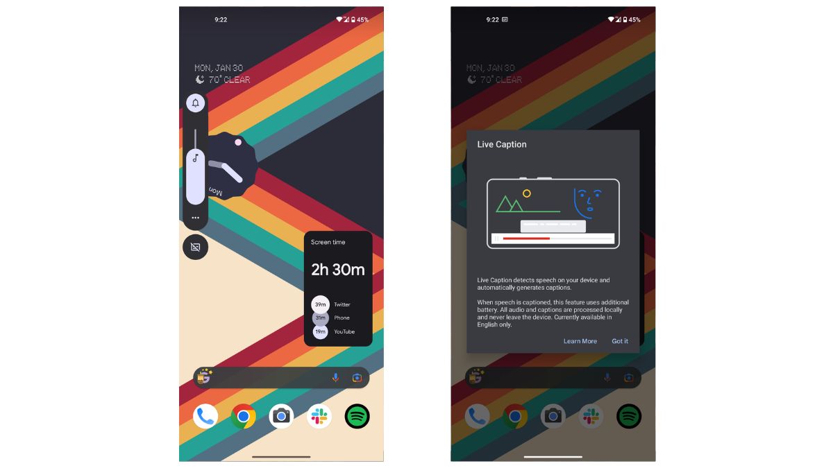
Another new feature we get with this beta release is the live caption tool. Under the volume control panel, you can enable/disable live captions, which are machine learning-generated live captions for video content.
The latest edition is an all-new weather application that shows weather details in a digital dot matrix style, curated from the AccuWeather platform.
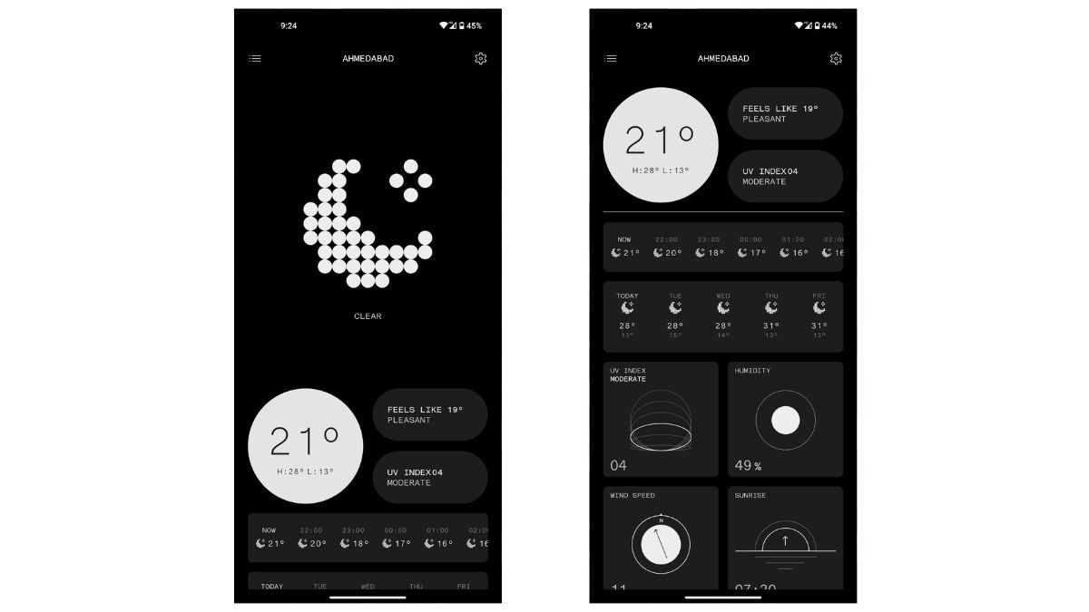
UI Changes
This update also brings more customization options to the Phone (1). If you go to the wallpaper and style settings, you will now get 16 wallpaper colors to choose from based on your wallpaper colors alongside the traditional four basic colorways.
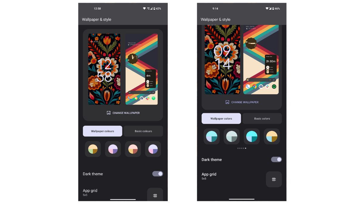
You also get themed icons that will theme every supported application with the same ‘Material You’ color you set with the wallpaper. In customization settings, go to the icon pack menu. You will witness the Default as well as Theamed Icons option.
![]()
The volume control panel also gets a refreshed design, giving you a floating menu for ringtone, media, and alarm volume, compared to the Android 12’s docked menu.
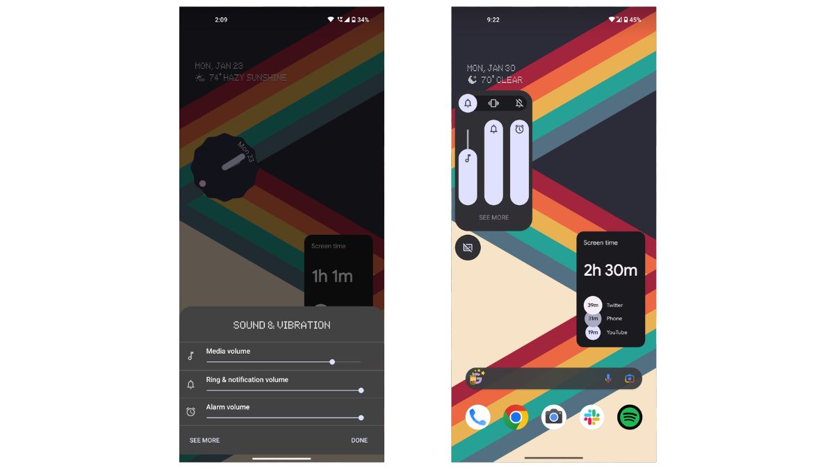
When you go to the recent apps menu and slide to the left end, you will see that the “clear all” option is more prominent on the Android 13 build than on the Android 12.
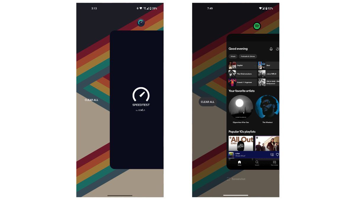
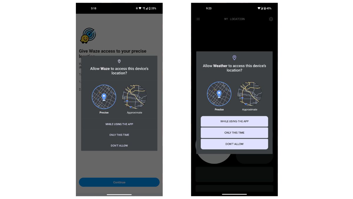
Another minor cosmetic change is how the prompt for the location has Material You and Dynamic Color theming with rounded edges on Android 13, compared to the older squared-off buttons on Android 12.
